So Here Are My Tips For Drawing Side Profile Views And Study People’s Faces! I Wish I Could Explain


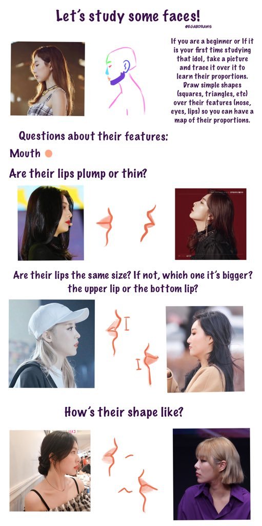

So here are my tips for drawing side profile views and study people’s faces! I wish I could explain more but I’m all over the place I’m sorry ㅠㅠㅠㅠ but well, I hope this can be useful for someone!
More Posts from Aether1984 and Others
How to draw a basic head construction
By REIQ
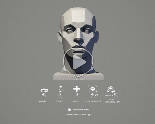
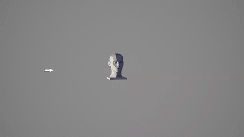

MALE HEAD LIGHT REFERENCE TOOL by William Nguyen
Click here to use the interactive reference!

Long time no see Tumblr. Quick guide on coloring deeper skin tones
Sorry for the disorder, but I wanted to ask if you could do a tutorial on lineless art! By the way, nice art!!!
thanks! lineless art it is, then
i start with the sketch, obviously. since you won’t have the lineart to guide you later, a clean and detailed sketch is pretty important

then i make it transparent enough so that i could focus on the shapes, but was also able to tell the details of the sketch, and pick some background color

then i slap on the colors i wanna use. the accuracy of these splotches of color depends on my mood and patience and the amount of details in the drawing (lol), so it’s fairly arbitrary i guess
the more accurate it is, the less it takes to clean it up later, but the opposite sometimes adds life to the drawing and welcomes the experiments with the colors and shapes
if there’s something that needs extra accuracy (like the earring here) or i just don’t feel like cleaning it up again later, i use several layers (face, hair, etc) or add the details later. but i love using one single layer whenever possible

aaand then i just start erasing / adding stuff to make it all nice and crispy!
there isn’t really a certain point when i start doing it. like, here i added those light hair streaks before defining the shape of her head, so that i could erase the messy parts altogether, but i could also clean up the head first, then lock the layer and add the streaks

when i decide that it’s comprehensible enough for me to work without the sketch, i hide its layer. you could continue working with it, of course, but i find it distracting. it’s nice to take a fresh look and figure out what it’s gonna look like in the end

details time! i enjoy adding lines here a lot, it’s really not the same as creating the lineart beforehand. there’s something comfy and lively about this process, because you compliment the shapes, silhouettes and color rather than just redrawing the empty carcass of a sketch. besides, it adds more definition and movement to the shapes

hope that helps!
I've always loved drawing people and especially portraits. Your art is so inspiring! Do you have any advice on drawing portraits with accurate proportion? What aspects are the most important in portraits, do you think? And what are good exercises? I'm sorry for bombarding you with so many questions! :3
Thank you! There’s one thing about drawing portraits that I don’t think I’ve ever touched on, and it’s the technique of constraining features. Basically, it becomes easier and more intuitive to rotate the face in 3D space once your mind grasps exactly where the features are located and, furthermore, where they can’t be located.
I use a weird double trapezoid shape that I’ve depicted below in red to keep track of facial feature placement every single time I draw a face. It follows the top of the eyebrows, touches the corner of the eye, traces down to the corner of the lips, and finally ends at the bottom of the lips.

The shape of the constraint will change depending on the person’s features, and it works for every angle of the head. For me it really internalized where each part of the face was, as well as where it started and ended. It kinda helps moderate your drawings; i.e., you’ll stop drawing features that are wildly misplaced or off-sized. I don’t literally draw this shape out every time I draw a face, but I see it in my mind’s eye 100% of the time.
If you’re still learning proportions, a good exercise is to grab pictures of people and trace this shape over them (either digitally or with a marker or something) to get an idea of what realistic constraints looks like. Then go back to studying faces, and constantly check your drawing by tracing along the eyebrows and down to the bottom of the lips to make sure that things aren’t off (e.g., the constraint isn’t terribly asymmetric). It takes a while to get used to, but it might help you get a good feel for portraiture.
There’s one other unrelated thing I like to do with faces, and if you’ve seen a lot of my pics you’ve already picked up on it. If you kinda add some shading to the area on the cheek just below the eye and down to the nose, I think it adds a decent amount of depth to a face. Don’t go overboard of course but there’s another little tip that could be of use.


To celebrate a follower milestone on ig and also so I don’t have to keep a million references open whenever I draw these characters, I’ve made semi-model sheets on all of them, including their general build, face shape, expressions, and fashion styles.
Another comment I’ll make is that Julian and Lucio have quite similar faces, but Lucio is very sharp while Julian’s rounded out.
Each character tends to have a reoccuring line shape throughout their design:
Asra - Semicircles/curves
Nadia - Straight vs flowing lines
Julian - Loose waves
Muriel - Blocky or jagged
Portia - Bubbly waves
Lucio - Sharp and spiky
I hope this can be useful :D

I’ve been thinking about it for a while and I finally had the time to work on a really simple walkthrough of my design process for armors! Hope it can be useful :D
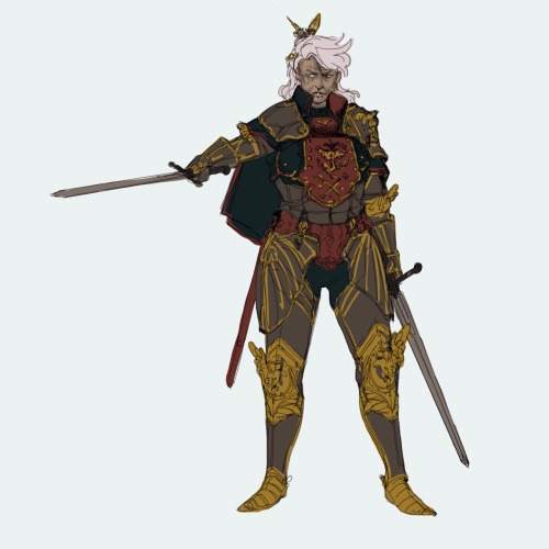
Before designing the attire I like to define first who this character is going to be, based on their alignment, their role, job and so on. I used a random dnd character generator and found a simple but cool prompt:

Based on this brief description the first step to take is to get a good silhouette and pose. Figure drawing and silhouette studies are a good method of exercise: they train you to think without any sort of detail. The pose alone should convey the whole mood. I wanted my human paladin to be an aged veteran knight in medium build, ready to strike and prepared to carry her weight in battle with two swords.

Armor is a tricky subject but only when you don’t know it. I study a lot from real traditional armor, because before designing something I have to figure out how it actually works in real life. I could recommend lots of book to buy but Pinterest does an amazing job in providing you with an endless stream of inspiration and photos/illustrations to study (Osprey Publishing has fantastic books about armor, weapons and military from 10th century and before to 20th century). I believe in functionality over beauty but with a middle ground that makes both aspects look good together instead of clashing (I’m looking at you, Korean concept artists): it’s my job to find a compromise between them. A good example to study is something like this:

Simple, readable, every rivet shown makes it understandable to know how to move into an armor like this. I also take lots of inspiration from fashion design but it’s another whole world lol, https://www.vogue.com/fashion-shows is pretty much the Bible for that since there’s a complete list of every season of pret-a-porter and couture from 1990 to the present day. It’s a fun game to play!
Question yourself when you design, “can I wear this? How? If I were to make a cosplay of this, how would I layer everything?”, if you’re aiming for realism you have to follow certain rules and guidelines. Speaking of guidelines, this is a simplification of the parts of the armor I want for this character.

You can call it a day and be done with it by refining the sketch a bit now. This is a good design, boring but functional. How do we make it more interesting? By using shapes and patterns to create a general theme, adding cloth parts like a cape and undershirt and all the elements needed like belts, chain mail and so on. Rectangles? Amazing. Circles into rectangles?? Beautiful craftsmanship (go wild)

This is looking like a real character now, congrats! Here’s where the fun really begins though: details. Once the silhouette is defined you can customize the character all the way and make it look like there’s a story to be told even in the armor. I like to think of a theme and apply it to pretty much everything, it’s usually animals or flowers because often times knights had themes like those. This woman is a fierce, fearless mom figure, tired but wise, willing to help the young adventurers to see them leave the nest and fly on their own… like a bird… but like, a cool bird? Like a cool bird often associated with freedom?

Eagle theme are all over the armor: it intrigues the viewer and makes the design look complex enough to be interesting on its own. The knee and elbow parts are wings now, one of the pauldrons has a raging eagle coming out of it (asymmetrical details are cool!), the important parts connecting the armor are shown with little details that make it look like a custom made set. At this point I’m satisfied and can go onto colors, then rendering.
Colors take a big part into the character design but it’s not something I feel good enough to cover lol, the only advice I can share regarding this is to have in mind the materials of the outfit. Right now the breastplate is in a grey zone: a slight change in material can turn a decorated breastplate into a half coat. Defining material when you’re sketching is a neat way to save yourself some time and get a bit less stressed when you get to painting.

And it’s done! Hope it was helpful!
I just realized how terribly short her right arm is LOL please don’t shame me
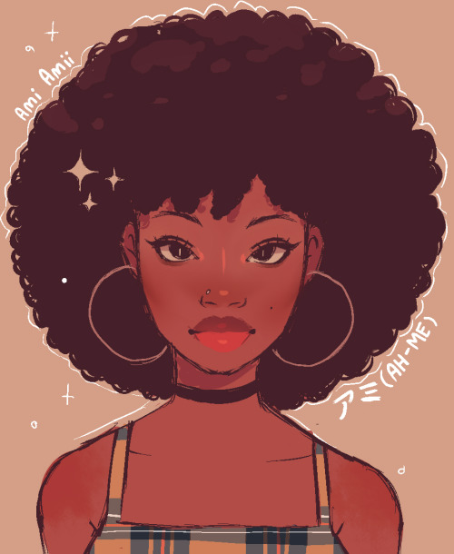
How to draw Afro textured 4c hair - an explanation/Tutorial
For those of you that don’t know what 4c hair is, 4c hair is a hair texture type that contains coils to small and tight that the hair appears to be more puffy rather than curly ( like to photo below ) this is in NO WAY to be confused with curly hair. there is a drastic difference.

As a black artist that primarily draws characters with 4c hair, I’ve been asked many times to do a tutorial on 4c hair so here we go~
before we get into 4c hair, lets take a moment to fully understand it by talking about hair texture in a general sense first
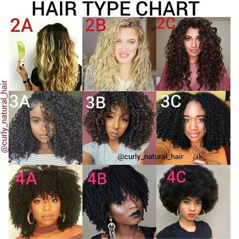
let’s take a look at this example of straight hair vs curly hair ( 1 type straight hair vs 3 type curly hair )

If you take a moment to compare the two you’ll notice straight hair is flat, it has no texture. Straight hair perfectly hangs down similar to liquid-like silk. It’s lack of curl pattern is the reason as to why it hangs perfectly flat.
curly hair on the other hand doesn’t lie down flat and silky like straight hair, It’s more thick. Curly hair in it’s raw and unstyled state has a trapezoid like shape this is because the sides of the hair spread more outward.

So why is this? Why is straight hair flat and curly hair thick?
the answer to that question is a thing called piling up. When it comes to hair texture, the shape of the hair strands aren’t the only thing that matters, its how the strands coexist with each other, Curly hair strands coexist by piling up on top each other.
moisture also effects hair texture too, different hair types absorbs moisture differently, thus the thickness of each hair type is different.


…..soooo, how does this all relate to how to draw 4c hair??
Well let’s take a look at the drawing below. Notice how the arrows go outward more as the hair texture gets curlier. As we’ve already discussed, this is because hair piles up, The curlier the hair texture, the more it piles up on each other, the bigger it gets, the more outward the arrows go.
Out of any hair texture, 4C hair has the most curls. Because of this, the hair piles up on each other so much that it doesn’t lie down flat like straight hair, nor does it make a trapezoid like shape like curly hair, it instead becomes more cloud like.❤️

This is what you need to take into account when it comes to drawing 4C hair.

Think of it as piling up a bunch of cotton balls on each other. The most cotton on top of top to lead to a bigger patch of cotton. this is 4c hair.
How to not draw 4c hair:
Garnet fanart. Let’s talk about Garnet Fanart. I notice a trend that when artists draw Garnet from Steven universe, her hair texture is usually changed to 3 type curly like texture. This subtle form of White washing has confused me because this is inaccurate.

Garnet’s hair is in the shape of a cube. Though 3 type hair piles up on each other, it isn’t curly nor thick enough for their hair to stay in the shape of a cube. Curly hair lies down more than 4c hair. So garnet’s hair being in the shape of a cube is a dead giveaway that it is 4C. Why do you think hairstyles like flat tops are usually seen on black men with 4c hair? It’s because, the 4c hair texture is thick and strong enough to stay in whatever shape you put it in.

please, if you’re drawing a character with 4c hair, avoid drawing it like curly 3 type hair, this is very anti-black and texturist.
So, how do you draw 4c hair?
honestly, its the most easy thing in the world


i wanna clarify that blobby looking 4c drawings ( like the one on the top left ) can work depending on how cartoony your art style is.
Another thing that I want to greatly clarify when it comes to drawing 4C hair is, YOU. DONT. NEED. TO. DRAW. EVERY. HAIR. STRAND!…..like, seriously. I’ve gotten many messages about how 4C hair is hard to draw, and it’s always left me confused; but then I find out that the same people that have trouble drawing 4C hair, attempt to draw every single strand of hair. This is unnecessarily time consuming because it’s merely impossible to get every single detail down, especially when you have a simple cartoon style. 4C hair does not require much effort, all you’re doing is drawing lumps. It’s that simple, nothing more nor nothing less.
The reason why I greatly advise all of you to avoid drawing every single hair strand is because in real life, when you look at a 4C textured Afro, your eyes don’t pick up on each individual hair strand like straight or curly hair. 4C hair, appears to be more undefined and cloud like, so attempting to draw each and every individual strand is unnecessary and will most likely end up looking inaccurate.


Anyways! that’s it for now! there will be a part 2 to this tutorial that will come out next week! i hope you guys have learned from this and apply it to your black character in your art!~
hmm this is a little weird to ask but how would you incorporate body horror or the uncanny valley into a monster design? all ive seen so far is r/nosleep too wide smile rake ripoffs n they kinda. suck
i think the simplest way to dip into uncanny valley irt monster design is just incorporating some humanlike features on a clearly nonhuman body. having a humanoid face on a quadrupedal form tends to do that very easily, anything to evoke a sense of wrongness but not quite jarringly horrific.
its why pacu teeth tend to unsettle people

or like if youre making something more humanoid, for example making body parts Longer than they should be seems to work really well
this is all subjective but i personally think the body parts that are best to modify for uncanny purposes are eyes, teeth, and hands because theyre the most recognizable, uniquely Human parts of our body. just putting human eyes or teeth or hands onto a nonhuman animal is enough to wig people out, and more delicate play with those features produces great results
uncanny valley horror works by givibg the impression of close approximation to what we know but being off in some way or another. thats part of why the really hackneyed “wooooo he was smiling UNNATURALLY WIDE SO SCARY” thing is popular on nosleep or why the monster mimicking human voices or body but somehow Wrong (movements too jerky, voice has wrong cadence or sounds like an audio loop, etc) trope is so successful (and getting really old at this point even tho i like it)
body horror tends to work similarly but instead of “this looks like a human but something about it is really off and its creeping me out” its “THATS NOT HOW A BODY IS SUPPOSED TO WORK AHHHHH”. the easiest way (a little lazy but fun) is just giving things Extra parts or parts where they shouldnt be, like eyes teeth etc, or wildly distorting how body parts should be. body horror also requires recognizability, like you have to be able to see what was once familiar/human but you can be a lot more violent with it.
like as an example john carpenters “the thing” is like the classic body horror movie. body horror doesnt have to be quite as gorey to be successful but i think the general language established in that film is really good, just twisting forms we recognize in ways that feel painful and wrong
on drawing fat bodies
-
 3city2 liked this · 6 months ago
 -
 ilamacorn reblogged this · 7 months ago
 -
ilamacorn liked this · 7 months ago
-
 gloryraiin reblogged this · 9 months ago
 -
 somerandomfollower reblogged this · 10 months ago
 -
 eddis-not-eeddis liked this · 10 months ago
 -
 telluricdog liked this · 10 months ago
 -
 xptobie liked this · 10 months ago
 -
 nothing-than-bleep liked this · 11 months ago
 -
gloryraiin liked this · 11 months ago
-
 burningbibliophilecomicbear liked this · 1 year ago
 -
somerandomfollower reblogged this · 1 year ago
-
 skelepen reblogged this · 1 year ago
 -
 leanderp liked this · 1 year ago
 -
 beetle-ze-bub liked this · 1 year ago
 -
 n22456 liked this · 1 year ago
 -
 dalmatiaspencil reblogged this · 1 year ago
 -
 super-metroid liked this · 1 year ago
 -
 saurian-official reblogged this · 1 year ago
 -
saurian-official liked this · 1 year ago
-
 diatarcmaropho liked this · 1 year ago
 -
 invaderskoodge liked this · 1 year ago
 -
 a-drays-mind reblogged this · 1 year ago
 -
a-drays-mind liked this · 1 year ago
-
 therebelknights reblogged this · 1 year ago
 -
 kali-cormac liked this · 1 year ago
 -
 ernyapoode liked this · 1 year ago
 -
 artutorialcollection reblogged this · 1 year ago
 -
 softiejing liked this · 1 year ago
 -
 youreiludida liked this · 1 year ago
 -
 hopelessromantic9 liked this · 1 year ago
 -
 is2unny liked this · 1 year ago
 -
 kitdreamzing liked this · 1 year ago
 -
 snikkeler liked this · 1 year ago
 -
 pixie-mask liked this · 1 year ago
 -
 oatmealstreetfighter reblogged this · 1 year ago
 -
 azura-fox reblogged this · 1 year ago
 -
 mariposasmonarch liked this · 1 year ago
 -
 theworldiswhispering liked this · 1 year ago
 -
 artimies6 reblogged this · 1 year ago
 -
 reputxtion13 reblogged this · 1 year ago
 -
 daslulilaan liked this · 1 year ago
 -
 starkitters liked this · 1 year ago
 -
 skyyism liked this · 1 year ago