I’ve Been Thinking About It For A While And I Finally Had The Time To Work On A Really Simple Walkthrough

I’ve been thinking about it for a while and I finally had the time to work on a really simple walkthrough of my design process for armors! Hope it can be useful :D
Before designing the attire I like to define first who this character is going to be, based on their alignment, their role, job and so on. I used a random dnd character generator and found a simple but cool prompt:

Based on this brief description the first step to take is to get a good silhouette and pose. Figure drawing and silhouette studies are a good method of exercise: they train you to think without any sort of detail. The pose alone should convey the whole mood. I wanted my human paladin to be an aged veteran knight in medium build, ready to strike and prepared to carry her weight in battle with two swords.

Armor is a tricky subject but only when you don’t know it. I study a lot from real traditional armor, because before designing something I have to figure out how it actually works in real life. I could recommend lots of book to buy but Pinterest does an amazing job in providing you with an endless stream of inspiration and photos/illustrations to study (Osprey Publishing has fantastic books about armor, weapons and military from 10th century and before to 20th century). I believe in functionality over beauty but with a middle ground that makes both aspects look good together instead of clashing (I’m looking at you, Korean concept artists): it’s my job to find a compromise between them. A good example to study is something like this:

Simple, readable, every rivet shown makes it understandable to know how to move into an armor like this. I also take lots of inspiration from fashion design but it’s another whole world lol, https://www.vogue.com/fashion-shows is pretty much the Bible for that since there’s a complete list of every season of pret-a-porter and couture from 1990 to the present day. It’s a fun game to play!
Question yourself when you design, “can I wear this? How? If I were to make a cosplay of this, how would I layer everything?”, if you’re aiming for realism you have to follow certain rules and guidelines. Speaking of guidelines, this is a simplification of the parts of the armor I want for this character.

You can call it a day and be done with it by refining the sketch a bit now. This is a good design, boring but functional. How do we make it more interesting? By using shapes and patterns to create a general theme, adding cloth parts like a cape and undershirt and all the elements needed like belts, chain mail and so on. Rectangles? Amazing. Circles into rectangles?? Beautiful craftsmanship (go wild)

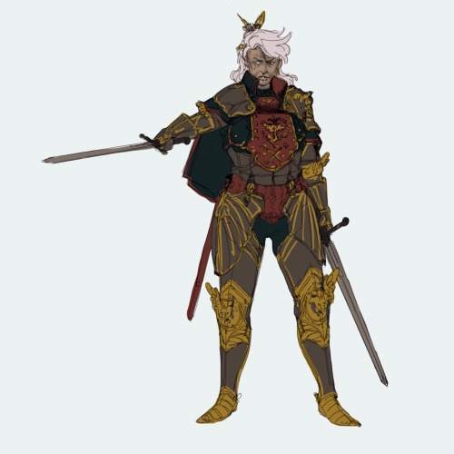
This is looking like a real character now, congrats! Here’s where the fun really begins though: details. Once the silhouette is defined you can customize the character all the way and make it look like there’s a story to be told even in the armor. I like to think of a theme and apply it to pretty much everything, it’s usually animals or flowers because often times knights had themes like those. This woman is a fierce, fearless mom figure, tired but wise, willing to help the young adventurers to see them leave the nest and fly on their own… like a bird… but like, a cool bird? Like a cool bird often associated with freedom?

Eagle theme are all over the armor: it intrigues the viewer and makes the design look complex enough to be interesting on its own. The knee and elbow parts are wings now, one of the pauldrons has a raging eagle coming out of it (asymmetrical details are cool!), the important parts connecting the armor are shown with little details that make it look like a custom made set. At this point I’m satisfied and can go onto colors, then rendering.
Colors take a big part into the character design but it’s not something I feel good enough to cover lol, the only advice I can share regarding this is to have in mind the materials of the outfit. Right now the breastplate is in a grey zone: a slight change in material can turn a decorated breastplate into a half coat. Defining material when you’re sketching is a neat way to save yourself some time and get a bit less stressed when you get to painting.

And it’s done! Hope it was helpful!
I just realized how terribly short her right arm is LOL please don’t shame me
More Posts from Aether1984 and Others
morty how the heck do you draw top heavy bodies (kinda like kuins) because its hell 2 me
OK SO THIS IS LATE AND IM BAD AT EXPLAINING SO I JUST SCREENSHOT’D MY PROCESS

FIRST, GET YOURSELF SOME MOOD MUSIC

BASE SKETCH: I don’t usually draw what’s in red there, but this is your basic inverted triangle shape. Basically, as long as you make sure the shoulders create an exaggerated silhouette that highlights the waist, you’re doing the top heavy thing right. Generally, you don’t wanna shrink the waist too much or else it looks REALLY weird, so if you want to exaggerate the shape more, try to focus more on the arms and shoulders. Keep the hips narrow.

LINING SHIT. Add some core muscles to actually support all that up top. I like making the pecs particularly pointy just to drive home the triangle thing.

It’s ya boi
i’m gonna drop an art tip here
i think an important thing to learn, especially if you start out with drawing anime, is that faces don’t necessarily have to narrow from top to bottom

i like to think of wide top, wide middle, wide bottom, and rectangle-like as the 4 main face shapes
what you should keep in mind about them:
you’re only halfway done: the jawlines, the width-length ratio, the amount of fat in the cheeks, the intensity or subtlety of the face’s curves are all important components you still have to decide on after choosing the shape itself
none of these shapes are exclusively feminine or masculine, don’t hesitate drawing them on any gender
most people in real life have some variation of the wide middle type
if you are trying to draw real people, getting the shape of their face down is the first step
i’ve seen tutorials say the shape of the face can tell a lot of the character’s personality - you don’t necessarily have to live by that rule. as long as you aren’t unrealistically drastic about their proportions, their face shape determines their inner qualities as much as it would in real life (not at all)

im a bad advice giver but in case anyone finds this handy?

wire tutorial for a friend


i present to you, TORSOs. heads an legs got lost in the mail sorry
do you have any tips on drawings noses? particularly non-white noses?? all the tutorials are european noses and i just want to learn how to draw my own nose!!
oh i feel you. the nice thing about being a poc is that you can always study yourself in the mirror to learn how to draw yourself better! but anyways:


if you’re wondering which kinds of noses are frequent for which race, i like to use this guide. I can’t verify how accurate it is, but it’s pretty damn comprehensive for racial traits around the world. I also really like this guide for learning how to draw a variety of East Asian noses (it’s not all flat!). Here’s an equivalent guide that includes drawing African noses. And there’s always Google images for more specific requirements.
+ 3D models are really helpful when drawing noses: x x x
+ here are some general nose tutorials by better artists lol: x x
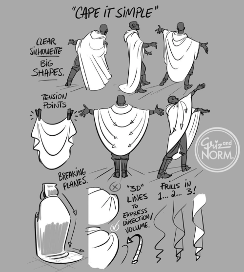
Drawing tips by Disney artists Griz and Norm Lemay

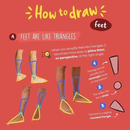
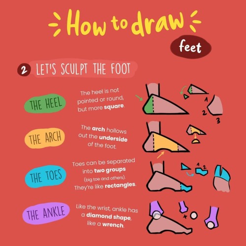


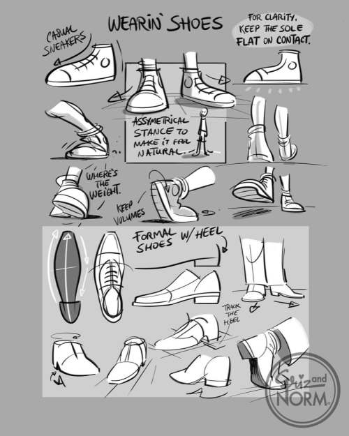
How to draw feet by zephy.fr
Support the artist and follow them on instagram!
I've always loved drawing people and especially portraits. Your art is so inspiring! Do you have any advice on drawing portraits with accurate proportion? What aspects are the most important in portraits, do you think? And what are good exercises? I'm sorry for bombarding you with so many questions! :3
Thank you! There’s one thing about drawing portraits that I don’t think I’ve ever touched on, and it’s the technique of constraining features. Basically, it becomes easier and more intuitive to rotate the face in 3D space once your mind grasps exactly where the features are located and, furthermore, where they can’t be located.
I use a weird double trapezoid shape that I’ve depicted below in red to keep track of facial feature placement every single time I draw a face. It follows the top of the eyebrows, touches the corner of the eye, traces down to the corner of the lips, and finally ends at the bottom of the lips.

The shape of the constraint will change depending on the person’s features, and it works for every angle of the head. For me it really internalized where each part of the face was, as well as where it started and ended. It kinda helps moderate your drawings; i.e., you’ll stop drawing features that are wildly misplaced or off-sized. I don’t literally draw this shape out every time I draw a face, but I see it in my mind’s eye 100% of the time.
If you’re still learning proportions, a good exercise is to grab pictures of people and trace this shape over them (either digitally or with a marker or something) to get an idea of what realistic constraints looks like. Then go back to studying faces, and constantly check your drawing by tracing along the eyebrows and down to the bottom of the lips to make sure that things aren’t off (e.g., the constraint isn’t terribly asymmetric). It takes a while to get used to, but it might help you get a good feel for portraiture.
There’s one other unrelated thing I like to do with faces, and if you’ve seen a lot of my pics you’ve already picked up on it. If you kinda add some shading to the area on the cheek just below the eye and down to the nose, I think it adds a decent amount of depth to a face. Don’t go overboard of course but there’s another little tip that could be of use.

Hey guys!
I have something for you)


PLS tag me if you use my refs for your art 🙏🏻
It will be such a pleasure to know if my refs are helpful 🖤
-
 givemyheadpeace reblogged this · 1 month ago
 -
 nochnye-vedmy liked this · 2 months ago
 -
 fullmetal-foolishness liked this · 3 months ago
 -
 nohonkhonk liked this · 6 months ago
 -
 artist-enjoyer-002 reblogged this · 1 year ago
 -
artist-enjoyer-002 liked this · 1 year ago
-
 cao0227 liked this · 1 year ago
 -
 muklicacgedist liked this · 1 year ago
 -
 not-a-snowman liked this · 1 year ago
 -
 17catsandpeanutbutter reblogged this · 2 years ago
 -
 seeserpent liked this · 2 years ago
 -
seeserpent reblogged this · 2 years ago
-
 blu-jei reblogged this · 2 years ago
 -
 sil11-sex-36byu liked this · 3 years ago
 -
 fleuria22 liked this · 3 years ago
 -
 hands-of-fate-ocs liked this · 3 years ago
 -
 iredara liked this · 3 years ago