Hylictober Day 4: Least Favorite Enemy


hylictober day 4: least favorite enemy
it's not that i hate them, but i swear, when that lil shit calls for help
More Posts from Aether1984 and Others
how do you do torsos?

[full pic here]
it’s not anatomically accurate but this is basically how i do torso
i’m gonna drop an art tip here
i think an important thing to learn, especially if you start out with drawing anime, is that faces don’t necessarily have to narrow from top to bottom

i like to think of wide top, wide middle, wide bottom, and rectangle-like as the 4 main face shapes
what you should keep in mind about them:
you’re only halfway done: the jawlines, the width-length ratio, the amount of fat in the cheeks, the intensity or subtlety of the face’s curves are all important components you still have to decide on after choosing the shape itself
none of these shapes are exclusively feminine or masculine, don’t hesitate drawing them on any gender
most people in real life have some variation of the wide middle type
if you are trying to draw real people, getting the shape of their face down is the first step
i’ve seen tutorials say the shape of the face can tell a lot of the character’s personality - you don’t necessarily have to live by that rule. as long as you aren’t unrealistically drastic about their proportions, their face shape determines their inner qualities as much as it would in real life (not at all)
The way you draw hair is so GORGEOUS!! It is okay to ask how you do it??
omg thank you :'D !! and ofc! here's how i like do it
whenever i draw hair i like to think about volume first and shape design second. usually when i make a sketch this is how i go about doing it:

^ i basically lay down quick shapes of what i want before going in with cleaner lines
first i choose a direction that the hair is supposed to swoop towards, then draw overlapping and twisting chunks/strands of hair (with varied size, thickness etc to make it look less stiff)

this applies to other types of hair as well :)

i guess to put it more plainly - i like to layer hair a little bit to make it look more visually interesting... but i do tend to go overboard sometimes, so i erase or start over a lot ^__^"
here's a recording i managed to take while sketching, hopefully it clears up what i've written so far LMAO
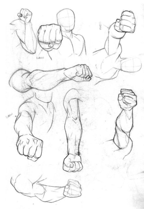
Would you perhaps do a tutorial on arm muscles? Or at least link a few good ones you know
Arm muscles took me a bit to figure out when I got started out with anatomy. But the layout of the arm’ muscles can actually be simplified a whole lot while still maintaining a rather believable look. So let’s have a look-see.

One of the first tidbits I discovered that really made it click for me - was that the upper arm contra the forearm intersections kind of like a set of chainlinks. Both in the way, they sit statically but also how they move. If a “broad” or “wide” side of one of them is shown, the “narrow” side of the other should be shown in correspondence. If you just keep the rough shape of these two lings in mind - you ‘ll have an easier time remembering the layout of muscles.

Just for kicks. This is roughly how the main bones are laid out in the arm. We have the Humerus, the large bone in the upper arm. This one’s rather dense and thick. Then you got the Radius and Ulna that start at the elbow and then reach into the wrist. When we move our wrist, the two ends attached to our wrist twist around one another. ( Take a look at your own hand, turn it, twist it, You should be able to vaguely feel the slight shift in angle in your elbow ).

So here’s a pretty accurate depiction of the muscle layout in the arm. The most notable muscles ( or at least those most iconic ) are the two large ones on the upper arm ( the Bi- and tri-cep), as well as the brachioradialis on the lower arm.

I’ve gone and simplified the layout accordingly to how I usually consider the layout in my own art. Here we can see the “chainlink” figure again. The bi- and tri-cep forming the “upper” chain link, and the brachioradialis along with the flexor carpi Ulnaris former the “lower” chain link.
The reason I tend to simplify this is that the many extendors and flexors on the lower arm, aside from the two listed - are rarely defined on people who’s muscles aren’t highly defined. And having these two braid into one another is just easier than having to keep track of 5-6 different muscles that feed into mostly the same shape.
On the upper arm: We have the bicep in the palest red, the tricep in the darkest red.
On the forearm: The brachioradialis in the darkest red, and the flexors/ extendors gathered up in the lighter red.

What’s interesting to note is that the flex/ex’ es meet with the brachioradialis kind of cross each other in a V-shape, which opens up into the dent of the elbow and attached - not on line with the elbow- but slightly above it. Attaching this muscle group underneath - or on the line with the elbow was a common mistake I used to do - which contributes to your arms looking like sausage links. But just like any other muscle layout, the muscles of the arms are carefully braided with each other with little areas where no muscles are overlapping or weaving into one another.

llllhttps://www.researchgate.net/figure/Agonist-antagonist-operation-of-the-biceps-and-triceps_fig2_326597252
A brief detour for posing- when the forearm is bend upwards (especially in people with highly defined muscles), you’ll notice that the bi-and tri-cep are compressed and thusly build their mass upwards, which makes this engorged bump. The flex is also visible in non-muscular people, but much less prevalent and rarely anything that one depicts - at least in semi-realism unless they want to emphasize a physical strength with their character.

A quick note on more muscle builds can be found here, https://theredlinestation.tumblr.com/post/185528871950/do-you-guys-think-you-could-give-me-a-tutorial-onand are relevant if your character’s muscles are somewhat defined.
- mod wackart ( ko-fi )
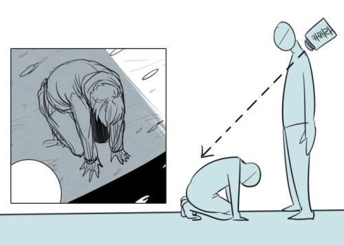
Do you have any tips for drawing body horror/ horror in general?
ooh ooh imma put this one under a cut cuz it’s gonna be long
Keep reading
Could you please show us how to draw faces with nice fangs please.

Hope this is helpful!
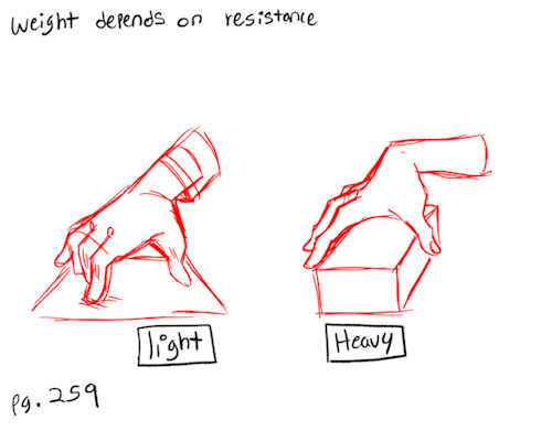
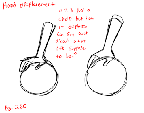
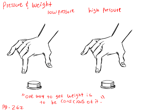
Notes from “The Animator’s Survival Kit” book.
[Pg.259 - 265] This is the end of my book studies. I’m pretty proud to have gotten through it and do a handful of the exercises. But this is only step one, I’m moving onto more advance animation techniques and will be posting those as I complete them. At the moment I’m currently wrestling with Toon Boom, so we’ll see how that goes.
——————- Tools: Rough Animator - Ipad + Apple Pen Patreon: [patreon.com/lunaartgallery] Twitter: [@LunaArt_Gallery] Instagram: [@lunaartgallerys]
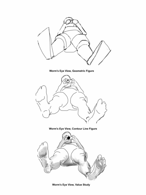
A glorious fuck-ton of perspective angle references (per request).
[From various sources.]
do you have a reference/tutorial for the way you draw teeth??


I kinda just freehand it myself since i got it memorized but i made one for ya- i hope it’s alright;;v;!!
hey so i looove body horror monster stuff .. and i noticed u do too.. i wanna draw stuff like that but i always end up unhappy with it, SO do u have any good blogs/things for inspiration/tips and also what kind of body horror monsters r ur faves and what kind of stuff do u like to see in that kind of art... write me a paragraph idc i just want inSPIRATION thanks <3
http://guydavisart.tumblr.com/http://deadwooddross.tumblr.com/http://dimetrodrawn.tumblr.com/http://empartridge.tumblr.com/are all good artists for body horror… I would also look up some of the monsters in things like guillermo del toro’s movies and more recent cartoons like steven universe/ adventure time/ over the garden wall
a lot of 80s horror has a lot of good body horror, see movies like The Thing, The Gate, The Company of Wolves, etc.


I would also look at horror movies for a younger audience as they tend to rely more on surrealism and body horror due to not being able to show a lot of blood


(limbs that are just way too long are /great/ by the way)video games imo tend to have pretty good creature design compared to movies, especially ones with simpler graphics. I really like the amalgamates in undertale, for instance:

(the endogeny is a really good example of ‘less is more’… a lot of times, a lack of features, like no eyes or a face that’s just a hole is much more unnerving than adding way too many eyes and spikes)

The designs also take advantage of a minimalistic art style to let the viewer make up some of the body horror… it’s hard to make sense of where everything begins and ends here, and given the character is a melting mutation, the negative space + vagueness is really effective


OFF also has some really nice monster designs… it also takes advantage of a lack of features (most creatures have no or blank eyes) as well as giving a lot of the creatures too many teeth, which always looks scary and wrong imo. Especially if they’re drawn crowded instead of spaced outlower poly monsters are also weird and nasty, possibly because their lack of more than like three angles makes them look super uncanny. there’s just something about flat surfaces + textures…:

human features on non human things are really cool:


people hands on something that’s just terrible and monstrous is just so gross and fun. hands are the worst. teeth are good too. with the second picture here, asymmetry is also adds a lot to the design; it’s very clearly not a natural creaturealso look at real world animals if you can! a lot of fish are weird, things like pink river dolphins and naked mole rats are pretty freaky looking.. leopard seals and their mouths… cordyceps on insects…but yeah, I think the best things you can do with body horror personally is exaggerate features (really jutting necks are super weird, for instance) and pick traits you think look horrific (a lot of people don’t like clusters of holes in the skin, teeth where they shouldn’t be, etc.)
-
 wonderemporium liked this · 2 years ago
 -
 pongolin liked this · 2 years ago
 -
 devilofoctober liked this · 2 years ago
 -
 spectradragon liked this · 2 years ago
 -
 tocsam liked this · 2 years ago
 -
 dismyzz liked this · 2 years ago
 -
 hydrathermal liked this · 2 years ago
 -
 kush-and-hylikz reblogged this · 2 years ago
 -
 trippledx liked this · 2 years ago
 -
 waspinators reblogged this · 2 years ago
 -
 unusedcactus liked this · 2 years ago
 -
 end-orfino liked this · 2 years ago
 -
 bunnysfarms reblogged this · 2 years ago
 -
 smulnsander liked this · 2 years ago
 -
 emperornero liked this · 2 years ago
 -
 skittercritter reblogged this · 2 years ago
 -
 spookmctoasty liked this · 2 years ago
 -
 protoformx liked this · 2 years ago
 -
smulnsander reblogged this · 2 years ago
-
 jawharpdotcom liked this · 2 years ago
 -
 differentloverbiscuitwagon liked this · 2 years ago
 -
 perish-lolz liked this · 2 years ago
 -
 5gb-of-data liked this · 2 years ago
 -
 lavenderbeak liked this · 2 years ago
 -
 squuote liked this · 2 years ago
 -
 doctorjohcoy liked this · 2 years ago
 -
 paaaige liked this · 2 years ago
 -
 dienollie liked this · 2 years ago
 -
 literal-ball liked this · 3 years ago
 -
 paig-does-it liked this · 3 years ago
 -
 bistecha reblogged this · 3 years ago
 -
 hiperfijacion reblogged this · 3 years ago
 -
 loafdaloaf liked this · 3 years ago
 -
 loaf-a-nator liked this · 3 years ago
 -
 crestfallenclown liked this · 3 years ago
 -
 superfaggot reblogged this · 3 years ago
 -
superfaggot liked this · 3 years ago
-
 coiffedstalker liked this · 3 years ago
 -
spxceboy707 liked this · 3 years ago
-
 catboylesbianz reblogged this · 3 years ago
 -
catboylesbianz liked this · 3 years ago
-
 xravenbladex liked this · 3 years ago
 -
 rainbow-clown-xp liked this · 3 years ago
 -
 aether1984 reblogged this · 3 years ago
 -
 jaspersforever liked this · 3 years ago