I Finally Reached 5000 Followers *quietly Cheers* And @strongity Asked Me A Day Before That Happened
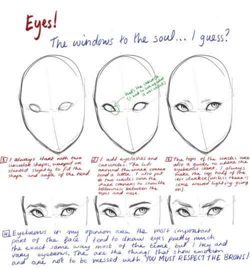


I finally reached 5000 followers *quietly cheers* and @strongity asked me a day before that happened to maybe do a tutorial thing on eyes and anatomy… So I did my best. I have kind of moved past using methods to draw (like using boxes to create shapes), just because I’m so used to drawing people. It kind of became a tips thing rather than a step by step guide, but hopefully it will help some of you!
More Posts from Aether1984 and Others
Do any of the mods have tips for drawing a full body in side view? I always get it wrong


There’s a really good side view breakdown in Bridgman’s Constructive Anatomy book, however I can’t find it! I did my best to emulate what I know.
If you already have the front view down, it’s a simple thing of translating the proportions over to the side view. One thing that helps me construct the body is using boxes to construct the head, ribs, and pelvis. The shoulder usually sits with bias towards the back, unless the person is slouching or their shoulders are raised in tenseness. I would recommend studying the bone structure of this if you really want an analytical sense of how it works!

-Mod Future (ko-fi)

So you might be saying: Lion why a guide on drawing black people? Well young blood it’s because a lot of people cant…seem…to draw…black people..Amazing I know.

Racist (caricatures) portrayals of black people have been around forever, and to this day people can’t seem to draw black people like they are human. If your artwork resembles any of the above even remotely your artwork is racist and offensive. If you try to excuse that as a stylistic choice you’re not only a terrible artist, but racist too!!! Congrats.

Whitewashing is also a problem. A lot of people refuse to draw black features on canonly black characters. While this example isn’t colored, lightening the skin-tone of a character is also considered whitewashing. So lets start with features!

Now all black people have different noses thats a no-brainer, but black noses tend to have flatter bridges, and wider nostrils. Please stay from triangular anime noses and small button noses. Your drawings should not depict black people with abnormally large noses. (Especially if you do not draw other characters this way)

If you feel like the way you draw lips on black characters is offensive or resembles a caricature,it probably does and you should change it. ABSOLUTELY AVOID PLACING LIPS AT THE BOTTOM OF THE FACE.

Hair is so diverse! Please get used to drawing braids, locs,kinks and coils! If you can learn to draw ringlets and long waves you can learn how to draw black hairstyles.

Add clips! Learn how to draw baby-hairs and never be afraid to add color Pinterest and Google are free my dudes! Also try using square brushes for blocking in coils.
OK THAT’S ALL YOU GUYS


hii i saw some tutorials floating around on avoiding same face so i wanted to share how i do it! heres something quick :’D
hi! umm pls pls PLS if you have the time, do a thingy on arms when you get the chance, they are so hard i could almost cry aslkdjaskjsas, i keep forgetting how many curves an arm should have/how long it should be (in diff positions/when it's not resting at the hips) etc etc etc ahhh omg please!! thank you sosososo much, i l♡ve all of your art and i hope you have a nice day!! ✧ ㅠㅠ ✧


I don’t want to go into detail in terms of muscles, but I’m sure you can find them if you google arm muscles! Hope this helps u out a little!

I’ve been thinking about it for a while and I finally had the time to work on a really simple walkthrough of my design process for armors! Hope it can be useful :D
Before designing the attire I like to define first who this character is going to be, based on their alignment, their role, job and so on. I used a random dnd character generator and found a simple but cool prompt:

Based on this brief description the first step to take is to get a good silhouette and pose. Figure drawing and silhouette studies are a good method of exercise: they train you to think without any sort of detail. The pose alone should convey the whole mood. I wanted my human paladin to be an aged veteran knight in medium build, ready to strike and prepared to carry her weight in battle with two swords.

Armor is a tricky subject but only when you don’t know it. I study a lot from real traditional armor, because before designing something I have to figure out how it actually works in real life. I could recommend lots of book to buy but Pinterest does an amazing job in providing you with an endless stream of inspiration and photos/illustrations to study (Osprey Publishing has fantastic books about armor, weapons and military from 10th century and before to 20th century). I believe in functionality over beauty but with a middle ground that makes both aspects look good together instead of clashing (I’m looking at you, Korean concept artists): it’s my job to find a compromise between them. A good example to study is something like this:

Simple, readable, every rivet shown makes it understandable to know how to move into an armor like this. I also take lots of inspiration from fashion design but it’s another whole world lol, https://www.vogue.com/fashion-shows is pretty much the Bible for that since there’s a complete list of every season of pret-a-porter and couture from 1990 to the present day. It’s a fun game to play!
Question yourself when you design, “can I wear this? How? If I were to make a cosplay of this, how would I layer everything?”, if you’re aiming for realism you have to follow certain rules and guidelines. Speaking of guidelines, this is a simplification of the parts of the armor I want for this character.

You can call it a day and be done with it by refining the sketch a bit now. This is a good design, boring but functional. How do we make it more interesting? By using shapes and patterns to create a general theme, adding cloth parts like a cape and undershirt and all the elements needed like belts, chain mail and so on. Rectangles? Amazing. Circles into rectangles?? Beautiful craftsmanship (go wild)

This is looking like a real character now, congrats! Here’s where the fun really begins though: details. Once the silhouette is defined you can customize the character all the way and make it look like there’s a story to be told even in the armor. I like to think of a theme and apply it to pretty much everything, it’s usually animals or flowers because often times knights had themes like those. This woman is a fierce, fearless mom figure, tired but wise, willing to help the young adventurers to see them leave the nest and fly on their own… like a bird… but like, a cool bird? Like a cool bird often associated with freedom?

Eagle theme are all over the armor: it intrigues the viewer and makes the design look complex enough to be interesting on its own. The knee and elbow parts are wings now, one of the pauldrons has a raging eagle coming out of it (asymmetrical details are cool!), the important parts connecting the armor are shown with little details that make it look like a custom made set. At this point I’m satisfied and can go onto colors, then rendering.
Colors take a big part into the character design but it’s not something I feel good enough to cover lol, the only advice I can share regarding this is to have in mind the materials of the outfit. Right now the breastplate is in a grey zone: a slight change in material can turn a decorated breastplate into a half coat. Defining material when you’re sketching is a neat way to save yourself some time and get a bit less stressed when you get to painting.

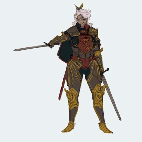
And it’s done! Hope it was helpful!
I just realized how terribly short her right arm is LOL please don’t shame me

have fun w/ this


Very happy to finally post my second tutorial ! You guys have been so kind the last time and I really hope this helps some of you in your art path 🙇♀️
Drawing Heads and Faces: Cheekbones

I’ve found that drawing the head starts to make a lot more sense once you start thinking about cheekbones and cheeks, and how the fit into the head structure.
You might be aware of the Mysterious Indent that Looks Good Next to the Outer Part of the Eye, or the Mystery Indent for short.
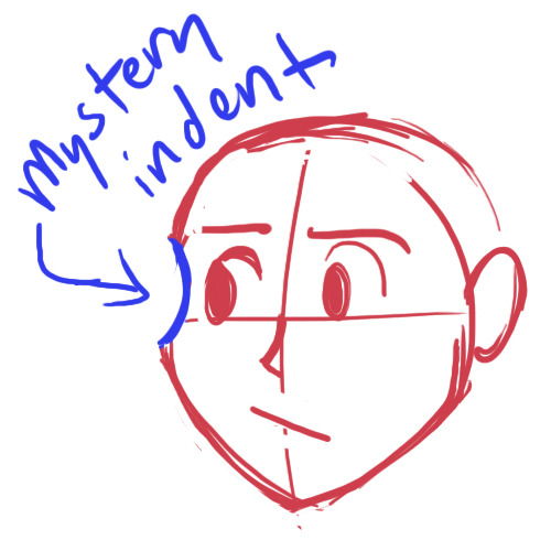
Drawing a Mystery Indent may serve you fine if you only draw the head from flat angles, but it falls apart when you get adventurous.

Why isn’t this making sense anymore?
Drawing a ‘Mystery Indent’ is an attempt to imply cheekbones without knowing how they actually incorporate into the skull, and this is why it looks so unconvincing when you use it to draw the head in anything other than ¾ view.
The cheekbones wrap around the head and eye sockets from above the bridge of the nose. The concave you draw if you draw the ‘Mystery Indent’ is a misunderstanding. There is no concave. You should instead be thinking of this as where the eye socket/brow overlaps the (convex!) cheekbone.


Compare the cheekbones on both sides for placement. They should match up and correspond with each other.
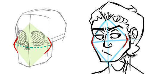
(Knowing cheekbone structure helps when drawing gaunt characters, because their cheekbones may stick out. Remember to compare the cheekbone placement on both sides!)
* This is part of a much larger tutorial I’m working on about head, face, and facial feature structure. Hopefully more to come eventually?
DeviantART – ArandaDill

Les’ get organic, cuz bones should be insects.
Also , hip dips <3
-
 the-awesomeness-of-randomness liked this · 1 month ago
 -
 gold-iridescent liked this · 2 months ago
 -
 rohanrider3 liked this · 2 months ago
 -
 ellias-elliott liked this · 4 months ago
 -
ellias-elliott reblogged this · 4 months ago
-
 artking-4 reblogged this · 4 months ago
 -
 indeneato reblogged this · 4 months ago
 -
indeneato liked this · 4 months ago
-
 casa-layout-tester reblogged this · 6 months ago
 -
 casablahca liked this · 6 months ago
 -
 cuttote reblogged this · 6 months ago
 -
cuttote reblogged this · 6 months ago
-
 nezjazz reblogged this · 7 months ago
 -
 sadlyserendipityxo liked this · 7 months ago
 -
 maybeillwritesmth reblogged this · 9 months ago
 -
maybeillwritesmth liked this · 9 months ago
-
 rryzia liked this · 9 months ago
 -
 artistafrustadomain liked this · 9 months ago
 -
 artref081 reblogged this · 9 months ago
 -
 hobnobbers liked this · 10 months ago
 -
 perkypimp liked this · 11 months ago
 -
 noctam-bulle liked this · 11 months ago
 -
 lunarqueen13 liked this · 11 months ago
 -
 reliand liked this · 11 months ago
 -
 viiistrength liked this · 11 months ago
 -
 officalrockpage reblogged this · 1 year ago
 -
 wagemage reblogged this · 1 year ago
 -
 glamurina-vibes liked this · 1 year ago
 -
 inukazoki liked this · 1 year ago
 -
 crazymanicherelmao reblogged this · 1 year ago
 -
crazymanicherelmao liked this · 1 year ago
-
 nightmarewritings liked this · 1 year ago
 -
artking-4 reblogged this · 1 year ago
-
 thesmurfchick liked this · 1 year ago
 -
 joshiemakesgifs reblogged this · 1 year ago
 -
 aderblack reblogged this · 1 year ago
 -
 paperluigirpg liked this · 1 year ago
 -
 trayd3n liked this · 1 year ago
 -
 guineveresgarden liked this · 1 year ago
 -
 gildedroses36 reblogged this · 1 year ago
 -
 bitterrsakent reblogged this · 1 year ago
 -
bitterrsakent liked this · 1 year ago
-
 crowdoesart21 reblogged this · 1 year ago
 -
 collromampifo liked this · 1 year ago
 -
 martialwriter liked this · 1 year ago
 -
izzy-7 liked this · 1 year ago
-
 orderdchaosthings2 liked this · 1 year ago