Ay Yo Binch, How You Draw Teeths So Good. They Look Great
Ay yo binch, how you draw teeths so good. They look great

Thanks! :^)
Usually I just start by filling in the mouth (all black since I mostly sketch in black and white) and then I use an eraser to make the shapes for the insides of the mouth (teeth, tongue). Since Ruby has monster-ish teeth, I draw them pretty sharp.

Draw different shapes and fill them in!
More Posts from Arttuti and Others


How to show expression with the mouth!
This was a request and at first I wasn’t sure if I had anything to provide with, but as it turn out it got a little longer than I expected because there were actually things I had to say!! Wow!!
Anyway, this is some guidelines I follow when I try to make the face expressfull, more specifically the mouth! It is often neglected, since it’s actually pretty hard, I’ll admit. But I’m here to help (hopefully…)! A mouth expression tutorial as per request. Enjoy and hopefully it will help some a little. ʕ•ᴥ•ʔ
Draw the teeth at the right angle.
This is super important. The upper jaw follows the angle of the head, and the lower jaw will depend on how open it is. Make sure you have a rough estimate of where the teeth are, and how much of them you’re going to see!
The lips will VERY roughly follow the same angle as the teeth. It really depends on the character, but it gives you a sense at least.

If you DON’T do this, you’re going to lose so much volume and the mouth is going to end up looking unrelatable. I showed this example in this tutorial:

It’s not just the lips!
The cheeks, chin, and tongue play a role too!

Try look at your own mouth or references! I have a very pliable and large mouth, so that’s one reason why my characters have it too lmao.
ASYMMETRYYYYY (ง ͠° ͟ل͜ ͡°)ง
I cannot emphasize how important asymmetry is when drawing expressions. It applies not only to the eyebrows to achieve the Dreamwork Face™, but also the mouth. Seriously if you draw a symmetric mouth I will deliver myself to your mailbox and then shout at you until you fix it.
Look at the difference between these two for example: which one has more “life”?

I think you get the idea.
Push and squish - give it flow
Here’s an old drawing I have but it illustrates how I think when I squish the mouth, and use folding and wrinkles to my advantage.

Look at your own face and see where skin bundles up, where it creases the most and when bumps appear on your chin. Subtle details makes all the difference!
One VERY effective detail is illustrated in the first sketch, where I pull upwards on one side, and downwards on the other. That’s a good detail to use when the character is making a skewed expression, or is extremely frustrated. I encourage you to play around with that concept bc it’s ~super effective~!
EXAMPLES:
Happy: Your entire mouth is pushed upwards, not just the corners of your mouth!

I tend to draw a :3 mouth bc I’ve been drawing Lance too much….. You don’t have to but it’s basically imprinted in my motor memory by now.
Pouting/frowning: corners are pushed down, middle pushed slightly up. Sometimes, there’s a slight dip in the middle too. It can give a sense that the character is biting their lips.

Showing frustration/intimidating/is intimidated: basically showing a lot of teeth. The corners are as open as possible and the middle sorta more squished. An extremely important detail here is showing some of the gums, and open space between the cheeks and teeth. That way it looks like the mouth it open to it’s full potential. Here is also where you basically MUST add folds and bumps, or else it’s not going to look relatable.

(Here I am again with the pulling upwards on one side and downwards on the other, as illustrated on the last sketch)
And then again, here’s just another doodle showing how important it is to show the gums. It’s the same face twice, but the second one looks slightly more frustrated doesn’t it?

(from my other tutorial on how to draw facial expressions)
As you can see, this last one is very versatile and I draw it a lot. Play around with the basic shape and see how much subtle details makes a lot of difference!
That’s it!
I hope that cleared some things up and was somewhat helpful! Enjoy drawing ✨


Webcomic tips
In the conclusion for now, some things I’d really recommend doing if you’re seriously considering making a webcomic (or really a comic in general). Some of these don’t really apply to strips or gag-a-day type of comics, but I’m not talking about those here.
1. Write down ideas\sketch stuff, LEGIBLY. “I’m gonna remember it later” NEVER works. And if you scribble it somewhere on a piece of paper, you’d better scan it or retype in one doc later, because tiny notes always get lost among other doodles in my skethbooks.

(i know it’s hard to keep everything clean and organized, but this mess is just not productive)
If your project is a collaboration, save your conversations. If you’re working alone, make a blog for your ramblings. You have no clue what tears of relief I cry when I open that blog and rememeber I don’t have to painstakingly look through my heaps of sketchbooks and folders for a tiny idea I’m not even sure I wrote down a few months ago.
2. Inspiration folders, or even better, inspo blog with tags also help with collecting and remembering ideas. Color schemes, landscapes, style inspirations, atmospheric stuff, maybe some photo references, all those neat things.

3. Basic tier: character design sheets. Top tier: common poses, expressions. God tier: outfits they wear throughout the comic. Holy cow tier: turnaround sheets for all those outfits.

(I’d die trying to find good pages for references without these)
4. If you haven’t finished detailing the plot, don’t even think about moving on to drawing the comic. You’re gonna regret it when you come up with a really cool plot element that can’t be incorporated anymore because you’ve already drawn all the parts you could’ve tweaked.
5. Don’t just define the plot, make a script. Writing down the lines and the brief description of the actions serves me fine:

(notice that I approximately divided the pages & the text that’d go to each panel on a page)
6. Hard mode: make thumbnails for all the pages, if possible. At least whenever a new chapter starts.
7. If your story involves some convoluted chronology shenanigans, you’d better write down the events of your timeline in the chronological order.
8. Backgrounds. You can’t avoid them, bro. Like half of the comics are backgrounds, especially if your story involves a lot of adventuring and looking around. I know it hurts, but you’ll have to become friends with them. Read some tutorials, practice on photos, go out and sketch some streets, use 3d programs (like Google Sketch) to understand the perspective, use sites like houseplans to visualize your buildings better, I don’t know. Just be prepared for their imminent evil.
9. If you’re drawing digitally, pick a brush size for the lines and stick with it. You don’t want your lines and detail levels to look all wonky and inconsistent in different panels. And I don’t mean the cool stylistic varying lines, I mean this:

Also, things on the background should have thinner and/or lighter lines to avoid distraction. Usually less details too, unless you’re making a busy background with a simple foreground to help it pop out. Or wanna draw the attention to an object on the bg.

10. Readable fonts. Even if you chose to ignore people with poor sight or dyslexia, the majority of your readers aren’t gonna be excited about struggling to decypher this:

Also, as much as I love my black speech bubbles, colorful text on black still kinda hurts the eyes. I wouldn’t recommend doing that for all the characters. Black speech bubbles are usually used for creepy, inhuman voices. And yes, having a colorful outline in this case helps.
11. Probably newsflash, but did you know that panels have their place, order and functions? They do! My favourite thing ever is how I used panels when I was like 12:

(comics ain’t rocket science, but this one is)
The composition of the panels and word balloons always serve for a better reading experience. They guide your eyes over the page, so that you never feel lost or confused. The images in the comic equal frames in a movie, so it’s pretty damn important in what order you look at things and how quickly you can understand what’s going on!

(Eric Shanower & Scottie Young’s Wizard of Oz)
12. One update a week is fine for testing waters. Don’t overestimate yourself, especially if you have a pretty busy life outside it. A stable comic that updates slowly, but regularly is better than an unpredictable erratic one. You can always pick up the pace later, if you feel confident enough.
13. Try to always have a buffer - a couple of pages in reserve. If you’re making the pages much faster than you’re updating, this shouldn’t be a problem. But if those paces are equally the same, it’s goddamn HARD. But on the other hand, if something happens and you skip an update, those come in handy.
If you’re looking at this list and thinking “wow that’s a LOT of work”, you’re totally right. And it’s okay to be intimidated at first! But that’s why it’s important to start with something small. Once you get the formula down, these things will be natural to you.

Cuddles reference sheet by *Kibbitzer
Cuddles for everybody! If you’re interested on Patreon you can find the complete series and all the normal and special reference sheets for 5$ per month! use it for your exercises if you need it XD Patrons or not, thanks for supporting me! ^A^/ <3 Facebook Deviantart
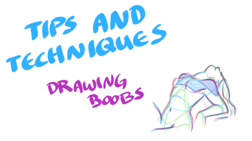
Just when you thought you knew everything about boobs… NSFW?


My darling friend Chizzi mentioned that there are a lot of booby tutorials out there are just predrawn boobs with the artist going HEY LOOK! HERE ARE SOME BOOBS! but not many that actually talk about the anatomical structure, and where to put the lines. I was like, “Hey, I can probably whip something up.“ And so I spent my thanksgiving making this.
Proportions probably aren’t exact, but I did my best. I also didn’t explore the various body types, but perhaps I could do a separate tutorial someday. I hope you find this tutorial useful :)
All photo references used in the tutorial were found on The Drawing Script. Credits to each photo belong to their respective owners.
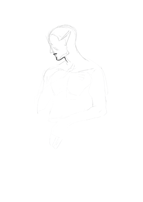
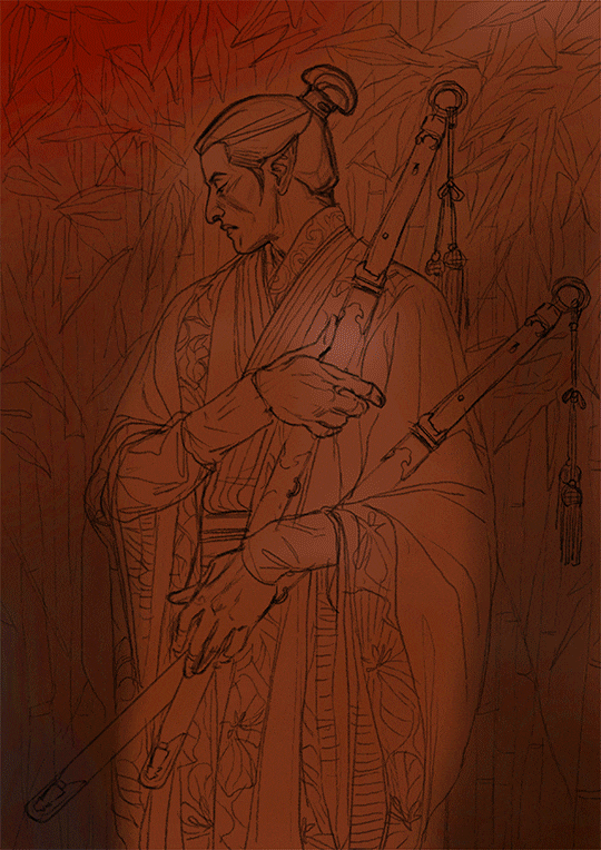
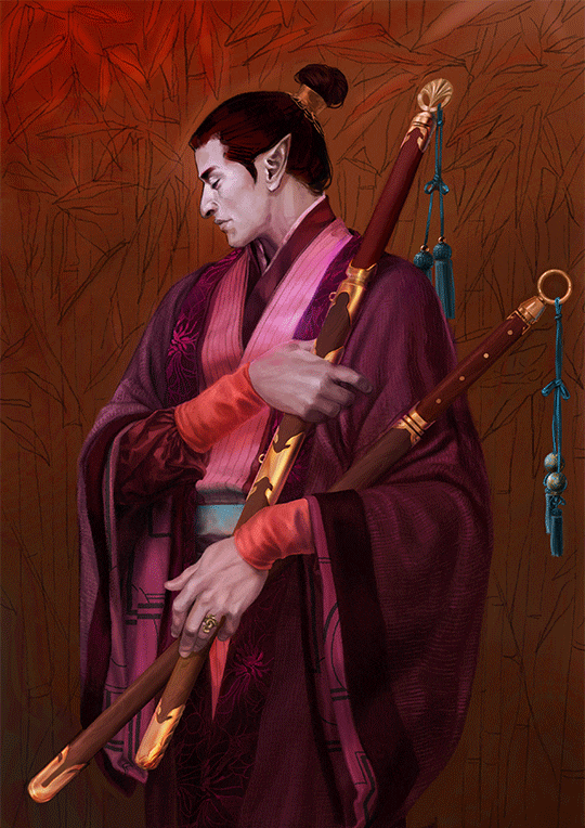
Ey yo!! Kathy, do you have tips to learn to draw faster? I know artists have a unique pace but it's pretty embarrasing that it takes me a week to draw something small n simple.. I want to be a cool artist that posts at least once every 2 or 3 days ;;
as you practice drawing more, and learn more art stuff (like anatomy, composition, gestures, coloring, shading, etc), you’ll get faster since you won’t spend as much time on every single step. eventually, you’ll figure out what works and what doesn’t, and you’ll be able to use that knowledge with future drawings. tbh i’ve always been a pretty fast sketcher, but i guess something that i always do is that i keep my sketches extremely vague and loose looking, and i finalize and draw in details along the way. my final drawings sometimes change really drastically from my initial sketches, but that’s because i’m not afraid to adjust my drawings as i line more. here’s an example of my progress to give an idea of how i draw

also goals are always something you’ve just gotta work up to! everyone has their own pace with drawing, and their own pace with learning. it’s hard not to compare yourself with everyone around you, but you just gotta do you, you feel me?


-
 diannalavigne2 liked this · 3 years ago
 -
 melticart reblogged this · 3 years ago
 -
 meltic-daze liked this · 3 years ago
 -
 keeperofbeesanddragons liked this · 4 years ago
 -
 blacklightsystem liked this · 4 years ago
 -
 smolturtleboy liked this · 4 years ago
 -
 elyurista liked this · 5 years ago
 -
 zekkevonpoof liked this · 5 years ago
 -
 spamgender liked this · 5 years ago
 -
 little-bullheaded-shit liked this · 5 years ago
 -
 asurafire03 liked this · 5 years ago
 -
asurafire03 reblogged this · 5 years ago
-
 gemagloria liked this · 5 years ago
 -
 tondurtoka liked this · 5 years ago
 -
 coffeesforcatchers reblogged this · 5 years ago
 -
 restlesschickennugget liked this · 5 years ago
 -
 lunatic---cultist liked this · 5 years ago
 -
 vanillamidnight-us liked this · 5 years ago
 -
 wolfykit liked this · 5 years ago
 -
 bossgamerbest liked this · 5 years ago
 -
 cursed-healer liked this · 5 years ago
 -
 appledoodlearts liked this · 5 years ago
 -
 robbedpanples liked this · 5 years ago
 -
 f1re5park liked this · 5 years ago
 -
anyons-refs reblogged this · 5 years ago
-
 nerdsdream liked this · 5 years ago
 -
 larrydog liked this · 5 years ago
 -
 lightly-salted-icecream reblogged this · 5 years ago
 -
lightly-salted-icecream liked this · 5 years ago
-
 magma-cjay liked this · 5 years ago
 -
 linumlena liked this · 5 years ago
 -
 sandpancakecat liked this · 5 years ago
 -
 hellosunflowerbouquet reblogged this · 5 years ago
 -
hellosunflowerbouquet liked this · 5 years ago
-
 shookehded liked this · 5 years ago
 -
 authoringtool liked this · 5 years ago
 -
 jack-jo-lantern liked this · 5 years ago
 -
 elephunke liked this · 5 years ago
 -
 waywurd liked this · 5 years ago
 -
 sp4cegizm0 liked this · 5 years ago
 -
 rockdrop liked this · 5 years ago
 -
 crunchyspositivybubble liked this · 5 years ago
 -
 kamalahkhan liked this · 5 years ago
 -
 art-writing-other reblogged this · 5 years ago
