Loki In Thor Quest Book 1 Hammers Of The Gods


Loki in Thor Quest Book 1 Hammers of the Gods
More Posts from Synth-ab and Others

I did some doodles of her. I might be a little obsessed.
Just wanted to ask, please forgive me if you've already answred this, what program do you use? Your art fucks HARD and like. I was looking at your art of the two moths over the city they die in and I was hit with the wave of "oh that looks really fucking fun actually." Like i know my art program can't do some of those effects and like, I'd love to try fucking about with them.
hi there, thank you! all my art is done in procreate and paint tool sai
because you mentioned that drawing in particular i thought it would be fun to break it down and show ppl what exactly went into each part of it so check this out

sketch & lineart - the brushes come from georgbrush.club and the urban sketcher is my most commonly used lineart brush, it has a nice irregular shape. the square brush is nice for big blocky sketches.
the cityscape was REALLY hard but basically I got a photo of the skyline of florence, traced some basic building shapes, then bullshitted the rest using the vertical symmetry/mirror tool to cut down on the amount of work (so i only had to sketch one half of the city). then for lineart I turned off vertical symmetry, turned on the two-point perspective tool, and got this:

the rose windows were made using the radial symmetry tool.
I didn't like it being so flat, so I used the liquify tool to make a kind of fish-eye effect (limited success tbh). I liked how it looked but the buildings in front needed something to cover them up to make the liquification less obvious...

first pass colours. I felt they were very washed out, aside from the sun which i loved. I use the spectra brush (default procreate) for skyscapes a lot, I love the texture. Although the clouds were filled in using the lasso selection tool, I softened the edges using the square pencil again and added texture using true grit sampler grainy brushes. The translucency effect comes from my setting the brush as an eraser. The sun rays come from the radial symmetry tool.
Blocking in the moths' colours was done with the urban sketcher again.

Something people may not have noticed is the labyrinth hidden in the sky! yeah I had a bunch of versions where it was more obvious but I found that it clashed a bit and was too busy, so I made it subtle. But yes. I searched for "royalty free labyrinth" and picked one.
The toner grit brush is one you've seen before if you've looked at any art on tumblr lately (this is such a popular brush) and it's from the true grit fast grit set. The pointillism brush is from the true grit free sampler pack, like my grain brushes.
I added shadows to the moths, increased saturation overall, and changed the clouds to a translucent blue (you can even see in the sun where I forgot to block in the sun itself because the clouds over it used to be opaque lol). Moon rays were drawn using the radial symmetry tool but this time with rotational symmetry off. I also moved the moon down closer to the moths because I felt that it was a bit far away, and this served to visually divide the drawing into three equal parts, so I chose to lean into that and divide the sky colours too, to show passing time, or an endless moment - morning, evening, night, etc.
And then the oroborous, I tried a few different effects on it because I wanted it to be very clearly separate from the main scene - I settled on a dot matrix newsprint texture, using procreate's onboard tool, and some heavy chromatic aberration. This is because the oroborous isn't real, it's purely symbolic and the moths' demise started when they became photographers so I liked the print media aspect there as well. The story itself is about grief without closure, cyclical violence, and sunk cost fallacy, while everyone explores an endless labyrinth, so an oroborous fits I think
what makes art fun to me is thinking up ways I can tell a story using just a single image. and sure a lot of it will be lost to an audience who isn't familiar with the characters or backstory but i want to leave enough in there that even complete strangers to my work will be able to construct a narrative about what's happening here, rather than it just being a cool image. that's my goal.
Finally I exported it to sai on my pc to give it a once-over. this is really important because the retina display on an ipad is oversaturated on purpose, to make everything look amazing and vibrant. but what this means is that on other screens, your work might look washed out. it's especially bad at displaying yellows! so i look at it in sai on my pc and i make minor adjustments, in this case I actually added another multiply layer on the moths and an overlay on their non-shadowed parts to increase the contrast there.
finally if you've read this far, I played a little trick with the caption of the drawing. yeah, THEY die... but only one of those moths is a theythem pronoun haver... the other has to survive. he isn't given a choice in the matter.


LINKTOBER DAY 20: ZORA WELLSPRING
Sidon plays packhorse. Link and Zelda play with electricity and water. Everybody leaves happy except for the fried aerocuda.
(Something’s in the water temple.)
This is a self indulgent totk au called Familiar Familiar where link and zelda travel through upheaval hyrule! Masterpost can be found here:
Patreon here too, if you wanna feed me a slice of bread like a duck
Soolian again !


POV girl u put in jail is ripping you apart verbally and also raving about sea sponges

I'm Crucified
Crucified, like my savior
Saint-like behavior
A lifetime I prayed
"Crucified" by Army of Lovers
I started digital art two years ago(doing art barely 3y) so a newbie, in past bc I wasn't good at art it was easier to get better, now I've been struggling for a while, i don't get better than last time(coloring and it lacks creativity). I feel stuck in a loop. so idk any tip I can get better? what artists do to get more creative?
Hey!
So I go through this a lot as well and what always helps me is to just draw something completely out of your comfort zone, something you've never drawn before. For example: You enjoy drawing people? Go fill a sketchbook page with only cars. You enjoy drawing dogs? Go fill a whole sketchbook page with toothbrushes.
Why do I do this? Because for me there's no expectations. I've never drawn this thing before so obviously it's gonna be shit in the beginning. But this way you will see your improvement so quickly. The first car you draw will look shit, but once you've filled a whole sketchbook page with just cars, the next one you draw will 100% look a lot better than the first one. While drawing them over and over again, you will subconsciously learn how a cars shape works.
And you can surprisingly improve your overall art by doing these studies of random things, because in the end all you need to know as an artist is how shapes work and interact with each other.
Just try something new, allow yourself to just learn and forgive yourself if something doesn't work out the way you want. You learn the most from mistakes after all!


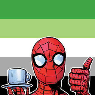

Spidey says lgbtqa+ rights
Free to use with credit! If your flag is missing, just send me an ask and I will make it :)
-
 itsdorarosier liked this · 3 weeks ago
 -
 wasianspiderman16 liked this · 4 months ago
 -
 iamapan242 liked this · 4 months ago
 -
 nev4rlnd liked this · 5 months ago
 -
 legatoe-7 liked this · 6 months ago
 -
 crimsonaction12 liked this · 6 months ago
 -
 liftbeswift liked this · 7 months ago
 -
 naruto-fan-shipper-paradise liked this · 7 months ago
 -
 wotqon liked this · 7 months ago
 -
 angelchester liked this · 7 months ago
 -
 drdrozen liked this · 7 months ago
 -
 synth-ab reblogged this · 7 months ago
 -
synth-ab liked this · 7 months ago
-
 mamapluto liked this · 7 months ago
 -
 desperatehouseflies reblogged this · 7 months ago
 -
 luigipanda12 liked this · 7 months ago
 -
 freakish-goth liked this · 7 months ago
 -
 0lento liked this · 7 months ago
 -
 giallo4ver liked this · 7 months ago
 -
 twasjane liked this · 7 months ago
 -
 tapka222 liked this · 7 months ago
 -
 meowoo00 reblogged this · 7 months ago
 -
meowoo00 liked this · 7 months ago
-
 tangyyrine reblogged this · 7 months ago
 -
tangyyrine liked this · 7 months ago
-
 greatarcadedestiny liked this · 7 months ago
 -
 valmartii01 liked this · 7 months ago
 -
 valkyrie-jane reblogged this · 7 months ago
Eternal Lurker, finally here - they/them - art only account : @synth-art - 🔵blueskye account : synthab.bsky.social
154 posts