Were They Ever Really That Different?

Were they ever really that different?
More Posts from Robinnygrenart and Others

My friend requested an Ant-Man. But I assume he meant Scott… and the MCU-version. But I felt classic Hank and his questionable stability was more in line with my stuff and my own selfish interests.

So at Comic Con Stockholm, I went to an activity where you would learn to design your own hero or villain, expecting it to be held by some kind of indie-company I never heard of to learn… It was held by a high school teacher and his top students… yay.
So, not exactly the most in-depth or professional insights, he mostly just showed pictures from “How to Draw Comics the Marvel Way” and kept on calling Stan Lee an artist instead of a writer…
But I had an hour to kill so I stayed and the assignment was to create an element-based character and I felt “wow, fire’s often compared with destruction and water’s healing” stuff like that and to turn the tables so I wanted to make a fire-hero. And I had no clue what to do. So I started with the villain instead.
So yeah, basic stuff, he was big, towering, inspired by the sharp form of the triangle. I was creative and used fur to exacerbate the shape a little. I also taught one of the students about the bts of Star Wars and talked about how Stomtroopers and Vader’s helmet are supposed to look like skulls and wanting a little bit of that to hide my character’s humanity and make him look a little bit scarier.
Never got to the colours but imagined him in cold colours, white, blue. But also a little bit of brown for a fun contrast. I did sketch a few logos but decided to go without.
They were also supposed to have some artefact so I gave him a water-gauntlet, imagining the source of his powers and since I had also bought a bag with the “Great Wave of Kanagawa” printed on it, I decided to use that as the decorating of the gauntlet.
But with a kind of basic idea of the character, I think I have ideas on how to make his hero-counterpart.

Though I based this on an episode but when I couldn’t find it, I realised the idea probably had roots in fan-fiction… It's been a while since I listened to some good fan-fiction…

Kind of feel done with couples for now and Valentine, which is natural maybe as it has passed. But before going back to whatever stuff I want to do at the moment, here’s a heart someone drew outside my apartment building. I thought it was cool with all the steps avoiding it, even animals like dogs and birds had totally just gone around it.

Spider-Man WIP
Hi!
Feels like ages since I did a superhero. I don’t really read many comics these days, not that many that managed to keep my interest. So I haven't gotten that many new ideas either. Kinda feels like I’m losing touch with a big part of my childhood, wondering a little what will take its place.
But I have started on a Spider-Man/Captain America Team-Up and felt I wanted to share my step-by-step drawing ol’ Webhead!
First of all, open up your friendly neighbourhood JustSketchMe. Really helpful when you can’t really see the full canvas when you draw. And start with lineart. Spidey’s suit is tight and thin to allow him to use his powers and to hide under his clothes. So, abs, ribcage, toes should even be slightly visible while adding wringage or stretching in groin, elbows and knees. If I make a younger Ditko-era Spidey, the mask would have more wrinkles and the ears more prominent but for an adult Spidey, the head is smoother and the neck tighter.
Spider-Man’s eyes are one-way-glass and in my render, not that flexible so I imagine them being this round shape and the mask form around that and are held by two shiny plastic frames, them being separate from the thin fabric as well.
Most times I have to adjust the ratio of red/blue in the torso to make space for the webbing but managed to pull it off this time without any major readjustments. Webs are drawn on an individual layer.


As the lineart is done, the next step is the coloring. I actually make Spidey’s eyes quite dark here as a dark base will make it easier for me to make it shine afterwards as I try to catch a glass-effect. I always make sure to keep an extra layer for each color in a hidden folder so I can mark the specific colors when needed.

Next step is my highlighter. Simply strengthen the lineart and first step to add a little depth in it. Where I chose to highlight and not has changed over the years, like the space between the head and the further arm lacks highlight as it’s further away, same with the closer arm and the torso as well as left leg/thigh. Areas where one piece of clothing goes to another gets a subtle highlight like shirt, gloves and boots.

Next step is a 3-parter where I depthen the figure more. First layer’s functions the same as the last step but in a larger area and wider brush. Second layer goes more along the edges of the line art and makes the body rounder. Last is just focusing on areas with more depth like collarbone, ribs, some wrinkles, maybe if I missed a spot on the wrist.


So now is the basic “pillar” of the character done, the steps I undergo for all my figures, so now are the personal details like eye colors or hair coloring. This is where the spare layers are mostly welcomed. I give my Spider-Man a halftone effect on the red areas, making the suit look more breathable and giving the thing a comic-effect while the blue parts get darkened. I then eliminate the already shadowed areas, kinda reversing the work so wrinkles get lighter and smoother parts get darker. Inspired by how the suit can be portrayed black with blue detailing in classic comics as well as the fabric in Tom Holland’s second homemade suit.
Speaking of films, I also brighten some spots. I add a light grey spot on the eyes and I brighten the webs, inspired by Tobey Maguire’s suit but more subtle.


Last steps are brightening the black areas like the frames and logo. A lesser layer along the edges to showcase the shape and bulge of things and a brighter one that can be splashed across, reflecting light. I add more black and white on the eyes for that glass-effect.

AND… That’s basically it! Things might change and get added when I put in a real light source but for a basic 3-Dimensional Spider-Man in a pure white world, the process is done!

I guess I think about the afterlife a lot. And it just hit me that why do we assume it’s just a skeleton in a robe? Does it have to look human just to make sure we can perceive it?


This might need explaining.
This was a school project from (year on screen) that I wanted to remake. The premise was to design a restaurant focused on bug-based meals and I had this clear image from the start how I wanted it to look. But not the skills. Now I might have better skills but also free space to just explore my bad humour.
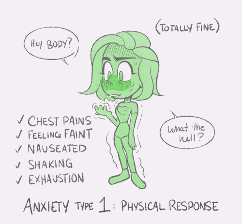
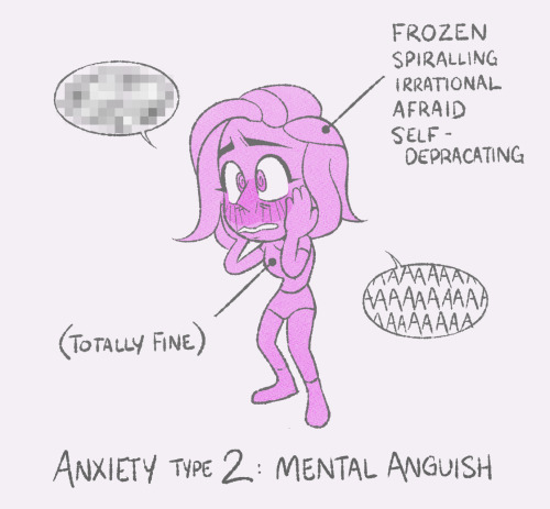
anxiety cycles🌀
EDIT// I didnt expect this so get so many notes lol. But real quick, I’d like to add some context: this post is about the way anxiety affects me! It’s not meant to be an infographic or an all encompassing list of anxiety types/ symptoms. It manifests differently for a lot of different people (like having panic attacks, which are sort of a combo of mental and physical distress, as several folks have pointed out). I think it’s cool people are discussing more about it in the notes! I just want to clarify the original post is about the way I personally experience general anxiety symptoms.
-
 axhandlehoundle reblogged this · 1 week ago
 -
 alexisescapism liked this · 1 week ago
 -
 cryometeor liked this · 1 week ago
 -
 yoselinsaa liked this · 1 week ago
 -
 excalibur0 reblogged this · 1 week ago
 -
 donkindunts liked this · 1 week ago
 -
 danigotthots reblogged this · 1 week ago
 -
 magnys-voss liked this · 1 week ago
 -
 morpheusonmars reblogged this · 1 week ago
 -
morpheusonmars liked this · 1 week ago
-
 stqrmyskies liked this · 1 week ago
 -
 kayakischaotic liked this · 2 weeks ago
 -
 silverpintalssigo reblogged this · 2 weeks ago
 -
 jinx-xoxo reblogged this · 2 weeks ago
 -
 midnight--strikes reblogged this · 2 weeks ago
 -
 fanoffandoms23 liked this · 2 weeks ago
 -
 randys-adventures liked this · 2 weeks ago
 -
 annelostshoe reblogged this · 2 weeks ago
 -
 eeve2810 reblogged this · 2 weeks ago
 -
 daijatheartist liked this · 2 weeks ago
 -
 imtiredowo liked this · 2 weeks ago
 -
 seven-san liked this · 2 weeks ago
 -
 stormflowerstudios liked this · 2 weeks ago
 -
 deboasismo liked this · 2 weeks ago
 -
 kindleofhope reblogged this · 2 weeks ago
 -
kindleofhope liked this · 2 weeks ago
-
 ghostlyprince liked this · 2 weeks ago
 -
ghostlyprince reblogged this · 2 weeks ago
-
 secondmostwantedmaninwesttn liked this · 2 weeks ago
 -
 thebluedevil24 liked this · 2 weeks ago
 -
 colpac liked this · 2 weeks ago
 -
 deepestharmonytaco liked this · 2 weeks ago
 -
 djpeachh reblogged this · 2 weeks ago
 -
djpeachh liked this · 2 weeks ago
-
 weepingcowboywolfbat liked this · 2 weeks ago
 -
 sleepylittlespacecadet reblogged this · 2 weeks ago
 -
 wrensroostart liked this · 2 weeks ago
 -
 eeveeloutionpov liked this · 2 weeks ago
 -
 jinxeds reblogged this · 2 weeks ago
 -
 pyrrhicluvr liked this · 2 weeks ago
 -
 tricksterkit liked this · 2 weeks ago
 -
 ratnomnom liked this · 2 weeks ago
 -
 skylarmooon liked this · 2 weeks ago
 -
 kurakasabe liked this · 2 weeks ago
 -
 lazy-active-me reblogged this · 2 weeks ago
 -
lazy-active-me liked this · 2 weeks ago
-
 bernieisnearanddear liked this · 2 weeks ago
 -
 moved-to-aftout liked this · 2 weeks ago
 -
 plata-siddhartha liked this · 2 weeks ago
 -
 wistericaine liked this · 2 weeks ago
