Custom Brush Tutorial Kinda??
Custom brush tutorial kinda??
Heres how you can make pixel brushes in Clip Studio Paint
first make a little pixel pattern and made sure that the background layer is transparent.

then you want to select edit -> register material -> image. this i remember from trying it before

next name it and choose a place for it to go among the others. doesnt matter where really. also check the texture box.

next to make the brush choose whatever brush that youd like to give it that has the properties you want and copy it. i just chose the standard oil brush. go to the copied brushes settings and click texture

click where it says none and find the brush that you made. after you click it change the setting to this

for me the texture works for subtract, multiply and compare. dont really know the differences between them all or form the others but for what i wanted those three seemed to work.
i did this for a bunch of different pixel patterns and brushes and got some cool effects! check it out!

i appreciate all the help and suggestions yall gave me!

maybe once i figure them out some more i could offer stylized commissions with them :V
More Posts from Nastysynth and Others


Pallete challenge but i did some crappy background lel.
Do you have any advice for maintaining a celebrity's likeness in a drawing without compromising your art style? When I try to draw real people they look completely different from how they should be and my art style ends up totally skewed as well. Thanks in advance!
This is a tough skill to develop! but with some hard work and research you’ll be able to do it!!!
My recommendation is to study professional caricature! Even if the end goal isn’t to do exaggerated crazy portraits of the the celebrity, studying the art form can help you learn to apply those concepts more subtly in your own style!
The key element of caricature is studying a persons face and looking for what makes them unique or different from the ‘standard’ anatomical face model, eg how do their proportions stray away form the ‘rules’.
once you take note of these things experiment by exaggerating them in different ways through quick thumbnail sketches

thumbnails by Court Jones for Proko.com
They might not look like the person right away but keep experimenting! trial and error is your friend!!!
(for more info on Caricature the Proko youtube channel has a whole in depth series by Court Jones the artist above! I Highly recommend checking it out and the other lecture series the channel!)
Once you have done this research you can apply it to your style and design the celebrity just like the design team on Netflix’s BoJack Horseman designed Character actress Margo Martindale! She and many other celebrity cameo’s on the show look like themselves but also like they belong in the world of the show!

The final thought I want to leave you with is: don’t worry too much about art style or let it get in the way of learning new ways to draw. There is a lot of pressure on the internet to find your own unique art style and have everything be consistent all the time but this thinking can actually get in the way of your artistic growth if you focus on it too much or to early.
I Personally dont care about consistency at all in my art, I design the style of the drawing based on the project (eg. am I going to animate this character, is it an illustration, what age group am I targeting? what Genre? if you want to see examples of this I have plenty on my instagram)
I have a lot of feelings on the topic of art styles but I dont want this post to be essay length or take me a week to write so please watch this video by Kesh on youtube about it : Stop Trying to Find Your Art Style He talks about this issue way more clearly and concisely then I ever could!
Hope this Helps!!!
-Mod Todd (ko-fi)
How do you draw noses?
I’m not sure what specific part you’re wondering about, so here’s a run-through of my process from sketching to painting!
1) The first thing I do is simplify the nose into a few basic shapes to get a prism-like block, like so:

2) I can now easily draw the prism shape in three-dimensional space depending on the angle and rotation of the head.

3) Using the guidelines/planes I can draw a proper nose in any angle! There aren’t many tricks or shortcuts for this step, unfortunately (other than practicing lots). I recommend using references, they’re always helpful :)
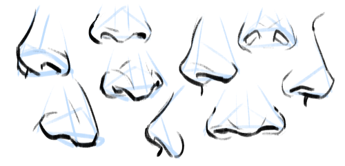
4) Really important to note: all noses vary greatly, especially from different ethnicities! A high-bridge “aristocratic” sort of nose or a ski-slope button nose might be accurate for some people, but definitely not everyone. Compare differences in size, width, a hooked or button nose tip, high or low nose bridge, and so on:

5) Then I paint! I have a skin tone tutorial here, if it helps. Take note of the lighting, skin tone, etc. Here are some things I keep in mind:
For pale skin tones, the nose sometimes has a redder colouration than the rest of the face because of increased blood flow.
The nose also usually has highlights (due to oil). These are located on the tip of the nose, the nostril groove, and where the base of the nose meets the flat area of skin around it!

Hope this helps! In the end, all stylistic choices are completely up to you. Art’s subjective, so feel free to draw any noses you want :)

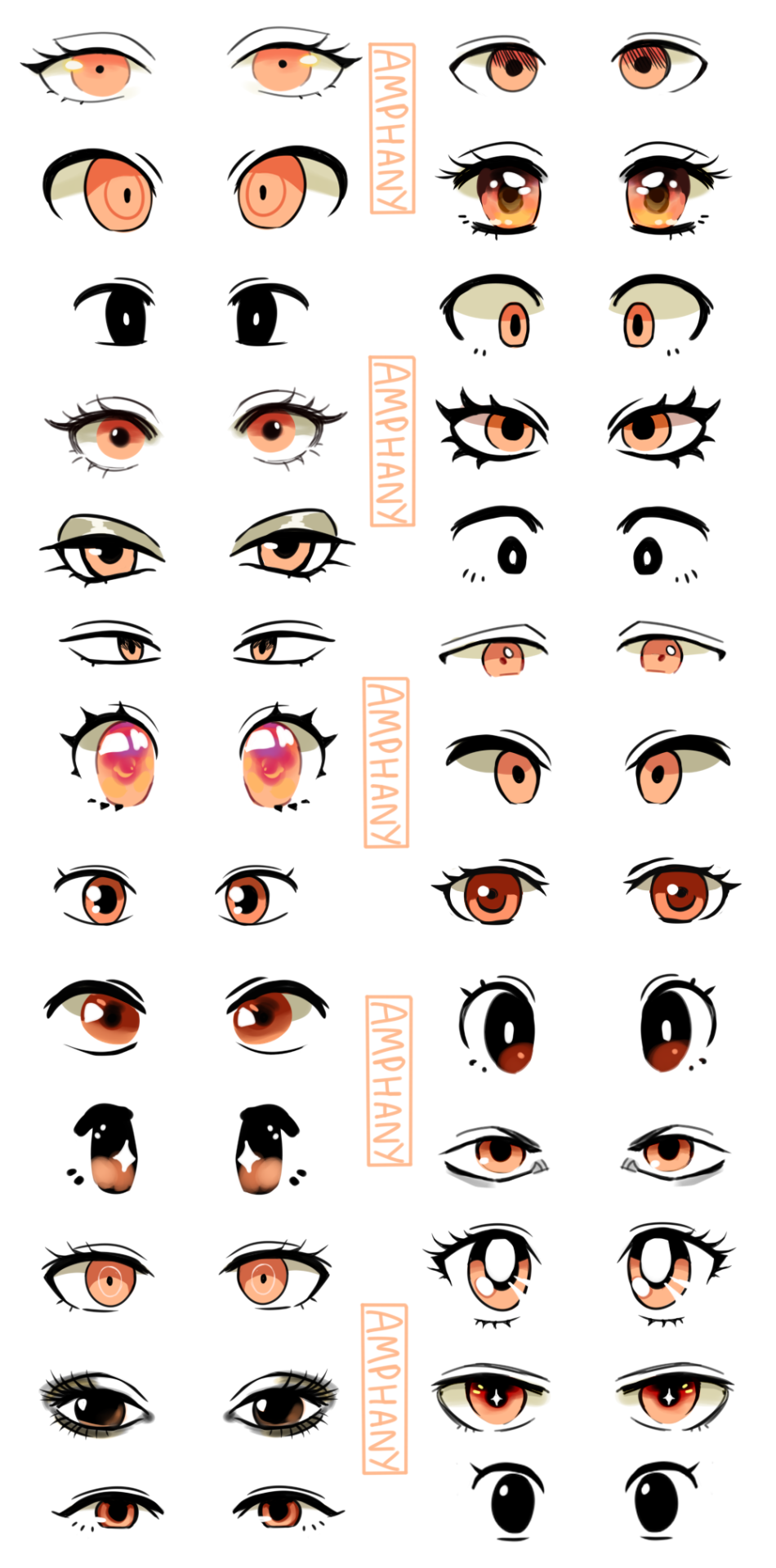
I made a tutorial! I hope it is helpful. Some of the styles of eyes are from Studio Ghibli,Sailor Moon, Pokemon, Dangan Ronpa, Fire Emblem, Ace Attorney.
Please ask me if you have any questions! <3
Custom brush tutorial kinda??
Heres how you can make pixel brushes in Clip Studio Paint
first make a little pixel pattern and made sure that the background layer is transparent.
then you want to select edit -> register material -> image. this i remember from trying it before
next name it and choose a place for it to go among the others. doesnt matter where really. also check the texture box.
next to make the brush choose whatever brush that youd like to give it that has the properties you want and copy it. i just chose the standard oil brush. go to the copied brushes settings and click texture
click where it says none and find the brush that you made. after you click it change the setting to this
for me the texture works for subtract, multiply and compare. dont really know the differences between them all or form the others but for what i wanted those three seemed to work.
i did this for a bunch of different pixel patterns and brushes and got some cool effects! check it out!
i appreciate all the help and suggestions yall gave me!
maybe once i figure them out some more i could offer stylized commissions with them :V
Symbols and Signs: Animals
Animals are among the first symbols any human race has used. From birth we know that certain animals represent traits that are human, such as courage, wisdom and strength. I would look into Viking, Egyptian, Christian, Native American Legends and Greek/Roman mythos for animal motifs.
Tigers: a symbol of strength, power, energy, passion, ferocity, sensuality, beauty, speed, and wrath.
Panthers: symbolize strength, , adventure, loyalty, triumph, and a spiritual mind or personality.
Lions: courage, power, royalty, dignity, authority, justice, wisdom, and ferocity.
Koi Fish: fortune and luck, perseverance in adversity, and strength of purpose. (Japanese)
Dolphins: gracefulness, playfulness, gentle, harmony, intelligence, friendship, community, and generosity.
Crabs: trust, emotion, protection, regeneration, and transformation.
Shark: calculation, perceptiveness, and instinct.
Dove: peace, hope, love, freedom, promise, maternity, and messenger. (Christian)
Eagle: patriotism, spiritual protection, guardianship, opportunity, freedom, skill, authority, vision, power, and leadership. (Native American)
Peacocks: Glory, royalty, power, beauty, awakening, refinement, and incorruptibility.
Hummingbirds: joy, energy, vitality, healing, peace, infinity, agility, playfulness, loyalty, and affection.
Snake: duality, the search for balance, rebirth, patience, awareness, wisdom, ambition, evil, healing, intellect, protection, royalty, and awareness. (Christian, Greek, Egyptian)
Frog: f fertility, luck, purity, rebirth, renewal, healing, metamorphosis, and opportunity.
Turtles and tortoises: steadiness, protection, patience and stability
Butterflies: beauty, metamorphosis, transformation, fragility, grace, resurrection, transition, and change.
Spiders : fate, death, rebirth, and signifying a crafty or resourceful personality.
Dragonflies: prosperity, peace, good luck, purity, and harmony.
Scorpions: death, transition, sex, control, solitary, passion, protection, and defensiveness.
Horses: power, grace, beauty, strength, freedom, and nobility.
Foxes: cunning, playful, quick thinking or strategic personality, wisdom
Ant: group mind, patience, action
Antelope: action, agility and sacrifice
Armadillo: safety, boundaries, medicine shield
Bat: rebirth, secrets, blood and initiation
Beaver: builder, protector
Boar: Fire, savageness, power, the sun
Buffalo: sacredness, life, abundance, prophecy (Native American)
Cat: Royalty, cunning, evil, independence (Egyptian)
Bear: Strength, Motherhood, power
Coyote: laughter, humor, foolishness
Crow: Death, greed, murder, wealth
Deer: gentleness, trust, innocence and purity
Dog: Loyalty, nobility, true friendship
Hawk: Speed, persistence and quick wits
Lizard: Self-reliance, longevity, age, wisdom, evil
Mouse: Timidness
Otter: Laughter, curiosity, mischievous
Owl : wisdom, deception, death (Greek/Roman)
Rabbit: Virtue, serenity, low curiosity, quiet talent, fertility, (Chinese)
Ram: self worth, stubbornness (Chinese)
Raven: Magic, the messenger, mystery, dreams, death (Norse)
Sheep: trusting and naivety
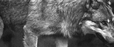
Wolf: knowledge , leadership, savagery, teamwork, fear, Motherhood (Native American, Norse, Roman)
Not the same Anon, but hyacinths please
Hi friend, thank you so much for your interest! I’m going to go over how I draw these flowers, but I realized midway that I’m actually very terrible at drawing these in particular, haha. There’s a reason I’ve lowkey avoided doing them so far, and I think it enabled me to highlight a bit more, the way I choose my arts.
It’s quite hard to teach just “how to draw a specific flower” mostly because I myself don’t know - the most important thing I can emphasize is using references!

I personally dislike drawing these flowers in my art, and I couldn’t figure out why until I started this tutorial.
One thing I tend to notice when I look at reference pictures is how flowers move as a ‘whole’ and their relative ‘flexibility’. I pay attention to that because the way I do art, I choose the flower in part based on appearance and how natural they will look in a specific composition.

I tend to like flowers that sprout outwards and have a kind of ‘loose’ appearance. The red lines here show the ‘direction’ I want the flowers to go in.

This is where these flowers pose a bit of a problem. Because arranged in clumps, they are very stiff. It’s not a bad thing if that’s what you’re looking for, but it’s not what I wanted, exactly, for this image.

They just stick straight up, because they have very stiff leaves and a tight packed pattern. (They sometimes tilt though, mine always did). At this point, I could decide the form isn’t right, and this isn’t the flower I want. But there’s also another thing I could do, which is altering it’s appearance when I draw it, slightly.

Left is a simplified version of the shape, while the middle is a more detailed image. The furthest to the right is a close-up of a single flower. Depending on what you want to portray, you can choose to alter what you want your flowers to look like.

As you can see, when drawn closer up, the flower has a lot more flexibility!

So with this, I ended up drawing the batch of flowers a lot larger than how it would be normally, while still retaining the recognizable flower and leaf shape.
So what I’m trying to convey is that sometimes you have to study references, but then know you can pick and choose what aspects to highlight in your art. That’s I think, how you can get your flowers to look extra ‘dynamic’ in your work - by accentuating their specific shapes to work to your advantage! And also playing with their colors and such! But hyacinths come in so many colors that any would work!
I hope this is helpful to you, anon!
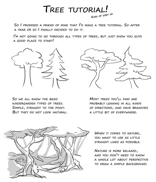
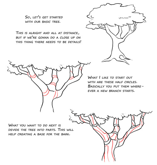

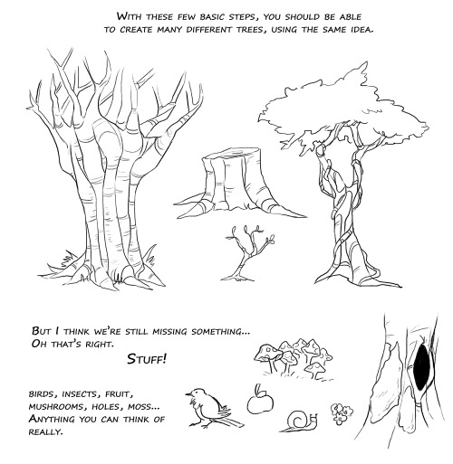

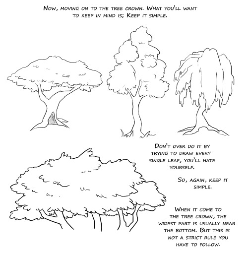

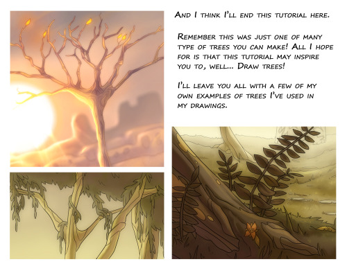

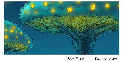
Aaahh so yeah. I’m nothing amazing at trees, but my friend Huispe has been asking for this for such a long time now, I decided to finally do it. Hopefully it can be useful for any of you out there <3 (there’s prolly plenty of typos in there too but I am just so tired right now aughhh)
Oof those action shots are 👌👌👌
Action shots like this one need a lot of planning. Let’s have a look about how I made this scene!

MAIN ACTION LINE:
The important aspect is the flow. You have to find a way to make the action easy to understand. I chose the main poses, but all of them are following a base action line. This line can have different shapes and curves, but I chose one that follows left to right , then down: occidental reading flow.
But it’s not over yet!

SECONDARY ACTION LINES:
Okay these bad boys make the « oh wow this is fluid » effect. Each characters have their own motion trail, based by the main action line. It mostly affects the elements like the capes, the hair and the particles in that case.

*GASP*
YES, I’m shook too. Battle drawings are so fun to make!
Comic where the fight scene is: Wanted part 17


-
 juicemini liked this · 1 month ago
 -
 tombstuck liked this · 3 months ago
 -
 circuzclownz liked this · 3 months ago
 -
 orcaposter liked this · 5 months ago
 -
 sky-shale liked this · 6 months ago
 -
 catch-all liked this · 7 months ago
 -
 cosmicvaca liked this · 9 months ago
 -
 milamurart liked this · 10 months ago
 -
 abandonednspace liked this · 10 months ago
 -
 mothlover25 liked this · 11 months ago
 -
 succubussally liked this · 1 year ago
 -
 sugar-baer liked this · 1 year ago
 -
 snailhinataarchives liked this · 1 year ago
 -
 randomblognumberfuck liked this · 1 year ago
 -
 condemnedtranscendant liked this · 1 year ago
 -
 wolfwhoodie liked this · 1 year ago
 -
 uniquely-waffles liked this · 1 year ago
 -
 husku-u liked this · 1 year ago
 -
 craftykit1 liked this · 1 year ago
 -
 metan01aaa reblogged this · 1 year ago
 -
metan01aaa liked this · 1 year ago
-
 cowards-way-out reblogged this · 1 year ago
 -
cowards-way-out liked this · 1 year ago
-
 voidfluid reblogged this · 1 year ago
 -
 xx-valk liked this · 1 year ago
 -
 beeenenn liked this · 1 year ago
 -
 belinda-amy liked this · 1 year ago
 -
 sporadicthunderlight liked this · 1 year ago
 -
 jibbityjabber liked this · 1 year ago
 -
 peabnut liked this · 1 year ago
 -
 blackroz112 reblogged this · 1 year ago
 -
blackroz112 liked this · 1 year ago
-
 importantword reblogged this · 1 year ago
 -
importantword liked this · 1 year ago
-
 maggotism reblogged this · 1 year ago
 -
 arumjeram liked this · 2 years ago
 -
 ilovespringrain liked this · 2 years ago
 -
 armania-mothe-pb liked this · 2 years ago
 -
 shinserknoire reblogged this · 2 years ago
 -
maggotism liked this · 2 years ago
-
 penicilliums liked this · 2 years ago
 -
 wolfieolfie liked this · 2 years ago
 -
 pietralojo liked this · 2 years ago
 -
 mkh-draws liked this · 2 years ago
 -
 marshonie liked this · 2 years ago

Sylwester | i will mostly post sketches, because i'm too lazy to end them
196 posts