SenshiStock’s Gallery Consists Of Millions Of Pictures That Are Free To Use As Reference.
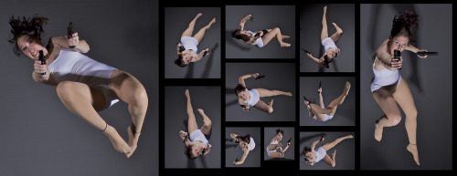
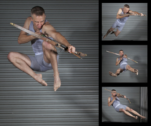
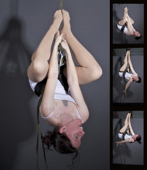
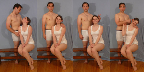
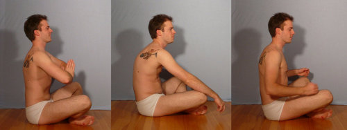
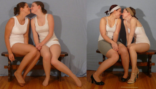
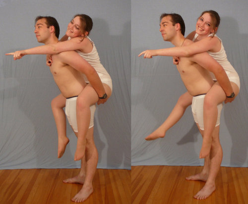
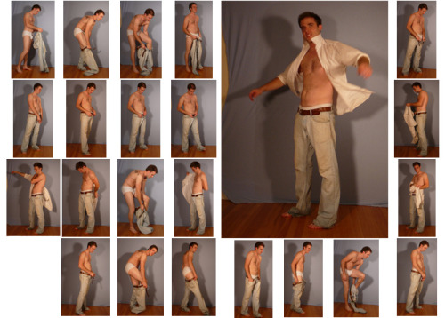
SenshiStock’s gallery consists of millions of pictures that are free to use as reference.
General Drawing Poses Sit and Kneel Dramatic and Reaching Drawing Poses Magic and Hogwarts Drawing Poses Staff Weapon Pose Reference Hammer, Axe and Bat Pose Reference Sword Weapon Drawing Reference Small Bladed Weapon Pose Reference Gun Weapon Pose Reference Bow and Arrow Archery Stock Foreshortening and Perspective Poses Dynamic Flying Falling Action Poses Deafeated or Laying Drawing Poses Magic Crystal Magical Girl Wand Weapon Transformations and Dance Cards Back Pose Reference Pin Up Inspired Poses for Drawing Performances Poses Life in General Poses Fights and Fighting Pose Reference Leaning Poses Classic Sailor Senshi Poses Wings Sailor Moon Villains Pairs Romance or Couples Pose Reference All the Male Stock Hanging Stock Drawing Reference Three or More Groups Instruments Mirrors Whip Technobabble
More Posts from Arttuti and Others
Heres a google drive folder filled with art book pdfs, if anyone has some others that you'd like me to add to it thats missing, please let me know and send me the link


Ay yo binch, how you draw teeths so good. They look great

Thanks! :^)
Usually I just start by filling in the mouth (all black since I mostly sketch in black and white) and then I use an eraser to make the shapes for the insides of the mouth (teeth, tongue). Since Ruby has monster-ish teeth, I draw them pretty sharp.

Draw different shapes and fill them in!


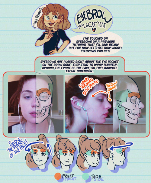

Hey friends!
Meg here for today’s TUTOR TUES-WEEK! Today we’re taking a look at eyebrows/eyebrow placement! I’ve covered more about expressions here! If you have any tutorials you’d like to see send ‘em in here or my personal! Have fun, keep practicing, and I’ll see you soon!


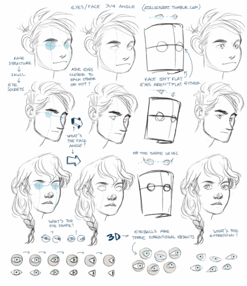
Anonymous said: I know you’ve shown how you draw faces from different angles very briefly before, but I was wondering if you’d ever go more in depth? For example, I always struggle with drawing the eyes at a ¾ angle… 😔
Ok, I get this question so many times that I decided to do something about it. I’ve already made a tutorial about drawing eyes and tbh it should help with drawing eyes from any angle, the tricky part is to understand the human face, its anatomy. If you see the face/head as a three dimentional object you’ll be able to draw it, I can’t say it enough, 3D thinking is important. Also, references are important, drawing from life is important because then you have a 3D model of the head right in a front of you. All you need to do is observe and understand.
hey i was wondering how you draw female faces? drawing guys im like hell yeah, but ladies im like hell neh. would you be able to give an example with rey?
Ahhh I’m not the best person to ask for drawing females but um I think generally you just have to be a little more careful with your marks. Everything should be a little softer, more curves, etc. Rey’s a little difficult bc she has a pretty boxy/angular face but her facial features are more delicate.

Of course these are just suggestions and stuff I noticed and not set rules ;;;; but I hope it helps a bit!!

THE LAYERS CHEAT SHEET PART TWO (PART ONE HERE) Once again, I’m no expert- there are things about these layers I probably haven’t covered, so please try them out for yourself! Layers 1-7 help your contrast. They are usually a pair of the former two groups I went over in my last post. 1. OVERLAY: Helps your contrast by boosting your lights and darks, while the more mid tone pixels aren’t affected as much. It does this based on the layers beneath it. “Screens” the lights, “multiplies” the darks. 2. SOFT LIGHT: Similar to overlay, but a “softer” effect. You can think of soft light as more transparent. 3. HARD LIGHT: You can look at hard light as an intense version of overlay, with much brighter colors and a much less transparent look. 4. VIVID LIGHT: This is the heavy metal version of overlay- think of it similar to color dodge and color burn. Very intense colors, good for finding interesting lighting and color combos. 5. LINEAR LIGHT: Crazy amounts of contrast and color is added here, even more than vivid light. so heavy metal 6. PIN LIGHT: This one is interesting because besides it also being an intense contrast layer, it can add random noise to the active layer. Apparently this is a combo of the lighten blend mode on the light pixels and darken on the dark pixels, but the noise effect is what makes it really interesting imo. 7. HARD MIX: You will turn this mode on and be like “no” but it is actually adjusting its fill will reveal another overlay-ish type layer. It throws the colors on the active layer towards a more primary color such as blue, or magenta. _____ 8. DIFFERENCE: This will invert your colors, taking into account the layers below. If colors are very close, they will be black. 9. EXCLUSION: This also inverts your colors, taking into account the layers below. If colors are very close, they are grey. Exclusion and difference are layers that would be good for graphic pieces, I haven’t really gotten used to incorporating them in my painting workflow. 10. SUBTRACT: Similar to the above layers, but more intense. You will notice that the darker you make your active layer with Difference, exclusion, and subtract, the lighter and more transparent looking the result will be. 11. DIVIDE: Divide, however, usually results in crazy highlights that are pretty opaque unless the layer is fairly light, and then it will begin to go transparent. ___ 12. HUE: Makes the lower layer take on the hue of the active layer. 13. SATURATION: The lower layers take on the saturation of the active layer. 14. COLOR: The lower layers take on the color of the active layer. 15. LUMINOSITY: The lower layers take on the luminosity, or brightness, of the active layer. Once again, I’m no expert, but I hope this helps. Thanks guys! http://drawmaevedraw.tumblr.com/
-
 sketch-shepherd liked this · 2 weeks ago
 -
 xx-leech liked this · 3 weeks ago
 -
 moshy333 liked this · 3 weeks ago
 -
 empireofcyr liked this · 3 weeks ago
 -
 rustediris liked this · 3 weeks ago
 -
 p4r4no1d liked this · 3 weeks ago
 -
 romancebyliv liked this · 1 month ago
 -
 tomassci reblogged this · 1 month ago
 -
 jdoodles1824 liked this · 1 month ago
 -
 twilektrekkie reblogged this · 1 month ago
 -
twilektrekkie liked this · 1 month ago
-
 apathyislikeawoundedsoul reblogged this · 1 month ago
 -
 elegantlyenchantedstubbornfool reblogged this · 1 month ago
 -
 sleepaspirant liked this · 1 month ago
 -
 pedestrian-pop liked this · 1 month ago
 -
 ilovecatsveryalot liked this · 1 month ago
 -
 midnight-aura-star reblogged this · 1 month ago
 -
 zezozproductions liked this · 1 month ago
 -
 huiup liked this · 1 month ago
 -
 destroya1441 liked this · 1 month ago
 -
 doutrireblogs reblogged this · 1 month ago
 -
 llixulia liked this · 1 month ago
 -
 wingedfable liked this · 1 month ago
 -
 sullencrab liked this · 1 month ago
 -
 antagonisttendencies reblogged this · 1 month ago
 -
 ajolote-mexicano liked this · 2 months ago
 -
 artking-4 reblogged this · 2 months ago
 -
 newdawnhorizon liked this · 2 months ago
 -
 jam-n-jay liked this · 2 months ago
 -
 starlingmation liked this · 2 months ago
 -
 glitter3fiction liked this · 2 months ago
 -
 callme-mys-tical liked this · 2 months ago
 -
 squidzgirl liked this · 2 months ago
 -
 beesofink reblogged this · 2 months ago
 -
beesofink liked this · 2 months ago
-
 curi0uscreature reblogged this · 2 months ago
 -
mrbrinedfish liked this · 2 months ago
-
 mysticmiracles liked this · 2 months ago
 -
 scribbleycactus reblogged this · 2 months ago
 -
 v1xv4p0rub reblogged this · 2 months ago
 -
 daengeli liked this · 2 months ago
 -
 xxcringecake69xx liked this · 2 months ago
 -
 bulletedandunderlined liked this · 2 months ago
 -
 jikapu-2-0 liked this · 2 months ago
 -
 illustration-inspo reblogged this · 2 months ago
 -
 tobysbadhorns liked this · 2 months ago
