People From Classic Paintings Inserted Into Modern City Life
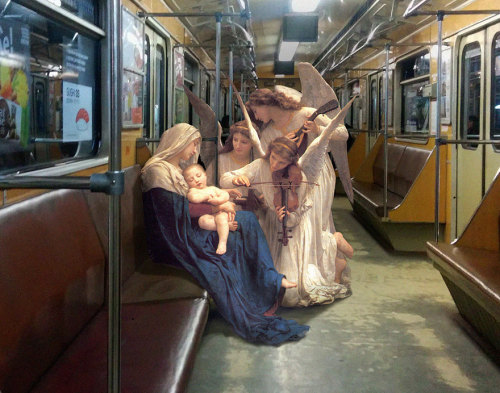

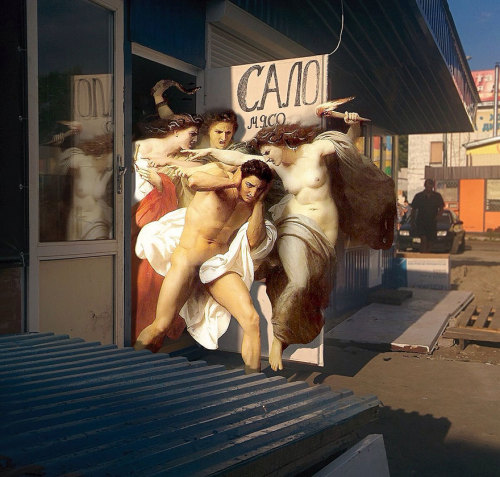

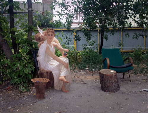
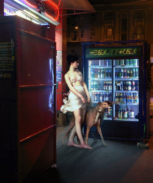
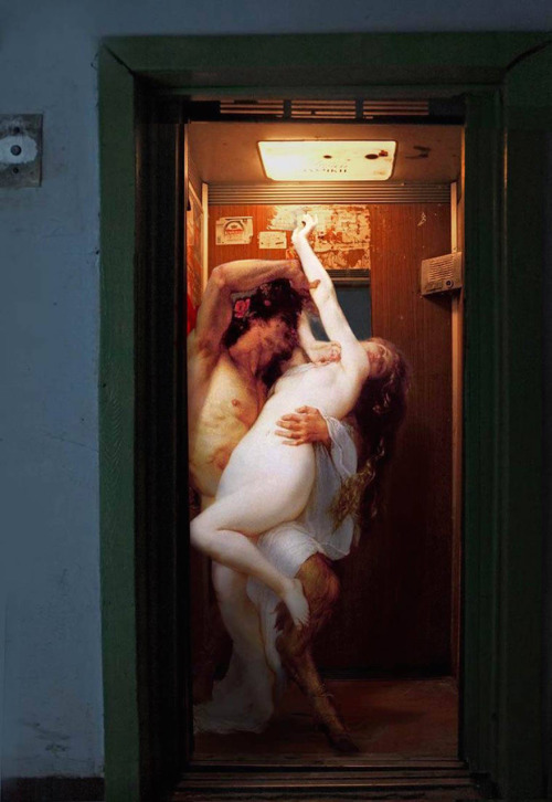


People From Classic Paintings Inserted Into Modern City Life
More Posts from Zelo-ref and Others

Close up of new capelet in ivory :) For all about my designs, see: www.somniaromantica.com ^^
How To Shade
a quick tutorial on shading (with graphite) by yours truly. this is the process I use for shading, and there are tons more out there if this one doesn’t work for you.
MATERIALS USED

1 HB graphite pencil
1 2B graphite pencil
1 4B graphite pencil
1 blending stub (the bigger the better)
1 plastic eraser (white)
1 kneaded eraser (grey)
now why do I use two erasers? well, they’re very different from one another, and each serves their own purpose.
the plastic eraser is harder, and when it erases, it erases everything. the kneaded eraser is soft, and it doesn’t completely erase everything all at once. you can use it to pick up some of the graphite and leave some behind, lightening (but not totally erasing) your shading. plus, the kneaded eraser is so soft you can mold it, and it doesn’t leave pencil shavings. if one end gets too used, you can just stretch it out, and it’s as good as new.
REFERENCE USED

now lets get this started, shall we?
STEP ONE
scribble lightly over your drawing with either an HB (aka a regular #2 pencil) or 2B pencil. you don’t have to be extremely neat, but do it light and nice enough so it can still be erased/you can still see the original lines underneath.

STEP TWO
take your blending stub (the wider the better, and if you don’t have one, use a tissue) and rub in the opposite direction of the scribbling. don’t press too hard, because it might streak/not work if you do.


STEP THREE
erase the extra shading around the edges (using the plastic eraser.).

STEP FOUR
roughly add your darks

STEP FIVE
roughly add your lights by erasing with the kneaded eraser

STEP SIX
add your finishing touches (secondary shadows, background, etc)

(I reshaped the sides, added more lights, and added the background shadow)
and voila! you just did some shading!


Vilnius University Library


It seems like all of the resources I can easily find online for identifying wolves vs dogs are either massive and difficult to understand without prior knowledge of the subject, or extremely bare-bones and miss a lot of key information. I tried to hit a comfortable middle-ground. (sorry if it’s a little wordy) This tutorial is made as a reference for drawing, so everything but purely visual differences between dogs and wolves have been left out. I’ve been wanting to make this for a while now, so I’m glad I finally sat down and did it! **EDIT** When it comes to the section on wolfdogs, please take it with a grain of salt. With something as complicated as genetics, they are of course, not going to be as simple as I make it seem. What features different levels of content can display, and even which percentages designate which levels of content are often hotly debated within the wolfdog community. At this point I’ve elected not to change the image set itself because: a. it’s a huge pain in the ass b. this is a tutorial for beginning artists. It’s meant to be a hugely simplified version of the topic, and I’ve stated clearly that it is NOT to be used in real-world identification. ((Huge thanks to yourdogisnotawolf. who’s blog inspired me to make this and for digging up that amazing picture of the wolf/lab mix))

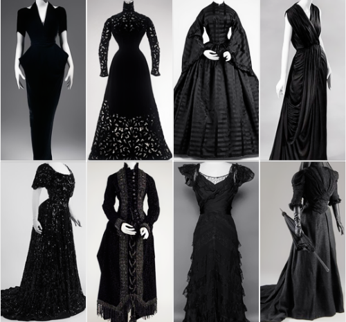


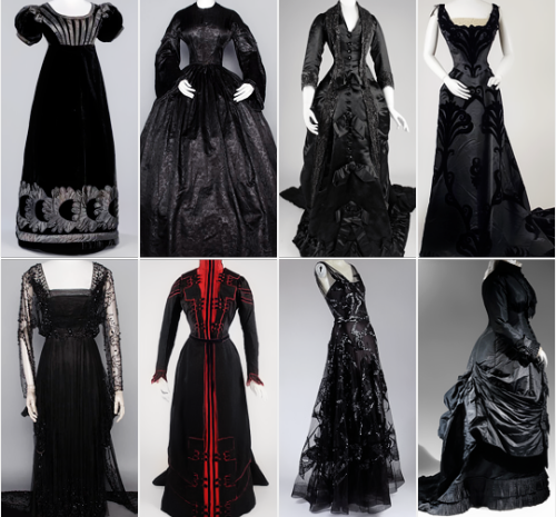
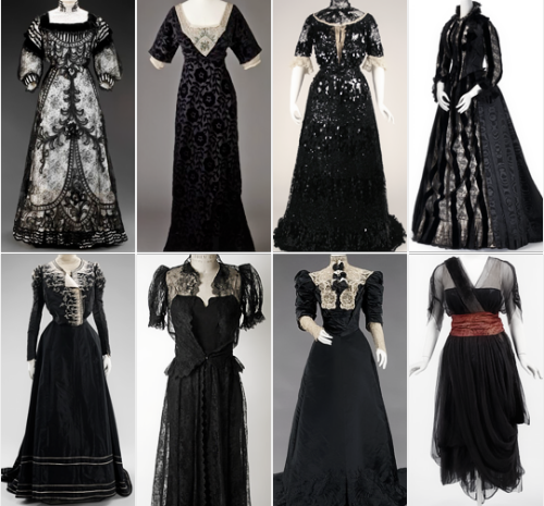


some of my favorite vintage dresses ↳ black


Bummed that I didn’t manage to photograph (so sorry for the bad quality) this bugger of a blade properly but kind of happy (always hard to part from such time consuming projects) that got it sold so fast at Turku Medieval fair. Have to start crafting more blades as soon as possible.

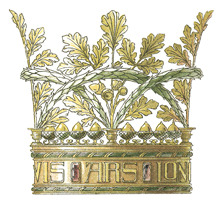

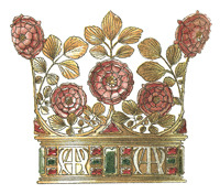
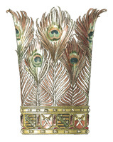


art nouveau crown illustrations

-
 itsvvvme reblogged this · 3 weeks ago
 -
 itmademestrong liked this · 3 weeks ago
 -
 wonderfucktastic reblogged this · 3 weeks ago
 -
 mountain-magician reblogged this · 4 weeks ago
 -
 pripyatprincess liked this · 4 weeks ago
 -
 applecherryandpears liked this · 1 month ago
 -
 sswwaiteq liked this · 1 month ago
 -
 purplesora5678 reblogged this · 1 month ago
 -
purplesora5678 liked this · 1 month ago
-
 wiltdflowrs reblogged this · 1 month ago
 -
 pacifismohc reblogged this · 1 month ago
 -
 kiubai liked this · 1 month ago
 -
 seemythirdeye liked this · 1 month ago
 -
 vairden liked this · 1 month ago
 -
 rodney469 liked this · 1 month ago
 -
 feer-black liked this · 1 month ago
 -
 ronnie92 reblogged this · 1 month ago
 -
 rkive-moon reblogged this · 1 month ago
 -
 lazypeacereview reblogged this · 2 months ago
 -
lazypeacereview liked this · 2 months ago
-
 mathiswops liked this · 2 months ago
 -
mathiswops reblogged this · 2 months ago
-
 randomthoughtsinyourhead liked this · 2 months ago
 -
 0verdoserose reblogged this · 2 months ago
 -
 pinche-vago reblogged this · 2 months ago
 -
 chaotiqueoccurrence liked this · 2 months ago
 -
 lavend-err reblogged this · 2 months ago
 -
 linhasespectrais liked this · 3 months ago
 -
 m4rris liked this · 3 months ago
 -
 th3-gentl3man liked this · 3 months ago
 -
 cunhampaye reblogged this · 3 months ago
 -
cunhampaye liked this · 3 months ago
-
 salgadapedra reblogged this · 3 months ago
 -
salgadapedra liked this · 3 months ago
-
 ratgarcon liked this · 3 months ago
 -
 remy-labelle-purple reblogged this · 3 months ago
 -
 sisenox liked this · 3 months ago
 -
 majorrarcana liked this · 3 months ago
 -
 westcoastpuppet reblogged this · 3 months ago
 -
 lady-lich liked this · 3 months ago
 -
 itssublimetimemachine liked this · 3 months ago
 -
 i-am-venomancer reblogged this · 3 months ago
 -
 zzzzsman liked this · 3 months ago
 -
 blkkiwi liked this · 3 months ago
 -
 something-about-sunflowers reblogged this · 3 months ago