I Hate To Break It To Ya, Guys, But
I hate to break it to ya, guys, but
You’re all so creative and everything you wrote, drew and created made the world a tad bit more beautiful
Don’t ever stop, you little chunks of mess and fabulousness, because in this world today, we need every single drop of beauty we can get
More Posts from Yourwriters and Others
how to make a story file
As I am preparing for Camp NaNo*, I have been working on my story file. It occurred to me this might not be common or popular practice. “Story File” is a name I gave it and maybe some of y’all have a different name with the same contents.
*There’s still time to apply to join my Camp NaNo cabin!
My Story File contains everything about my story that doesn’t go in the outline.
It’s broken up into major categories and specific templates. So without further ado, here is how I structure my Story File.
Intro
Title
Logline
Synopsis
Genre
Estimated Total Length (word count)
Draft Length Goal (word count)
Character Bank
Main characters and brief, one-sentence descriptions with ages
Themes and Character Development
Central Question
The Yes/No question that is being asked through the whole story
Should have objective qualities, rather than subjective
i.e. “Will they fall in love?” (subjective) vs. “Will they leave their partners and become a couple?” (objective)
Thematic Questions
These are the internal conflict questions that reside in your character(s) and your story
ex. “Can there really be a successful government?”
ex. “Does grief excuse bad actions?”
Themes at a Glance
Words or phrases that relate to the themes of the story
ex. person vs. nature
ex. isolation
ex. grief
ex. first love
Motivation / Stasis State / Final State
for each main character, you should write a sentence or two pertaining to these three things
Motivation: What is the drive behind this character and their past, present, and future actions? What part of their background makes them the way that they are? What are they looking for? What do they want out of this/a situation?
Stasis State: What are they like before the inciting incident? What problems and questions do they have?
Final State: What has changed about them and their outlook? What questions have they resolved? What has happened to their internal conflict?
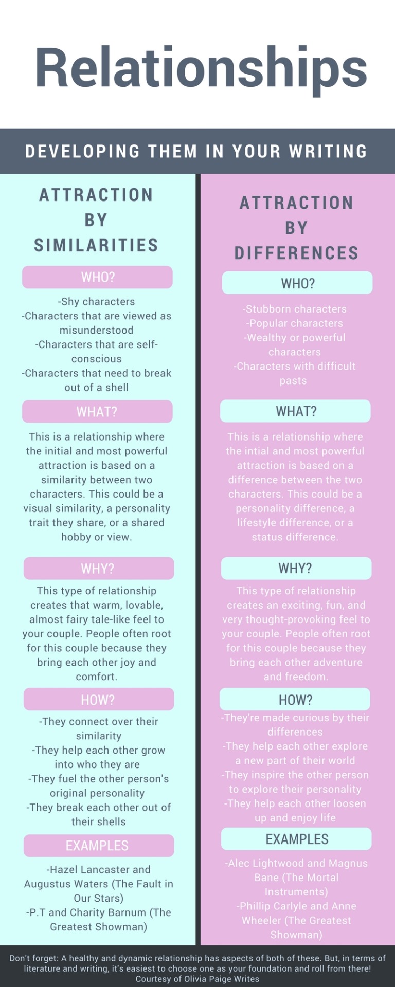
Relationships
I usually make a little web of the MCs and their relationship to one another. One for the stasis and one for final.
Stasis: How do these characters see each other? How do they act toward the other? (All before the inciting incident)
Final: How do these characters see each other now? How has their idea of one another shifted?
Even if a character dies before the end, include the most recent relationship status in the Final web.
ex. this is how I organize it, using the Draw feature of Google Docs

Character Bank
This is just a very preliminary character bank. If you prefer a more in-depth one, check out my 6 Box Method.
Per (relevant/important) character:
Name
Nickname/preferred name
Age
Field/Occupation
Personality
Personal History
Education/Occupation History
Extra Notes:
Worldbuilding Bank
(Check out my worldbuilding posts on Categories Pt. 1 and 2 for better context)
Seasons and Climate
Languages
Other Cultural Pockets
Folklore and Legends
Fine Arts
Dress and Modesty
Classes
Jobs
Currency and Economics
Shopping
Agriculture and Livestock
Imports and Exports
Literature, Pop Culture, and Entertainment
Food and Water
Holidays and Festivals
Family and Parenting
Relationships
Housing
Religion and Beliefs
Government
Health and Medicine
Technology and Communication
Death
Transportation
Plants, Animals, and Human-environment Interaction
Education
Beauty Standards
Gender and Sexuality
—————————
I hope this helps y’all and supplements what you’re probably already doing. I know it’s helped me tons to have everything in a central place.
Best of luck!
Hey, a chart! This is inspired by an ask I got (I’m gonna be honest, I promised the person I’d tag them, but then sent the reply before I wrote down the URL. So, if I told you I was gonna tag you in this, tag yourself!!)
Hey! Do you have any tips for people who've reached a block in their writing? I've been trying to plan out a plot for my book, but I've reached a point where I can't think of anything else
What to Do If You Get Stuck While Outlining Your Plot
Hi! Thanks for writing. Getting blocked can happen at all stages: Before writing, during writing, during outlining, in the idea stage, etc. But since you specifically said you’re reaching a block in your plot planning, I’ll address that :)
#1 Make sure your character’s motivation & conflict are “big” enough
If your character doesn’t have a book-length problem, you can get stuck trying to fill in empty space in the plot. In order to find more events to flesh out your story, you may need to make adjustments. Is their desire strong enough to fuel a book? Is the conflict big enough? Is their problem difficult to solve? If not, how can you make their problem harder? Or take longer to resolve?
You might need a combination of a fiercer desire, a bigger problem, more problems, more obstacles, and/ or a more stubborn antagonist to reveal potential scenes and events. For help with your character’s motivation and conflict, check out the PDF “Creating Character Arcs” in my Free Resource Library.
#2 Plot your story backwards
This can help you make sure you have a strong enough ending and open up new possibilities you might not have noticed while plotting forward. I have a post about it here.
#3 Use the but/therefore method
The but/therefore method is a great way to fill holes. It tests the cause-effect connections between your plot and character and almost always reveals gaps that need to be addressed with new or stronger scenes. Use this template for each scene or chapter:
Main character wants ______, but _______, therefore ______.
What comes after “wants” is the motivation for that chapter or scene. After “but” goes the conflict or obstacle. After “therefore” is the result or action the character takes, which leads into the next goal, and so on, and so on.
Chapter-by-chapter it might look something like this:
Chapter 1: Julian wants to ask Matt to the dance, but he’s scared of being rejected, therefore he slips a cryptic note into Matt’s locker.
Chapter 2: Matt doesn’t see the note. Now Julian wants to get into his locker and retrieve it, but the principal sees him trying to jimmy open the lock, therefore Julian is given detention for a week.
You can also do this scene-by-scene. My suggestion would be to start with the chapter outline, see what it reveals, then move into the scenes if you still feel stuck.
#4 Ask questions
Classic un-sticking questions start with “what if” or “why”? Asking questions can unlock new story directions you might not have noticed were there before.
What if the main character’s ex-boyfriend came back to town? What if they didn’t achieve that small goal back in chapter 4? What if they were hiding something? etc.
Why are they avoiding their sister? Why is it so difficult for them to apologize? Why haven’t they quit their job if they hate it so much? etc.
#5 Consider creating a subplot (or two or three)
A book-length story usually needs a few side stories to flesh out the main one. Look for areas of your story that could be expanded, characters that might take the story down a related tangent, and conflicts that seem small but could be bigger with some digging.
#6 Take a break
Sometimes, you just need to give it a rest. Walk away from your outline for at least a week. When you come back, you may see things you didn’t see before and be able to breathe new life into it. In the meantime, let your mind wander. It’s amazing what creative solutions writers can come up with when they aren’t “trying.”
//////////////
The Literary Architect is a writing advice blog run by me, Bucket Siler. For more writing help, check out my Free Resource Library, peruse my post guide, or hire me to edit your novel or short story. xoxo
Tips on Writing a Great Short Story

Weeks ago I was asked to do an article on short stories, specifically. What makes a short story great? And how is it different from writing a novel?
To be honest, writing a novel and writing a short story are very similar in many ways, and most of the techniques I’ve written about on my blog apply: creating complex characters, writing great dialogue, utilizing subtext, including hooks . . .
Sure, there are some exceptions, as always. You can find famous short stories that don’t really have complex characters, for example, but often such stories are really short stories–maybe by today’s standard, considered flash fiction. Here is a famous flash fiction story:
For sale: baby shoes, never worn
Does that really tell us much about the complexity of the characters? Not really. But it does still have great subtext.
So keep in mind that there are always exceptions when it comes to writing, but they are just that, exceptions.
So let’s got started.
Focus

One of the most important things about writing a short story is to keep it focused. Technically, novels should be focused too, but their focus has a broader range whereas short stories need to be narrower, like a flashlight beam compared to a laser beam. A common problem I’ve seen with newer writers is that they try to fit a novel-length concept into 50 pages. Problematic. Here are some ways to avoid that.
Limit Plotlines–In a novel, you will need a lot of plotlines to carry the story; if you don’t have that, a novel will start to feel repetitious since it lacks variety for so many pages. But in a short story, you need to limit your plotlines. Many short stories really have one plotline, with two components working closely together: the outer journey and the inner journey. Think about the premise or main concept of your short story, and keep a laser-beam focus on that. Aim to go deep into the concept, not broad on the topic.
Limit Your Characters–In a short story, you’ll usually focus largely on one main character and that character’s arc. The more focal characters you include, the more length you typically add. Sure, you can write a story with more than one focal character–you might be able to get away with maybe two. If you have more than that though, usually the focal characters–while individuals–have the same goals and function as a unit. As opposed to most novels, where each focal (or viewpoint) character may have somewhat different goals and more of their own, individualized journeys. (Again, keep in mind that everything in this post is generally speaking).
A good word of advice that gets pushed around in the industry, related to character and plot, is that in a short story, you should specifically write about the most important event that happened in that character’s life. I don’t know that I agree with this 100%, but it’s a good thing to keep in mind when evaluating plot and character. Capture the most important event, which naturally means that it will be an event that changed the character.
Laser-Beam the Theme–Unfortunately, people still talk and treat theme like it’s this elusive animal–something wild and beautiful, but dangerous if caged. In reality, the more you understand about theme, the more intentional you can be about it. It’s only dangerous when you try to tame it improperly, because you don’t understand it. For a recap on how theme actually works, check out this post, “How to Write Your Story’s Theme”
Themes are fantastic for focusing stories (and especially in short stories that may seem to lack a feeling of … cohesion). And because a lot of people don’t understand how to do them, you can really stand out if you master the theme in your story. Theme is what makes a story feel timeless. It sticks with us after we are done, so we aren’t left closing the book and thinking, Well that was entertaining, time to get back to normal life! If you read five excellent stories, but only one of them has a powerful theme that changed you, guess which one you will think about long, long after you’ve finished it?
In a novel, you have room to explore a theme topic rather broadly. Consider all the ways the theme topics of mercy and justice are illustrated and explored in Les Mis. In a novel, you can also explore how the theme topic interacts with other theme topics, societies, and ideologies. In a short story, you are going to be more laser-focused. Take the classic fable of The Tortoise and The Hare–it stays laser-focused on really one illustration of the theme. It doesn’t go into, say how in some situations in the real world, getting a head start can have benefits. So focus in on a particular rendition or two (but probably no more than three) of your thematic statement.
Often the most famous and powerful short stories are so great because they say something profound in a small amount of space. In a way, it’s similar to poetry. Professional poetry isn’t actually about using beautiful words (which is what a lot of people who have never legit studied it seem to think)–it’s about capturing specific, significant ideas, concepts, and images, in a brief space, for maximum impact. Great short stories function in similar ways, except you have more room to develop a powerful thematic thread. It can be hard to impact a reader in such a short space with the characters and plot, but you can really hit them in the feels with the theme.
Keep reading
a writeblr introduction
hello writeblr! i’m zie, a long-time writer and perhaps poet but that’s sort of stretch who just decided to publish my stories and other collection of words here. i had a tumblr account way back in 2013 but i wanted to start anew, so here i am.
about me:
she/her, aro-ace, infj(p), type 4, libra but pisces at heart, ravenclaw
overly enthusiastic for art, literature, books, music that punctures your inner psyche, psychology, philosophy, and you guessed it, theatre!
the superior time are afternoons and midnights, it’s when my imagination goes crazy and my aesthetics shift and morph
guilty pleasure is watching barbie movies and writing long-ass essays that i’m sure my professors are tired of reading, but oh well
i don’t know how to make cool edits like all the other splendid authors here on tumblr so heavens PLEASE, i hope my words will suffice
about my writing:
i love writing themes about mental health, fantasy, magical beings, and anything that borders on idealism, much like one of my favorite authors
pantsing or outlining a storyline really just depends on my mood. characters always go first before the plot, because i usually deem them as real people and the book revolves around them. they deserve just as much.
i am a sucker for symbolisms, metaphors, and paradoxes, it’s not that i overuse them, it just gives you a feel of what my oc’s are feeling.
i love creating dialogues, you’ll see a lot of ‘em. don’t get sick of ‘em, i beg of you.
current wips (all of which are subject to change):
sleeping at last is a mental-health centralized and mystery fiction set in the modern times of a fictional country/city. it explores the death of a recurring female character and how her friends try to search for the events leading up to it, making themselves subjects to ill-starred events all the while being under the same roof of adwell house, a mental wellness sanatorium for orphans such as them.
of curse and glory is a fantasy and dark academia story set in an alternate universe unbeknownst to humankind. it narrates the story of four kingdoms which do not know their history. but when the heirs of each kingdom receive an ancient message from those who claim are the oldens, they begin to uniyeld truth from a provocation—saving everyone else’s lives in the process.
in our orbit is a fictional romance story set in new york city, manhattan where two men meet each other in chaotic circumstances inside an art museum. when push comes to shove, they must decide whether or not love is worth keeping in the sacrifice of their dreams.
poems and essays is pretty much self-explanatory. this will be a series of thoughts constellated into words that i’ll share with the world. from my heart to yours.
please reblog if you’re also a writeblr because i would love to interact, be mutuals, and follow all of you! writeblrs supporting writeblrs, everyone!
contents coming very very soon in a poeticparchment near you!
Something that’s helped me a lot when writing/designing characters is to make associations with them. Usually I pick an animal, a season, or an abstract concept to define them, and I keep metaphors and similes relating to that character within those categories. It adds a nice bit of symbolism, plus it gives the story more of a mythical feeling. It also lends more weight to interactions. If character x is the moon, and character y is the sun, then their interactions are suddenly more meaningful, especially if they have a relationship that is like that of the sun and moon in mythology or astronomy.
writeblr introduction!
about me
li/lou whatever nickname is fine
i’m also @studylikeathena (i follow from there)
about my writing
i’ve previously written a novel. i will not be posting about it here
what i will be posting is my current wip novel, wintersong
i like first person and unreliable narrators and summer nostalgia
i used to write it’s always sunny in philadelphia fanfiction and if you’ve read it i’m sorry
what i’ll post
excerpts from wintersong
inspiration pictures/text for the novel
please rb if you’re a writeblr! i really want to get involved in the community :)
“Show Don’t Tell”? Not Always. Here’s When to Use Summary.
I was inspired to write this post after getting a great anonymous question in my Ask: “What’s your opinion on the whole ‘show don’t tell’ advice? Do you have any tips for when to show and when to tell?”
Here’s my response:
I honestly think that “show don’t tell” is one of the most over-quoted and least-understood pieces of writing advice out there.
For those of you who aren’t familiar, “show don’t tell” means that instead of explaining or telling something to your reader (“Sheila was reckless and impulsive”), you should show Sheila’s impulsiveness through action or dialogue. For example, “Even though her rent was overdue, after she got her paycheck Sheila spent $400 on an antique toilet.” This would allow the reader to draw the conclusion that Sheila was impulsive for themselves, rather than being told.
Theoretically, this is great advice for new fiction writers, who, left to their own devices, tend to write their stories entirely in “telling” mode.
But summary (telling) has a place in fiction as well, and it’s an important one.
Lees verder
How I make book covers + tips for you!
Hey people of Earth!
Around this time last year, I mentioned I would have a video up on how I make book covers/cover making tips, and to summarize: I did not do the thing, and this year old script is still sitting in my drafts.
SO, I thought I’d kill two birds with one stone and post a written version of these tips! Going to get straight into this because I imagine this will be rather long!
This post will be divided into 6 parts: finding inspiration, concept art, incorporating elements of design, composition, tools and software, and resources. Feel free to skip around to whatever section interests you most!
***Before we get started, really quick disclaimer. I am in no way a professional cover designer. Cover design is merely something I picked up on my own, and I don’t have any formal education/credentials in graphic design. So of course take my advice with that in mind. These are also just my personal thoughts and opinions. So take everything with a grain of salt!
1. Finding Inspiration

What’s the deal?
A really great way to start out in design
Finding cover designs or designers you admire may help you see what works technically
Helps nail down a style you like
In turn, can help you find your cover design style
What should you do?
Look at covers in your genre!
Whenever I design a cover, I take a scroll through Goodreads to pick up some inspiration in designs I personally love
I also love walking around my bookstore and taking a look at physical copies
Find a cover design you like, and point out the specific reasons you like it
Example:

Me and Earl and the Dying Girl was actually not an inspo cover for this edition of I’M DISAPPOINTED, but as you can see, things I liked from it spilled over into my own design. By pointing out aspects of graphic design you like, you’ll better be able to understand your style as a cover artist.
Some personal thoughts:
I like covers that include a textured backgrounds, as seen in the collage below:

So for the I’M DISAPPOINTED cover above, I included a textured background. I also love handwritten fonts/lettering, which I include in almost all of my book covers.
What I did:

Off-white colour from A List of Cages and Holding Up The Universe
Silhouette from Painless and previous cover design of I’m Disappointed
Speech bubble from Simon VS the Homo Sapiens Agenda and Say What You Will
Marker texture from A List of Cages
Obviously my thought process wasn’t to put 4 covers in a blender and thus create my product, ha, this is just an example for the ease of understanding!
2. Concept art

What’s the deal?
Coming up with concept art is a super important part of designing a successful book cover.
Acts as the skeleton of your book cover
Your book cover’s roadmap
Saves time/effort
Similar to an outline for a novel.
Can be a very quick sketch, or full fledged design
I like keeping my concept art quick, but if this is your first cover, making a more detailed mockup can help.
What should you do?
Sketch out book cover ideas once you get them/take notes of concepts you’d like to explore
If you can’t come up with concepts, take a look at your inspiration folder and pull concepts/ideas from covers you love
This does not mean copying another book cover (this is notttt a good idea!). BUT, pulling inspiration from elements you like on a cover can be helpful in generating your own concepts
You don’t have to come up with concept art (sometimes winging it works!) but I do recommend jotting notes down, and drawing out loose sketches when applicable!
Keep a list of ideas for book covers as you accumulate them (almost like a little vault of concepts lol) and reference them in the future!
Take a look at as many book covers as you can and make a list of elements you like and don’t like
This is one of the easiest ways to accumulate ideas/concepts!
Example:

^^^ Concept art for two book covers
Likes and dislikes in book covers:

Of course this list is not my be all and end all (nor should it be), and obviously, I still use these things (besides clunky composition I hope!) in some designs!
3. Incorporating the elements of design

What’s the deal?
There are 7 elements of design: line, shape, texture, form, space, value, and colour.
These sometimes vary depending on where you look, but this is what I was taught, so I’m going to be working off that!
Examples:
I’m going to go through them really quickly via an assignment I did for my comm tech class
Keep in mind this assignment is 2 years old and is only meant to give you an idea of what these elements are
1. Line

Line is probably the most important element of design as every piece of art starts with one.
There are various types of lines. You can have curved lines, straight lines, vertical lines, horizontal lines and so on.
2. Shape

You can have more mathematical, geometric shapes, or more abstract, free form shapes.
3. Texture

Texture is the feel of a particular surface.
Texture in my opinion is one of the most important elements when it comes to graphic design, especially book covers.
My favourite thing to see in book covers is texture, whether that be paper textures like construction paper, crumpled paper, wallpaper, lace, wall textures, paint textures, or marker textures
Texture adds depth to designs, and if there’s any element of design you focus on in this post, I’d highly recommend it be this one.
(i’m biased but still)
4. Form

Form is almost like shape, except instead of flat objects, we’re dealing with 3-dimensional objects.
I don’t often use it in my covers since I like drawings and flat shapes in my designs, but if you want to include objects on your cover, or any sort of 3D shape, this would be form.
5. Space

The distance around an object, to put it simply
Space in covers can help emphasize what’s important, and what is less important, or can draw attention to a particular piece of your design.
Examples of space:

Colour coding: yellow = space, teal = focal point/movement of viewer’s eye
In Twilight, the black space helps emphasize the main image, the hands holding the apple.
This also occurs in the Red Queen book covers. The empty space around the crown draws attention immediately to the focal point
You can also lack space. In The Duff, the girl’s face is the only thing you can see on the cover.
6. Value

Is determined by how much light or dark is incorporated into design.
Example of value:

A great example of value in book covers is on Alexandra Bracken’s Passenger. As you can see, the green at the top fades down in a gradient as more white is added to the centre.
7. Colour

Light reflecting off objects
Can make certain elements of your design stand out
Why should you incorporate the elements of design into your designs?
Adds layers of depth to your work
Thus can take your cover-making skills to another level
Can help in producing ideas
4. Composition:

What’s the deal?
In my opinion, can make or break a design
Can mean clutter of things, OR too much or too little space between elements
Title placement
Composition is sometimes subjective from design to design
What you can do:
Pay close attention to detail and spacing
Look out for natural shapes in your design you can fit elements into
Watch the linked video from Mango Street (one of my favourite photography channels) on composition
While photography and design are two different things, the tips in this video can also be applied to various ideas in design such as headroom and leading lines
Examples:
*Before I get into this, I want to make it clear that these examples are exaggerations for the purpose of showing you good and bad composition. If you make these mistakes, that doesn’t mean your design is bad, and again, I’m no professional. This comes from what I believe could be considered bad composition, but trust your gut.
Example 1: Stick People

doesn’t effectively use space
no headroom for text
text is covering 200 element (looks very clunky)
text is cut off
No focal point
Can’t read the title

Textual elements are better spread out
Title is now focal point
Slightly imbalanced
200 element is distracting

Addition of stick figures balances out cover
Text follows natural shape of photograph
Removed 200 element makes cover look less clunky
Example 2: Sixteen Cents

Half the title is on a dark background
Lacks readability
Last name is cut off by window
Uninteresting composition (everything is on one line)
No movement

Title placement is better
Better readability
‘A novel’ fits under windowsill
Last name is smaller to avoid cutting it off
Still slightly boring

Uses free space of wall wisely
Title is easy to read
Text is shaped around photo elements
Gives the cover some movement
Example 3: Fostered

Title is covering the focal point (the girl)
Title doesn’t seem to be incorporated into the design

By moving title down, we’ve made space for the subject
Title placement makes cover look less clunky

Same composition as prior but image is colour-graded
Embossed title adds texture/depth
I’ve mentioned this a few times in this post: focal point. What is it?
FOCAL POINT:
Is defined as the main attraction of your book cover
This is where you want your readers’ eyes to focus
Focal points can sometimes define themselves in areas where more contrast happens to be
Doesn’t have to be the centre of the page.
Keep focal point in mind for composition because if you put it in the wrong spot, you could end up drawing your readers’ attention to the wrong area of the cover.
The point of most interest in a cover is the focal point, so if you want a particular subject of your book cover, such as a person, to stand out make sure you don’t make the other areas of the cover too high contrast or busy.
Framing subjects also helps, so be creative!
The human eye tends to focus on areas with increased contrast so keep this in mind
Examples:

The Host
The camera has focused on the eye of the model, with the nose bridge and forehead shadowing each corner of the cover
Helps lead eye to focal point (the eye)
The Girls
Blue around the edges encircles the focal point (the girl), leading the viewer’s eye directly to her
Girl is also scarlet in colour, contrasting the background
The Hunger Games
Grey outlines on the cover lead straight to the mockingjay
Mockingjay is bright gold in comparison to the black background
Creates contrast, thus viewer’s eye is lead there
The Female of the Species
‘Straight’ composition
No particular focal point, viewer’s eye instead moves horizontally across the design
What should you do?
Use the natural shapes and outlines in your design/photo to fill your cover
Use your space wisely (see examples above)
Use leading lines to draw attention to your focal point
Manipulate text to fill empty spaces
5. Tools and software

You do not need Photoshop to make a good book cover
I made my first book covers in GIMP, a free image manipulation program (kinda like Photoshop’s little brother)

This is the stick people cover I made in photoshop, and the same cover made in GIMP.
Other tools you may want to use are CreateSpace’s cover templates.
You can find these through CreateSpace OR Bookow (my personal fave)
OPTIONAL (what I use):

Graphics tablet
I use the Huion H610 which I really enjoy!
I use this to hand letter, draw silhouettes, create concept art, and so on
Paper and my Faber Castell India Ink Artist Pens.
These are fine tip markers, and are what I used to create the text on I’m Disappointed
Thin sharpies and pens will also do the job, and you can always clean any mistakes up in photoshop or gimp.
A scanner so I can transfer what I’ve hand drawn onto my computer
If you don’t have a scanner you can take a clear photograph on a camera or phone
I also use a few custom marker brushes that now come with the 2018 version of Photoshop
The main one I use is Kyle’s AM - Watercolour Paper from the art markers set (you have to load these into Photoshop, but if you have PS 2018, you should have access to ‘em).
(I’ve lettered everything in this post with that brush)
6. Resources

Here’s a list of amazing resources you might need when making your own book covers!
1. Stock image websites
Check out THIS post for a master list of my favourite stock photo websites!
Stocksnap.io
Unsplash.com
Pixabay.com
2. Dafont
Is my main source for finding fonts
3. Goodreads
A huge resource I use to find cover inspiration
I’ll often browse the new releases section to look at new covers and so on
Easy way to narrow down the genre of cover you’re looking for, as well as the age category
4. Keyboard shortcuts
Check out a masterlist for Photoshop HERE
GIMP masterlist HERE
Makes workflow super efficient
My fave I highly recommend in Photoshop is ctrl > shift > alt > e (merge all layers into new layer)
I’ve made TWO custom shortcuts: ctrl > shift > o is now open as layer, and ctrl > shift > alt > r is now rasterize layer (these save so much time!)
So to conclude this post, I’m going to list out some of my favourite tips when it comes to cover making (sort of a reiteration of this post)
Add texture!
Texture is a super easy way to add dimension to your book cover
Try lettering with a paper and marker when starting out
I find this a lot easier than digital lettering!
Google is your friendddd
If you can’t figure out how to do something in Photoshop or GIMP, the internet is a vast depository of information!
Pay attention to detail
Cover design is alllll about the small details. Making sure you’ve centred something properly can seriously help in making your cover go from amateur to whoaaa who made thatttt
Get a second opinion
Been looking at your screen for 8 hours straight? Ask someone you know what they think of your design! I find this has sparked a lot of secondhand ideas!
If it doesn’t work out, doesn’t mean it was a fail
If a particular concept just doesn’t work, don’t worry! As you practice you’ll get better, and you can always revisit the concept for another novel!
EDIT: a really great suggestion from @sarahkelsiwrites: print out your design if you need a fresh perspective! You’d be surprised by what you notice on screen VS off!
So that’s it for this post! I hope this was helpful for some of you guys, I know it was looooong overdue. If it helped you out, let me know, and if you have any questions, feel free to send ‘em my way! :))
–Rachel
Contemporary F/F Audio Books
Here’s a list of contemporary wlw books you can listen to on audiobooks.com. You can also check my list of sci-fi & fantasy audio books.
Everything Leads to You by Nina LaCour
It’s Not Like It’s a Secret by Misa Sugiura
The Brightsiders by Jen Wilde
Winning by Lara Deloza
Annie on My Mind by Nancy Garden

We Are Okay by Nina LaCour
You Know Me Well by Nina LaCour & David Levithan
Leah on the Offbeat by Becky Albertalli
Lies My Girlfriend Told Me by Julie Anne Peters
Her Name in the Sky by Kelly Quindlen

Girl Mans Up by M-E Girard
Not Your Sidekick by C.B. Lee
Ask the Passengers by A.S. King
The Summer of Jordi Perez by Amy Spalding
People Like Us by Dana Mele

Happy listening~ 🎧
-
 spideronthesun liked this · 3 months ago
 -
 burningtrashwizard liked this · 5 months ago
 -
 escapist-paradiseseeker reblogged this · 5 months ago
 -
escapist-paradiseseeker liked this · 5 months ago
-
 templarhalo reblogged this · 5 months ago
 -
templarhalo liked this · 5 months ago
-
 helloitsmadamehyde liked this · 5 months ago
 -
 asklordcaptaincastronova liked this · 5 months ago
 -
 asklotarasarrin reblogged this · 5 months ago
 -
 earl-grey-love reblogged this · 1 year ago
 -
 strangefable reblogged this · 1 year ago
 -
 missmultifandommess reblogged this · 1 year ago
 -
 educatedinyellow liked this · 2 years ago
 -
 viridiandecisions reblogged this · 2 years ago
 -
 the-introverted-bibliophile reblogged this · 2 years ago
 -
 manneybrainproductions reblogged this · 2 years ago
 -
 kaleidodreams reblogged this · 2 years ago
 -
 eclipsedmoon87 reblogged this · 2 years ago
 -
 midnightchronicles87 liked this · 2 years ago
 -
 whatudottu liked this · 2 years ago
 -
 f-identity reblogged this · 2 years ago
 -
 readingwriter92 reblogged this · 2 years ago
 -
readingwriter92 liked this · 2 years ago
-
 a-taupe-fox reblogged this · 2 years ago
 -
 weezer-blog liked this · 2 years ago
 -
 spaghettisaurusrex reblogged this · 2 years ago
 -
spaghettisaurusrex liked this · 2 years ago
-
 puzzle-paradigm reblogged this · 2 years ago
 -
 kittenofdoom reblogged this · 2 years ago
 -
kittenofdoom liked this · 2 years ago
-
 lexiefirefly reblogged this · 2 years ago
 -
 fortdevereaux liked this · 2 years ago
 -
 onthisday-stuff liked this · 2 years ago
 -
 angelayasmim liked this · 2 years ago
 -
f-identity liked this · 2 years ago
-
 oreliel reblogged this · 2 years ago
 -
 whythursdaynext reblogged this · 2 years ago
 -
 time-andhabits liked this · 2 years ago
 -
 spaceguylewis reblogged this · 2 years ago
 -
 sher1bot liked this · 2 years ago
 -
 ixhadbadxdays liked this · 2 years ago
 -
 acecasinova reblogged this · 2 years ago
 -
 asexualatsushi liked this · 2 years ago
 -
 puggby reblogged this · 2 years ago
 -
 insanitybyanothername liked this · 2 years ago
 -
 androidlapis reblogged this · 2 years ago
 -
androidlapis liked this · 2 years ago
-
 prince-lee25 liked this · 2 years ago
 -
 oceansrose2002 reblogged this · 2 years ago
