Brainless Clogs >:(


Brainless clogs >:(
More Posts from Toxic-bisexual and Others
as a bi person, the bisexual flag brings me infinite joy and always puts a smile on my face, however as a person who has a Passion for Graphic Design, that undersaturated shade of purple infuriates me when it's used digitally
like, on an actual flag - which was its original purpose - it looks great!


those look fine! lovely, even! with the semi-transparent fabric, the way it catches the sunlight, it looks beautiful!
but now look at how it looks digitally

the pink and blue are so vibrant compared to the sad, lonely lavender!
and let's look at this statement from Michael Page, the creator of the bi flag:

(sidenote: he created this flag in 1998, so if his takes on bisexuality is different from yours, it's okay to notice that! a lot has changed since the 90s when it comes to lived experiences and the way we describe them. but, it's also important to respect his thoughts about this and the way he presented them, even if today, we'd probably not say that bi people "blend unnoticeably into both the gay/lesbian and straight communities.")
so in pantone colors, the pink is 226 C, the blue is 286 C, and the purple of the flag is 258 C.
but...here's the deal
Michael talks here about how the key to understanding the symbolism is to know that the purple blends into both the pink and blue. and on a physical flag, I think you can see that!
but digitally, it absolutely does not blend. it clashes badly, and looks oddly separate from the other two colors.
which got me wondering...what purple do you get if you actually blend 226 C and 286 C?

oh! oh, my god.

look at that! look at how nicely it fits between those colors!

look at it next to the original color scheme! look at how much more vibrant the purple is!
and friends. this is just blending through rgb! you get even more purple variations when you use other color spaces!
let's compare all of them:


(top: original, lab. middle: lrgb, lch. bottom: rgb, hsl)
look at all of the different purple options you can get just by combining these two colors!
if you want almost too-vibrant saturation, you can go hsl, if you want something more relaxed that's closer to the original, you can go lab or lrgb. and if you want to split the difference, lch is bright and violet, while rgb is there with its saturated but darker purple.
anyway, I guess I don't really have a point here? this isn't so much an informational post as it is Me Getting Weird About Colors, but I think it is a useful lesson about how colors look very different on screens compared to how they look on objects in real life.
and sometimes, I think it's okay to compensate for that.
out of all of these, this is my favorite bi flag:

it's the one where the colors were blended in lab color space. for me, the lighter, softer purple is close enough to the original bi flag purple, while also feeling like a smoother blend of the blue and pink
but that's just me! and it might not even look the same to you, since every screen is different, because technology is a nightmare!
anyway, thank you for coming with me on this colorful journey! I will now retreat back to inkscape and make pained sounds about inkstitch gradients until something tangible pulls me back into reality
time for a new profile layout!! i know people are getting hyped up for arcane S2, but i've been getting into harley quinn (TAS) lately, and i'm very adamant about poison ivy also being bisexual ─ at least in this version!


Preserving Bi Women’s History
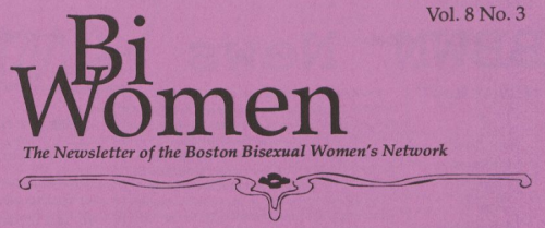
Bisexual activist and scholar Robyn Ochs just announced the successful conclusion of a project she has been working on for 7 ½ years in collaboration with Amy Benson of Harvard University’s Schlesinger Library.
Back issues of Bi Women (now the Bi Women Quarterly) (1983-2009) and of North Bi Northwest (a publication of the Seattle Bisexual Women’s Network) are now archived and available via Harvard University’s Schlesinger Library. They have been digitized, and are searchable and available to the public.
Here’s the press release from Harvard’s Schlesinger Library:
Boston is home to the longest-lived bisexual women’s periodical in the world. Bi Women Quarterly, a grassroots publication, began in September 1983 as a project of the newly-formed Boston Bisexual Women’s Network.
Staffed entirely by volunteers, and containing essays, poetry, artwork, and short fiction on a wide range of themes, Bi Women Quarterly provides a voice for women who identify as bisexual, pansexual, and other non-binary sexual identities.
Robyn Ochs, editor of Bi Women Quarterly since 2009, donated the only complete collection of this publication to Schlesinger Library several years ago with the agreement that it would be preserved, and digitized in a searchable format. The digitized collection at Schlesinger covers the years 1983 to 2010. We are delighted to announce that this project is complete, and this resource is now available to researchers and to the general public through Harvard’s catalog.
Making the voices of bi women accessible will hopefully provide researchers primary material with which to begin to fill this gap.
Issues of Bi Women Quarterly from 2009 to the present can be found online a BiWomenBoston.org. These more recent issues will be added to the Library’s collection in the near future.
“Politicised bisexuals want to connect with lesbian/gay groups, not to overthrow them, and to strengthen, not dilute, lesbian/gay anger and power.”
- Amanda Udis-Kessler, Bisexual Horizons: Politics, Histories, Lives
-
 bogreader liked this · 1 month ago
 -
 tea-and-bitchcuits liked this · 2 months ago
 -
 ashlee-wilson12 liked this · 2 months ago
 -
 nadiapym liked this · 3 months ago
 -
 hachidori358 liked this · 4 months ago
 -
 sapphic-shoka reblogged this · 6 months ago
 -
 randomsetofletters liked this · 6 months ago
 -
 maaayhaps liked this · 6 months ago
 -
 tamathena liked this · 6 months ago
 -
 mewtymew liked this · 7 months ago
 -
 lexarainy reblogged this · 7 months ago
 -
 lexarainy liked this · 7 months ago
 -
 toxic-bisexual reblogged this · 7 months ago
 -
 pride-cat liked this · 7 months ago
 -
 leotheloaf reblogged this · 7 months ago
 -
 leotheloaf reblogged this · 7 months ago
 -
 januscorner liked this · 7 months ago
 -
 bi-dykes reblogged this · 7 months ago
 -
 bi-dykes reblogged this · 7 months ago
 -
 leotheloaf reblogged this · 7 months ago
 -
 tgshydestan liked this · 7 months ago
 -
 leotheloaf reblogged this · 7 months ago
 -
 bi-dykes reblogged this · 7 months ago
 -
 leotheloaf liked this · 7 months ago
 -
 leotheloaf reblogged this · 7 months ago
 -
 eternalxblossom liked this · 7 months ago
 -
 starlingelliot liked this · 7 months ago
 -
 missmichellets liked this · 7 months ago
 -
 moonymegs liked this · 7 months ago
 -
 theowlishlibrarian liked this · 7 months ago
 -
 bi-dykes reblogged this · 7 months ago

☽☾ bi blog ✗ learn ur historyop (pride-cat, whom you can call aster) goes by he/she and identifies as butch (but is often inactive) icon credit: n7punk | header credit: mybigraphics
232 posts


