
pixelatedpsyche
Too busy stalking your archive rn
28 posts
Latest Posts by pixelatedpsyche

I found a buttload of old junk i made years ago. Figured you Tumblrfolk might like to see.

A young rat stands alone in his bedroom. It just so happens that today, the 13th of April, 2006, is the day he is banging out the tunes.
in celebration of april 13, i present all four known photos of neil, who banged out the tunes 19 years ago today
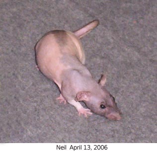


source: theagilerat.com (click right to see all four photos!)
fuck it homebrew boop button. reblog this post to boop the person you reblogged from.


Rb for daily health and prosperity

art by Seth Tobochman

good morning. let's get this bread
i think we should rename the Classic Tabby to Swirly Whirly Tabby. reblog if you also think we should rename the Classic Tabby to Swirly Whirly Tabby

Literal definition of spyware:
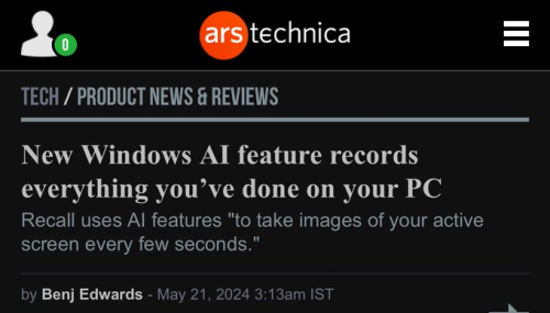
Also From Microsoft’s own FAQ: "Note that Recall does not perform content moderation. It will not hide information such as passwords or financial account numbers. 🤡


font reviews based on how good :3 looks

Arial: Classic font, looks good for the most part, but a little bit bland also. 6/10

Berlin Sans FB: There's already a lot more character, but the mouth is simply too long and the lips don't curl enough which takes away from the experience. 4/10

Comic Sans MS: Now THAT'S a colon-three. There's so much silliness in that face it's hard to bear. My only real critique is that the eyes are just a smidge too narrow, but that's just a nitpick more than anything. 8/10

Courier New: Sleek. Professional. Big vertical eyes full of glee. Very solid choice for a colon-three font. 7/10

Jokerman: I feel bad for including this one. That font stood no chance against the others. This is the eldritch horror of colon-threes. These eyes are filled with nothing except murderous intent. The mouth is crooked with a sharp corner, but the most egregious part is probably the teeth-like protrustions from the bottom part of the mouth. 0/10

Goudy Stout: An interesting take on colon-three. I like the idea of having an incredibly thick mouth (even if it's a bit too thick for my liking), and the eyes being big and centered is a big positive. Much sillier than most fonts, but I think struggles to beat Comic Sans in terms of silliness. 6/10

Consolas: Worse version of Courier New. The lips just don't curl enough and it just ends up looking a little pathetic. 4/10

Fixedsys: Oh my god. Holy shit. What the fuck. 10/10

tumblr users will see the word shrimp and black out and hit reblog without reading the rest of the post
🦐


another option:

turning it into a windows 95 logo is also acceptable.


aauuauauuuhahauaauhahHh euehhgah gweyeyhhhhhahhh nnnhnmnggjannm

everyone shut up. look at how cool shadow is


cat sitting on a pile of super mario bros for the ds in a bathtub


Reblog to make it die faster
