I Have An Arty Question. What Program Do You Us, How Do You Shade? I'm Actually In Love With Your Art
i have an arty question. what program do you us, how do you shade? i'm actually in love with your art style and i was wondering for some time if you could give away any tips :) i just started digtal art and i can't draw as good as i do on paper so anything is helpful
Oooh buddy, I LOVE making tutorials and explaining my way of drawing so prepare for a long (and hopefully helpful) post! >:D
Ok so first of all: I use Clip Studio paint pro and a simple Bamboo Manga Tablet from Wacom. (I’ve been using this tablet for 8 years now and it still works perfectly fine and never gave me any trouble!~ It has a great pen pressure, setting it up is very easy and it’s not super expensive)
I tried many different art programs and Clip Studio (back then it was called mangastudio 5) is still my absolute favorite. It provides you with everything you need as an artist, is very easy to understand and not as overpriced as other programs (I’m looking at you photoshop). So if you don’t have a lot of money (like me, I’m fucking poor X’D) and still want something of quality I’d definitely recommend it.
Time for the brushes:

My main brush for outlines and sketches

My absolute fav brush for shading (Opacity is around 40%)
The 2 brushes that are displayed up here are part of a set that you can download for free on this page. I love them for their rough look and they fit my sketchy art style perfectly. Sadly I can’t find the original set anymore but I made screenshots of their names:

I cannot stress this enough but you should always download new brushes and try them out. And this page is perfect for that (nearly all of them are free)! Using new brushes and combining different ones can give your art so much more personality.
But just a quick tip. I know that the range of brushes is gigantic and can be quite overwhelming. So download everything that might interest you, try them all out and only keep as little as possible! Having too many brushes will confuse you and you’ll spend more time searching through them than drawing. I’ve downloaded over 400 and only kept around 20. I only use 2 of them for my drawings and the rest is for manga backgrounds and action lines.
Now for the drawing itself:

I’m a quick artist and I care more about speed than quality. I always hated making multiple sketches so I’ll just draw the outlines
-

and fix them up without a previous sketch or making a new layer. That’s why most of my drawings look very rough and don’t have a clean look. (but I like that~)
-

For the color, I just fill in the entire picture with a neutral looking color and use the bucket tool to remove every unwanted color around the drawing. That way you won’t have any white pixelated edges inside your drawing and can add other colors quickly (again, with the bucket) without having to draw every single color per hand. Saves time and looks fine.
-

For shading (in this case his skin) I’ll combine the skin color with the color that I’ll use for shading inside this net. That way I can choose from multiple options to find the perfect color. ~
-

At first I’ll add rough shadows with dark red (Opacity 60%)
-

And then smooth them out with a lighter red. (Opacity 40%)
-

Now I’ll quickly add the last details and a few white spots on his hair and skin to give him a more realistic look
-

And you’re done! :D This took me about 15 minutes. But remember, you don’t have to be super quick. Draw at your own speed and use the style that’s the most fun for you! If you want to draw carefully with multiple layers and have clear outlines with many details then do it! Every person is different :D The most important thing is that you have fun!~
More Posts from Nastysynth and Others


A basic tutorial on how I do ghoul skin for anon!! I wanted to include how to do fat/veins and stuff underneath the skin, but this tut is already long enough so I just stayed with the basics! Sorry if this is a bit messy, but I hope it helps!
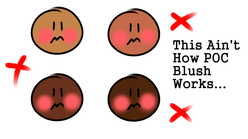
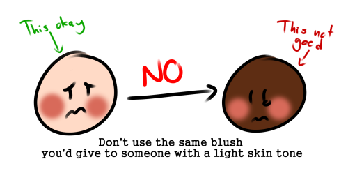
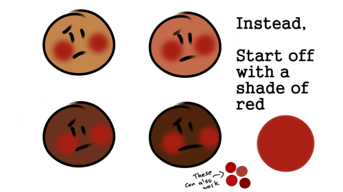
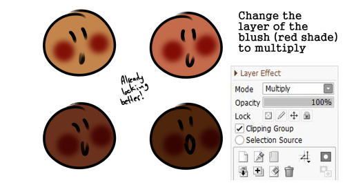
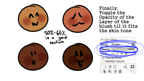
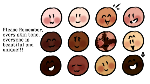
POC blush tutorial
Feel free to repost, but please credit me
I have two questions! First: have you ever thought of doing a tarot card suit for your characters? I think it'd work really well for them! And two: help me how do I draw legs
@gravitality
Hi!! I’ve absolutely been thinking about that, yeah, in fact I recently talked about that to my boyfriend just recently. It’ll likely happen after october! And to answer your second question! I made a thing on legs that i hope you’ll find useful!!
So. I’ve already explained basics on legs here, but I don’t think it hurts to go through some extra details to help you understand legs some more.

The very basic thing is to imagine legs as teardrops. Again, this has already been covered in said tutorial above, but I figured it’s still good to mention even the most basic thing that I know of. I still highly recommend you check it out to get in more detail and to see some other examples and practices that you do. But basically, think of legs in the shapes of teardrops, when it comes to shape. If you need a simple stick-figure to connect the legs in the first place, make sure that they bend at the knees a bit so that the legs don’t come off as stiff and unnatural.

As you can see, this method works perfectly for realistic legs as it does for stylistic ones. Remember to use these as a guideline, never to be the exact base of the legs you will be drawing. If you draw traditionally, remember not to draw these guides too hard, or they will be hard to erase/do freestyle!

But how do you actually draw out the legs without drawing them perfectly straight, as shown to the left? The trick is to add volume to them, and how you do that can be winged to your own liking. The idea is to think in curves. As no leg is perfectly straight. You may make these curves minimal if you don’t want them to be curvy, but keep in mind, still, that not even your own bones are perfectly straight, so it is highly recommended that you make them bend, at least a little.

It all depends on how you draw them as well. Say you put your legs together, as shown in this picture, what happens to the fat and muscle? Naturally, they press together, much like how thighs squish on the surface when you sit down (I’m sure most people know what I’m talking about). Make sure this shows in your art! This is very important to keep in mind, because it makes it all look more natural and believable. Try to cross your legs or stand up and sit down again for real-life examples!


The same applies for stretching your legs, more or less, except they appear to become more ‘hollow’ and slimmer. They become less soft to the touch, too, and might show. Try stretching your legs and feel where the muscles tense and where it feels ‘hollow’. This is very helpful with your art.

Many leg tutorials talk about legs without mentioning the behind. It requires a tutorial on it’s own, in all honesty, but this is the most simplest way to draw it connecting to the legs. Remember that it comes in many different shapes, and this is just a super basic guide! Two circles overlapping, while following the line and flow of the legs. Remember the muscle/fat as mentioned above!

Okay, so we got the basics of leg shapes figured out? What if you want o draw them in a certain pose, or with a certain silhouette, but perhaps do not have the reference for it? Or you want to blend your style into it? The key is to not shy away from doodling the form. Make mess, draw lightly and don’t care about the anatomy. That way you’ll get everything down without it appearing stiff. You can clean up the sketch later, always, and if you can, use a reference after you have drawn your pose, to correct your drawing.

Remember that the hips do a lot to the pose of the legs! Make sure they are in flow with your legs, so that it can look more natural. Remembers that hips ‘rotate’ with the spine.

I’ve talked about this method before when it comes to posing, and the same applies for the legs. One way to make legs appear ‘steady’ is to picture them standing in a line, and one of those legs need not to stray from the lines too much, making it steady. If you want a dynamic pose despite the steady pose, you can always have the other leg stray from the line, since it only matters that one leg is steady. This method can create good, casual poses without making them appear boring. (also notice how the teardrop shapes are used here, despite the highly stylized legs)

Do you want a highly dynamic pose, or them to appear unsteady, then skip the line entirely and make both legs aim away from it completely. As you can see, the legs appear more moving, in action, as if they’re fighting, falling, or dancing. As you can imagine, this is not a pose that one could stay steady on, suggesting that it’s taken mid-movement. More about posing and this ‘line’ method is talked about in this tutorial.
Hope this helped you, if you have any questions let me know, and if you’d like to check out all my tutorials they can be found here!


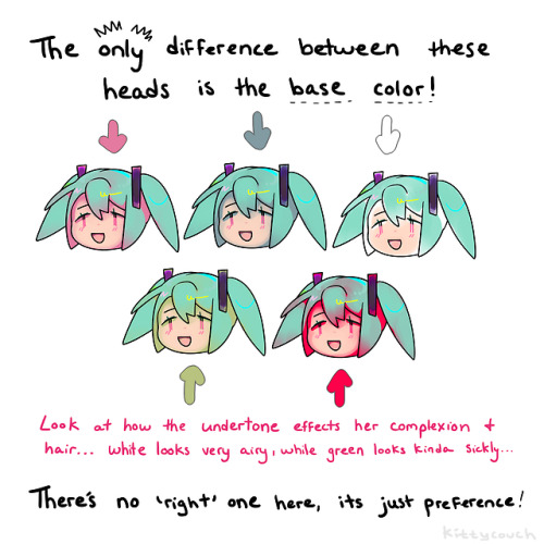
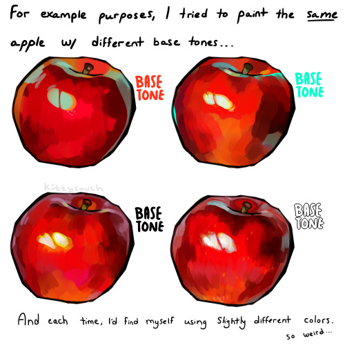
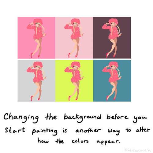
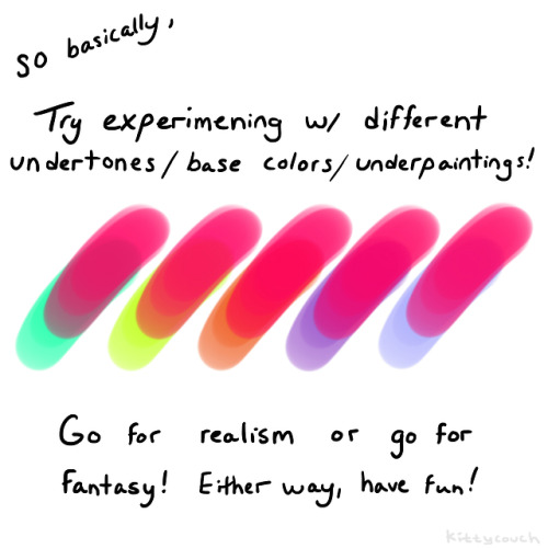
No one asked but here’s a brief tutorial on digital underpainting and how it can add some extra flavor to your art!
(I got asked this a couple times so just to clarify: I used “overlay” in the second slide… but the rest of these examples are JUST painted on, no effects! Try playing with the opacity on your pencil/water/brush tool to allow the base color to show through!)
Not the same Anon, but hyacinths please
Hi friend, thank you so much for your interest! I’m going to go over how I draw these flowers, but I realized midway that I’m actually very terrible at drawing these in particular, haha. There’s a reason I’ve lowkey avoided doing them so far, and I think it enabled me to highlight a bit more, the way I choose my arts.
It’s quite hard to teach just “how to draw a specific flower” mostly because I myself don’t know - the most important thing I can emphasize is using references!

I personally dislike drawing these flowers in my art, and I couldn’t figure out why until I started this tutorial.
One thing I tend to notice when I look at reference pictures is how flowers move as a ‘whole’ and their relative ‘flexibility’. I pay attention to that because the way I do art, I choose the flower in part based on appearance and how natural they will look in a specific composition.

I tend to like flowers that sprout outwards and have a kind of ‘loose’ appearance. The red lines here show the ‘direction’ I want the flowers to go in.

This is where these flowers pose a bit of a problem. Because arranged in clumps, they are very stiff. It’s not a bad thing if that’s what you’re looking for, but it’s not what I wanted, exactly, for this image.

They just stick straight up, because they have very stiff leaves and a tight packed pattern. (They sometimes tilt though, mine always did). At this point, I could decide the form isn’t right, and this isn’t the flower I want. But there’s also another thing I could do, which is altering it’s appearance when I draw it, slightly.

Left is a simplified version of the shape, while the middle is a more detailed image. The furthest to the right is a close-up of a single flower. Depending on what you want to portray, you can choose to alter what you want your flowers to look like.

As you can see, when drawn closer up, the flower has a lot more flexibility!

So with this, I ended up drawing the batch of flowers a lot larger than how it would be normally, while still retaining the recognizable flower and leaf shape.
So what I’m trying to convey is that sometimes you have to study references, but then know you can pick and choose what aspects to highlight in your art. That’s I think, how you can get your flowers to look extra ‘dynamic’ in your work - by accentuating their specific shapes to work to your advantage! And also playing with their colors and such! But hyacinths come in so many colors that any would work!
I hope this is helpful to you, anon!


a few ppl asked a while ago how to do the glitchy texture effect n i never rlly gave a good answer so heres a small tutorial:
1. add a wave modifier first, make the height really small (like 0.1-0.2), turn the speed to 1 and the width to less than 0.4
2. add a subsurf second (sometimes u dont need this one though, its mostly to stop the face/eyes collapsing on low poly models)
3. add a decimate modifier last
WHY IS DRAWING HANDS SO FUCKING HARD
BioShock Resource Masterpost
Due to multiple requests I’ve decided to collect all the free BioShock material I’ve shared under one post for ease of access. Because of size restrictions, some will have to be downloaded to be read, but I hope you enjoy anyways!
BioShock Artbooks
Breaking the Mold: The Art of Bioshock
Deco Devolution: Art of Bioshock 2
Art of Bioshock Infinite
If you like the physical books better, you can buy them here: The Art Of Bioshock Infinite & Deco Devolution: The Art of BioShock 2. The art book for the original Bioshock is very rare and expensive.
BioShock Novelizations & Original Pitch Document
BioShock: Rapture (eBook) (audiobook)
BioShock Infinite: Mind In Revolt (Spanish edition)
BioShock: First Person Action Horror
If you’d like a store-bought copy better, you can them here: BioShock Infinite: Mind In Revolt & BioShock: Rapture eBook or audiobook.
Extended Resources
Artbook Masterlist: All non-BioShock artbooks I’ve collected
If you’re worried about the downloads being infected/bugged or whatever don’t be- I bought them legally and am putting them up on a private google docs for easy access.
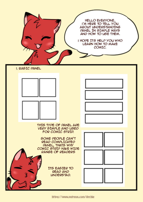
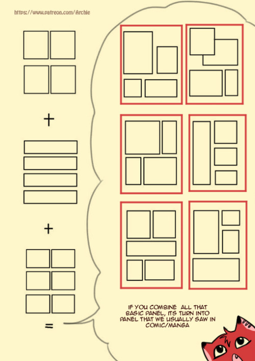
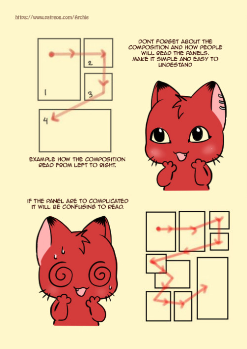
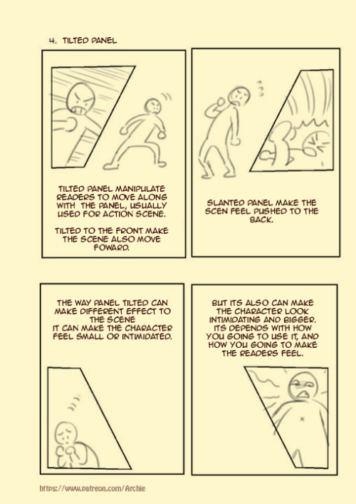
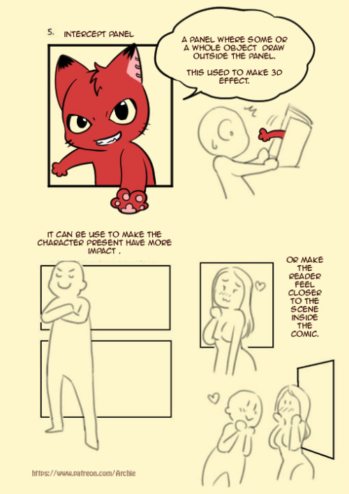
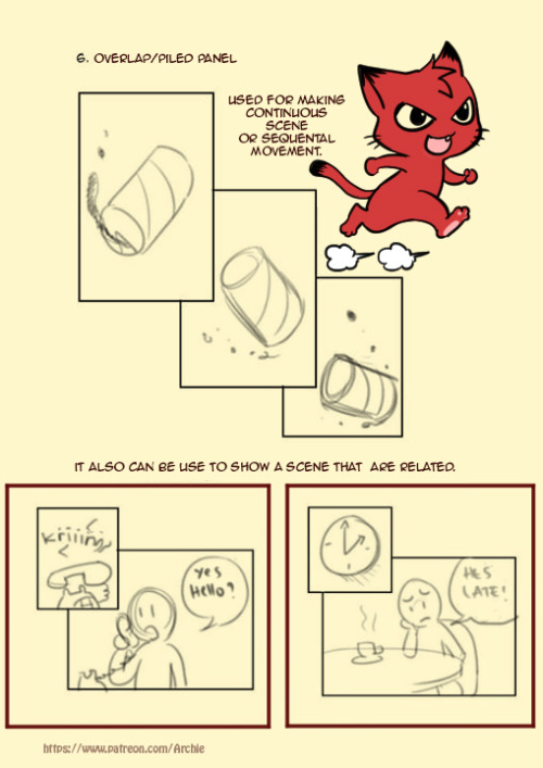
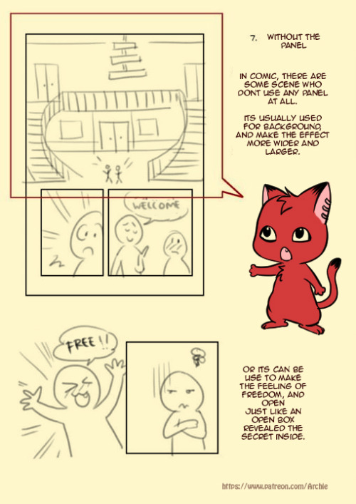
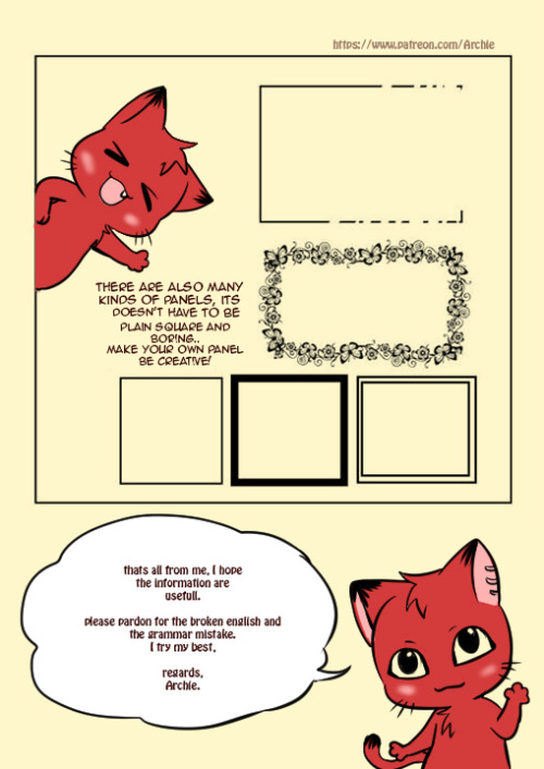
Simple Comic Panel Tutorial
please kindly visit my Gallery


A couple people have asked about muzzles and how I draw them, so I whipped up this super quick little guide. These are in my own personal art style of course, so play with the shapes and find out what works best for you!
disclaimer: I'm notorious for going off-model with my own guidelines due to my art style [especially in equines/bovines] and i'm vERY SORRY aAA;
I do hope this helps!! 😭💕
-
 makkat0 liked this · 4 years ago
 -
 casejewy liked this · 4 years ago
 -
 awriternotwriting reblogged this · 4 years ago
 -
awriternotwriting liked this · 4 years ago
-
 finally--beautifulstranger liked this · 4 years ago
 -
 keitycat03 liked this · 4 years ago
 -
 sasaborise7 liked this · 4 years ago
 -
 the-trash-23 liked this · 4 years ago
 -
 nyoschief liked this · 4 years ago
 -
 lu-ke liked this · 4 years ago
 -
 sunsetcowboy liked this · 4 years ago
 -
 mommabearsteve liked this · 4 years ago
 -
 tr4sh-dump liked this · 4 years ago
 -
 alexanderlazybunny liked this · 4 years ago
 -
 zeronightchance liked this · 4 years ago
 -
 analogdreamsinteractive liked this · 4 years ago
 -
 keyladragneel liked this · 4 years ago
 -
 cocoabean-ghost liked this · 4 years ago
 -
 valeriavales liked this · 4 years ago
 -
 potatoyeas liked this · 4 years ago
 -
 koishii-hito reblogged this · 4 years ago
 -
koishii-hito liked this · 4 years ago
-
 estenodeimons reblogged this · 4 years ago
 -
estenodeimons liked this · 4 years ago
-
 hex-i-think reblogged this · 4 years ago
 -
hex-i-think liked this · 4 years ago
-
 radshoefarmllama liked this · 4 years ago
 -
ohwlpp liked this · 4 years ago
-
 bubblescarfs liked this · 4 years ago
 -
 jeesharon liked this · 4 years ago
 -
 dreyaaahh liked this · 4 years ago
 -
jessmm02 liked this · 4 years ago
-
 bellsartworks liked this · 4 years ago
 -
 lady-chainsaw liked this · 4 years ago
 -
 bugmatics liked this · 4 years ago
 -
 leonenjoyer69 liked this · 4 years ago
 -
 one0p1nk liked this · 4 years ago
 -
paleoperapicklellama reblogged this · 4 years ago
-
 lavencher liked this · 4 years ago
 -
maximadragon liked this · 4 years ago
-
 bingbongdingdonger liked this · 4 years ago

Sylwester | i will mostly post sketches, because i'm too lazy to end them
196 posts