I Suppose, Every Fan Of The Stand Still. Stay Silent Webcomic Thought Of EXACTLY THIS Cat Today XD
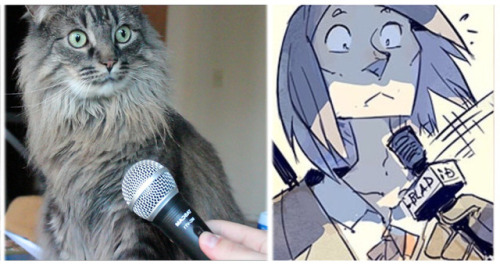
I suppose, every fan of the Stand Still. Stay Silent webcomic thought of EXACTLY THIS cat today XD
Character and webcomic belong to @hummingfluff
More Posts from Kevinthecantaloupe and Others
I physically can't stop making these


more of these:
[1] [2] [3] [4] [⭐️]

Hmm! A massive buffalo deity with luscious locks. Could make a batch of woolen shirts for an entire colony Gonna have a go at creating a pantheon of major/minor gods, it's something I've always wanted to do for story purposes <3 I just enjoy it
MEDIA: Ipad Pro 2024 Clip Studio Paint Pro
more people need to consume media how dedicated comics fans consume their media of choice

How I Made the Colors in Hunger's Bite So Good
first of all: buy my book. buy it and look at the colors. (if you cannot buy the book, ask for it at your local library or i GUESS you can look at these spreads i posted)
we're gonna talk about colors, but more specifically we're going to talk about overlays. if you're an artist you are probably familiar with overlays. we love our overlays. we love to color a picture and then at the very last minute go 'hm. looks bad. i'm going to put a yellowish overlay on it to make it look less bad :)'
do not do this.
i mean you can, and it'll work sometimes, but all you're really doing is tricking your brain into thinking different is better. you've been staring at the image for potentially several hours. none of the choices you made at the beginning mean anything to you anymore. you're just finishing what you started. one of the big reasons you might look at your art and go 'man, this doesn't look that good' is because You drew it and are intimately familiar with it. you know all the flaws and mistakes because You made them and You know what your vision was. one of the great frustrations with art is that the piece in your head doesn't look like something you actually made. you want it to look like somebody else did it, so you can enjoy it as a viewer, not as the creator.
so when you put that overlay on, and suddenly the image looks very different, your brain will go 'this doesn't look like the thing i've been staring at for 2-3 hours! this is different! now it's good!'
and again, sometimes it Is good. but do you actually understand why it's good? or is it just different?
okay so what am i supposed to do smart guy
i'm glad you asked. the trick to making overlays work is to have them on from the start. this requires knowing what mood you want to convey in your scene from the very beginning. hopefully you know what mood you want to convey. you do, right? and i don't just mean happy or sad, i also mean safe, threatened, familiar, strange, soft and harsh. blue is not always sad. green is not always healthy. yellow/orange are not the only way to convey a companionable warmth.
okay did you pick the mood? do you have an idea of what color you want to use to represent that mood? great. i'm gonna use blue to convey the cool, clean white of a ship's maintenance corridor without making things literally white. and i'm going to stick in two characters whose color palettes consist of bright yellow, brown, and wine red. awesome. i definitely know how those colors would behave under blue lighting.
(here's the thing: no i don't.) this is where a gradient map correction layer comes in. i want my page to be Blue. alright. let's make a gradient map that's Blue.

a gradient map is basically just A Gradient with specific colors connected to specific values. you have your darkest values on the left, and your lighter values on the right. at 100% opacity, this gradient map layer will read the value of anything below it and go 'okay this bit is this dark, so it should be This shade of blue. and this bit is this light, so it should be This shade of blue'.

kind of like a hue or color layer except determined by a gradient rather than one color, so it could also go 'this is light, so it's green' and 'this is dark, so it's purple'. it's math. i don't really get it either. but anyway this is probably not what you want if you want your characters' palettes to be recognizable. emery's sweater is supposed to be a wine red! neeta's skin should be brown, and her shirt should be yellow. these are their Key Colors. generally, i want them to be recognizable. so let's lower that opacity down.

nice! you can definitely now see that emery's sweater is red and neeta's shirt is yellow. and everything is relatively balanced. nothing is too saturated, nothing is significantly brighter than anything else. it's all got a little bit of blue in it. but i've skipped the step of actually picking your colors. because here's the thing with gradient maps.

they hate you and want to fight. when working with gradient maps you must imagine there is a monkey sitting on your shoulder dumping paint in every time you pick a color. the monkey has a tube of blue and he is going to put that blue into everything you paint, but it's not normal paint. it doesn't mix, it overtakes. it won't turn something yellow into green, it will turn it blue. it wants everything to be blue. if you want something to look like the color it's supposed to be, you will have to make it extremely saturated under the layer to essentially fight the paint monkey's blue. hence, emery's sweater is a BRIGHT red, so it will look a little more purpley under the blue. and neeta's skin is very orange, so it can be dulled down into a soft brown.
this is the sort of thing you will have to learn by feel, because it will be different with every gradient map, especially if you start getting into weird ones that aren't monochromatic. you want to know one of my favorite maps to use?

i have memorized where on the value scale all of these colors appear. i can color something using only shades of gray when i have this filter on. i am evolved. if you want to use gradient maps effectively, you'll have to get a lot of practice.
anyway this post got really long and i'm about to go to a movie so i'll talk about how to use screen/multiply/overlay layers later. but gradient maps are the main tool i used to make hunger's bite's palettes so unified across scenes. but you can see way above how they work to turn insane saturated colors into the nice harmonies--and the trick is that i'll never see those saturated colors while i'm working. because i have accepted the paint pouring monkey into my heart, and i trust him. except when i'm coloring wick's coat. holy mother of god every gradient map hated that man's purple coat.

Drew this yesterday testing out how streaming works from iPad. Got a pretty good grasp on how to do it :> I'd like to stream drawing comic pages since that's what I draw mostly anyway, obviously those who don't want to be spoiled shouldn't tune into it. But those who don't mind too much, it could be great!
The chekhov's gun has begun to unload.
being on tumblr for a long time but never reading homestuck like

Ah,
There it is
The yoink yeet

“do you know where you’ll be headed in 5 years?” no. but i do know about themes and motifs. and friendship. and putting garlic on everything
-
 the-snow-mum liked this · 4 months ago
 -
 voidrosemarionette reblogged this · 4 months ago
 -
 rogaladin liked this · 4 months ago
 -
 sirenadeillustrationcomics reblogged this · 4 months ago
 -
sirenadeillustrationcomics liked this · 4 months ago
-
 kuddelmuddell reblogged this · 4 months ago
 -
kuddelmuddell liked this · 4 months ago
-
 kevinthecantaloupe reblogged this · 4 months ago
 -
kevinthecantaloupe liked this · 4 months ago
-
 a-softer-world-for-ssss reblogged this · 4 months ago
 -
 breezy-cheezy liked this · 11 months ago
 -
 angrenwen reblogged this · 3 years ago
 -
 red-r0ver reblogged this · 3 years ago
 -
red-r0ver liked this · 3 years ago
-
 dakotafinely liked this · 3 years ago
 -
 alwayshere195 reblogged this · 3 years ago
 -
alwayshere195 liked this · 3 years ago
-
 ginger-garlic-goodness liked this · 3 years ago
 -
 earthyorangeaid liked this · 4 years ago
 -
 azure-wing liked this · 4 years ago
 -
 draconi-dae reblogged this · 4 years ago
 -
draconi-dae liked this · 4 years ago
-
 flyingcookiegumtruckthing reblogged this · 4 years ago
 -
flyingcookiegumtruckthing liked this · 4 years ago
-
 xenocomputerism liked this · 4 years ago
 -
 bassacaglia liked this · 4 years ago
 -
 puls397 liked this · 4 years ago
 -
 sagamivulpix liked this · 4 years ago
 -
 imaginaryurl liked this · 4 years ago
 -
 the-story-isnt-over-yet reblogged this · 4 years ago
 -
the-story-isnt-over-yet liked this · 4 years ago
-
 pokeblader3 reblogged this · 4 years ago
 -
 jackolanternsummers liked this · 4 years ago
 -
 kankalin liked this · 4 years ago
 -
 naturestune liked this · 4 years ago
 -
imwastingtimeonline liked this · 4 years ago
-
 bananalffytffys liked this · 4 years ago
 -
kikimoraaa liked this · 4 years ago
-
 d00m-sl4y3r liked this · 4 years ago
 -
 hahahoneybee liked this · 4 years ago
 -
 theredtraveler liked this · 4 years ago
 -
 iolitemoth liked this · 4 years ago
 -
 lumi-of-the-universe liked this · 4 years ago
 -
 gaell-dragons liked this · 4 years ago
 -
 ontological-concept liked this · 4 years ago
 -
 ataraxiaandserenity liked this · 4 years ago
