GRAPHIC DESIGN SUPPLIES MASTERLIST

GRAPHIC DESIGN SUPPLIES MASTERLIST
Under the cut is a masterlist with websites with useful resources for graphic designers, such as assets, photo & video stock, vectors & icons, fonts, palettes and more!
ASSETS
psfiles
freepik
resourceboy
creativefabrica
unblast
indieground
graphicsfuel
pixelbuddha
designbundles
truegrit
freedesignresources
graphicburger
freebbble
dribble
pixelsurplus
houseofmockups
graphicforfree
freebiesbug
PHOTO & VIDEO STOCK
pexels
unsplash
nappy
freenaturestock
freeimages
cutestockfootage
stocksnap
pixabay
rawpixel
VECTORS & ICONS
undraw
reshot
svgrepo
flaticon
icons8
freeillustrations
opendoodles
thenounproject
iconscout
fontello
bootstrap
FONTS
dafont
fontspace
fontsquirrel
urbanfonts
google fonts
fontfabric
PALETTES
coolors
colorhunt
color-hex
palette
colorlisa
lospec
colormind
colourlovers
adobe colors
palettemaker
webgradients
uigradients
eggradients
USEFUL SITES
canva
photopea
deviantart
meshgradient
svgshapes
bgjar
haikei: svg generator
background remover
More Posts from Honeycxmbb and Others


───⠀chikawa pngs
all sourced from pinterest no need to credit me ,, f2u feel free to repost anywhere
Mapping Where I’ve Been - Submitted by SeesawSiya
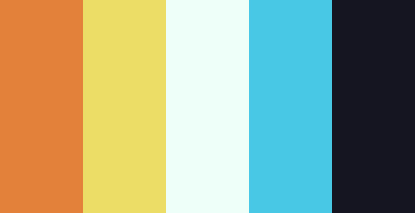
#e3813a #ecdd66 #eefff9 #48c8e5 #151521


Scaramouche Rentry Template
Harbinger Button by @/lavendergalactic
Recolored pixels, graphics, and stamps by me @honeycxmbb
f2u w/ creds for the button


Bombs 'n Buns PSD
dns , f2u psd cred when using
Self-Indugent


⌢⌢⌢⌢⌢⌢⌢⌢⌢⌢⌢⌢⌢⌢
﹉﹉﹉﹉﹉୨ ♡ ୧﹉﹉﹉﹉﹉
ೀ ㅤ۫ ㅤ۪ㅤ۫ㅤ : ᯓ DOWNLOAD ! ﹐ ⋆.ೃ࿔*:・
.°˖✧ ꒰ Moon 爱 Pearls ꒱ ⊹₊ ✰ ⋆
౨ৎ PSD : Credits needed﹒ 𖦁ׅ ࣪ ׂ
ೀ ㅤ۫ ㅤ۪ㅤ۫ㅤ : ᯓ F2U w Rb & Like ﹐ ⋆.ೃ࿔*:・
﹍﹍﹍﹍﹍﹍﹍﹍﹍﹍﹍﹍


☆ genshin impact shiny buttons !
self indulgent, made them myself! credit 4 putting on resource rentrys / blogs / etc f2u, feel free to resize / recolour!

…make a psd?
this is a question i get pretty routinely, and i’m going to tell you upfront: there is no one way to make a psd. there’s no ‘better’ way, no ‘easier’ method, you just have to figure it out yourself.
with that said, this post is going to be how i, personally, make my psds, just for the sake of reference. my way isn’t better or worse than anyone else’s—it’s just the way i do things ¯\_(ツ)_/¯
i. making a showcase/moodboard
depending on the psd you want to achieve, your moodboard will probably look different—if you’re making a blue psd it will be mostly blue, if you’re making a psd based on a certain character or card set it will be based around that, etc. i made myself a general showcase that i test my psds on that includes both irl images and darker skin characters, because i like for my psds to work for those purposes most of the time. my showcase is below if you’d like to use it!

it’s best to include sources you edit frequently so you know what works on them and what doesn’t but how the moodboard looks exactly is up to you ¯\_(ツ)_/¯ i also recommend using swatchies (original by zeroresources on d*viantart) as long as you bear in mind that swatchies is not a great guideline for actual dark skin
ii. creating the base
actual step two is creating a folder but that takes like two seconds. do make a folder though or you will be sad.
after making a folder, start making the base of your psd; whatever the foundation is going to be. depending on how you want your psd to look, this will look very different. i personally always start off with a gradient map, just to get things going

my settings for this are the default black and white gradient map set to reverse, and it’s set to blending mode soft light at 35% opacity. i typically do something in the range of 20-45% opacity depending on how i want it to look
i’m honestly not sure where i picked up this habit but it does make it a little easier to get things going for me personally. it’s a simple change but it’s a good start. if you want higher contrast you can do the same thing but without reversing the gradient map
next thing i do when creating a base is add a selective color layer, which helps things pick up the pace. i’m too lazy to write it all down but these are my settings:

worlds ugliest collage so i don’t max out my images LMFAO apologies. obviously depending on what colors you want to focus on this will look different. for this one i completely axed magenta and emphasized blue and red/yellow. i also maxed out the black in white, which is extremely typical in my psds. this is what our psd looks like now:

pretty different already, right? nice!
next thing i typically do is another selective color layer. it’s typically pretty similar to the first, but once again that depends on the psd! the worlds worst collage again:

pretty much the same but a little different. and our results:

as you can see, this is pretty saturated and a little all over the place. not to worry—let’s move onto the next step!
iii. let’s get serious
this step varies a lot depending on what my psd needs, but because this one is pretty sayurated right now and that seems to be my main problem, i’m going to add a photo filter in a light grayish-blue to help desaturate and cool it down

(i unchecked preserve luminosity here because i think it looks neat. i don’t recommend doing that if you’re using a darker color bc it gets hard to see, but you can do whatever forever)
obviously this isn’t the only way to desaturate but i find it fun. observe:

definitely better, at least to me, but still not great. we’re going to add another selective color layer bc the skintones look kinda wack. welcome back world’s worst collage:

i only adjusted some of the colors in this one because i wanted to fix specific problems; namely that the darker skin tones were too dark and ashy.

mission accomplished
with that done, it’s time for hue/saturation! for funsies ദ്ദി(˵ •̀ ᴗ - ˵ ) ✧ this part i just had some fun with. a new collage:

and the results:

purple! this wasn’t what i originally had in mind but it was much more fun to do tbh LMAO i decided to turn the cyan/blue into purple because it looked better in my head
iv. okay now get silly again
now that the main meat—so to speak—of our psd is done, we can add some fun layers. if you want ideas for this, i have a post about it, but what i’m gonna add as my first silly layer is channel mixer, which is one of my personal favorite layers

pretty simple adjustments for channel mixer honestly ¯\_(ツ)_/¯ but i thought this would look fun. as a general rule of thumb i don’t mess with the red channel so much because it tends to screw over my skintones, but, as with anything, you’re free to do whatever forever

next fun layer i’m gonna add is a noise gradient map, also just for funsies

i randomized until i got a nice pink-ish kinda one. i was hoping for blue but all the blue ones were too green and i got impatient LOL

a little fucked but for sure fun. i set the gradient map to soft light at about 15% opacity. it gave the psd a fun texture and a bit of extra warmth
v. finishing touches
sometimes i add a couple more layers, sometimes i add less, but this psd feels about done so imma wrap it up. i typically don’t save my psds as the showcase for my storage’s sake, so i’m gonna grab something to use as an icon. i typically go ahead and size it at about 300x300

hello, haruka! once i have my icon set i duplicate the folder into the new project and name both the project and the folder. how you name it is up to you, i usually either use a random word generator or just whatever comes to mind. in this case, i’m just naming it ‘tutorial psd’ lol


then go to file and save as psd, bada bing bada boom you’ve got a psd ☆〜(ゝ。∂)

as i said at the beginning, there’s no one way to make a psd. this isn’t the only process or even the best one, it’s just how i personally work. the best way to make a psd on your own is fuck around and find out <3 canarysage out
…so that’s how you do it.
P.S. the psd i made here will be posted under the tag #tutorial psd. you’re free to poke around in it and use it as per usual. if you want to copy it, feel free, but don’t claim it’s your own or repost it as your work. thanks!
P.P.S. wondering about adjustment layers? see photopea for dummies. wondering about something i haven’t covered yet? shoot me an ask ദ്ദി(˵ •̀ ᴗ - ˵ ) ✧


⠀⠀✿ ✿ ✿ ✿⠀⠀Free2Use.
𝄢 No Reposts.⠀⠀Recolors OK.


Hii !! I'm really new to rentry n stuff and i came across ur blog! u seem very experienced w using it(i can tell bc ur blog is so so pretty?!?) i wanted to know how you guys make favicons(like how u make them pixelated/how do u resize em+how do u make them move?,, n what program do u use?) and rentry graphics(idk how to make those move either😭)
ur help will be much appreciated !!


i use ibis paint x ! ! just create canvas 20 x 20 and add whatever pic you want it to be !
if you want it to move then save it by how many frames you want it to be ! for example:


now go to ezgif and upload your picture choose settings you like ! heres what i used :
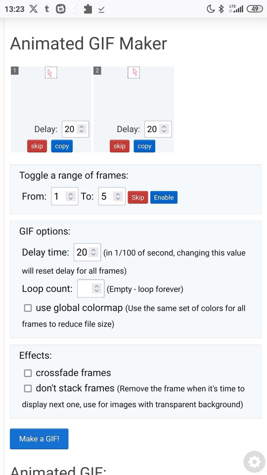
now click make a gif and its done ! heres my example i dont have too much time so looks messy . .

i hope that makes sense , im not good at explaining . .
now rentry graphics ! for this it isnt too much to explain . . i just search some graphics on pinterest and make them look pretty . . i think you should just try to do some and at some point youll find your style . . you can use mine graphics as a inspo !

Important.
Hey! Block this user if you come across them. They are extremely disgusting, saying slurs & being all around hateful. ( The username is @/basedhartman ). Got a nasty reblog on our post from them & their whole profile is just a miserable cry for attention.
Share this post if you see it so others can know & block them before they say something disgusting.

-
 iadesigns009 liked this · 2 weeks ago
 -
 luellala liked this · 1 month ago
 -
 sugarspiceandsuperheroes liked this · 1 month ago
 -
 justice4glitter reblogged this · 1 month ago
 -
 jasmine-jolene liked this · 1 month ago
 -
 polaroidxcamera liked this · 1 month ago
 -
 goodbye2u2day liked this · 1 month ago
 -
 homura-simpson reblogged this · 1 month ago
 -
 bun-i liked this · 1 month ago
 -
 2000pikas reblogged this · 1 month ago
 -
 stasisedits reblogged this · 1 month ago
 -
 miraffxiv liked this · 2 months ago
 -
 simcodes reblogged this · 2 months ago
 -
 aphacae liked this · 2 months ago
 -
 savioux liked this · 2 months ago
 -
takako-chigusa reblogged this · 2 months ago
-
 v01n32 liked this · 2 months ago
 -
 pymjr reblogged this · 2 months ago
 -
pymjr liked this · 2 months ago
-
 starkravingwriter reblogged this · 2 months ago
 -
 carazami reblogged this · 3 months ago
 -
 boxianbby liked this · 3 months ago
 -
 phalanghq liked this · 3 months ago
 -
 katurious liked this · 3 months ago
 -
 prettiestvampireintown liked this · 3 months ago
 -
 wickedwednesdaythings liked this · 3 months ago
 -
 lilie-stuffs liked this · 3 months ago
 -
 tearsofbriseis liked this · 3 months ago
 -
lilie-stuffs reblogged this · 3 months ago
-
 landofmisbelief liked this · 3 months ago
 -
 bombshellxslasher liked this · 3 months ago
 -
 purplef-angs liked this · 3 months ago
 -
 toutestfatal reblogged this · 3 months ago
 -
 jackhelps reblogged this · 3 months ago
 -
 phoenixdowns liked this · 3 months ago
 -
 its-elora liked this · 3 months ago
 -
 oracleintonite liked this · 3 months ago
 -
 palette25 liked this · 4 months ago
 -
 goghcst liked this · 4 months ago
 -
 mabsanxious reblogged this · 4 months ago
 -
mabsanxious liked this · 4 months ago
-
 milkywaymeows liked this · 4 months ago
 -
 pudimtalks liked this · 4 months ago
 -
 sakurajjam reblogged this · 4 months ago
 -
 verity-clover liked this · 4 months ago
 -
 miss-hudgins reblogged this · 4 months ago
