
amorphous blob (he/they) 19Sydney based queer artist, writer, and photographer
132 posts
Latest Posts by flaminggoatsstudio - Page 3


Online store is open!
Store
A few new originals have been added, as well as restocks of regular items. (And a small batch of calendars)


Hi! I just found your art and it’s so beautiful, I just have two questions- where do you find your pose references (do you take them yourself or look somewhere online)? And how do you paint lighting so well, especially on faces? Thank you and I hope you have a nice day ❤️
Hi there! I do both, I take pictures of stuff like my hands, poses, etc. and I also look online to find similar poses to get as many angles as I can.
For painting lighting, I look at photo references of lighting where it’s close to what I’m painting. Stuff like the turning shadow, rebound light, cast shadow; see if you can identify those in references or other objects. I’d also look at Bargue plates (ex down below), especially for faces. Lighting on faces is a bit more complex because there are so many planes at different angles, but hey, that’s what makes it interesting too. It definitely helps to look at facial structure drawings and sculptures. Knowing where the planes of the face are is important when you’re painting light on faces.


I love Bargue :)
I have a quick question about colouring if you dont mind! 🥺 I notice that whenever I try to render something with lots of shades and colours etc (esp if there’s dramatical lighting) everything ends up looking just,, muddy? I was wondering if that’s something you had to deal with before and if you have any advice on how to fix it? Haha thank you!!!
This definitely happened to me in my earlier years, and it sometimes still happens now if I’m not paying attention.
If something’s turning out to be muddy, I would try more clearly defining your contrasts in the image. Especially with dramatic lighting, it should be relatively simple (though not easy) to portray contrast, as opposed to something like more softer lighting/not as contrasting. Definitely check out your values (just lower saturation of the whole image till it’s in greyscale to check) from time to time while painting if you feel your image is getting muddy. Usually that’s a result of things like overrendering, not enough contrast (and contrast can come from both hue and value, not just value). So keep in mind color theory along with value, since color can definitely be a factor in muddiness. For ex, contrast in terms of color theory can be a complementary color scheme, and contrast in value is light and dark, and the intensity and degree to which you apply those is up to you :)
I also recommend simplifying your lights and darks at first, so you know where those are placed and so you don’t accidentally let them get away from you while painting. And use references too!! See how other artists paint light and dark, for example. Another tip is to paint the planes of an object before softening them, and to see if the contrast is as you wanted it to be. Think low-res polygon going to a more rounded form. Good luck! Happy painting :)
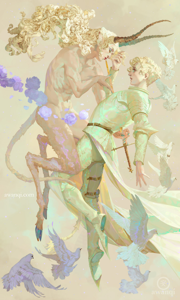
“Apollyon” for 3dtotal’s new release, Art Fundamentals: Theory in Practice.
Process, Hi-res, sketches available on my Patreon.
Also on my Patreon are monthly livestreams and other exclusive content! In fact, October’s stream will be on the 8th at 1pm CST.


Introducing February's Patreon-exclusive pin!
Info:
Those who subscribe to Tier III will receive a different enamel pin each month, along with everything else included in the previous tiers. Pins sent out each month are limited in quantity! Pin designs will not repeated, so if you miss out on a previous month's pin, you won't have a chance to get it in the future.
This tier is limited to 50 subscribers, US residents only (for now) ---
About the pin: Derived from my piece "Seraphim" (2020) from my Choir series, "Sanctus, Sanctus, Sanctus" (holy, holy, holy), is a proclamation by 'heavenly beings'. In medieval manuscripts, words so prolific in their use were abbreviated to save space on rare and valuable parchment. In this case, the composition of this pin forced the shortening of "sanctus" to "SCS". Another example, "spiritus sanctus (the Holy Spirit; every scribe in the Middle Ages would know that one) became "SPS SCS". These pins are only available from February 1-28.
P.S. There is still time to grab a January pin! By tomorrow, they'll be unavailable.
---
I'm on Bluesky!


honestly its so unbelievably lame that modern artists have settled on “plain white” for standard angel wing depictions considering the variety of cool and colorful designs that medieval and renaissance artists came up with.
like check out these blue and gold striped wings!! so sick!!

or the golden peacock feathers

or these rainbow ones! the paint is faded but imagine them much brighter and more vibrant originally

same with the paint on this blue and white gradient wing set

or even these sick goth wings on gabriel over here!!

like god not even going into the sticky moral implications of the whiteness/purity connotation theyre just so much lamer and more boring than they could be like come on

hot artists don't gatekeep
I've been resource gathering for YEARS so now I am going to share my dragons hoard
Floorplanner. Design and furnish a house for you to use for having a consistent background in your comic or anything! Free, you need an account, easy to use, and you can save multiple houses.
Comparing Heights. Input the heights of characters to see what the different is between them. Great for keeping consistency. Free.
Magma. Draw online with friends in real time. Great for practice or hanging out. Free, paid plan available, account preferred.
Smithsonian Open Access. Loads of free images. Free.
SketchDaily. Lots of pose references, massive library, is set on a timer so you can practice quick figure drawing. Free.
SculptGL. A sculpting tool which I am yet to master, but you should be able to make whatever 3d object you like with it. free.
Pexels. Free stock images. And the search engine is actually pretty good at pulling up what you want.
Figurosity. Great pose references, diverse body types, lots of "how to draw" videos directly on the site, the models are 3d and you can rotate the angle, but you can't make custom poses or edit body proportions. Free, account option, paid plans available.
Line of Action. More drawing references, this one also has a focus on expressions, hands/feet, animals, landscapes. Free.
Animal Photo. You pose a 3d skull model and select an animal species, and they give you a bunch of photo references for that animal at that angle. Super handy. Free.
Height Weight Chart. You ever see an OC listed as having a certain weight but then they look Wildly different than the number suggests? Well here's a site to avoid that! It shows real people at different weights and heights to give you a better idea of what these abstract numbers all look like. Free to use.


take a still, take the picture out of me
of this old me guilt
don't let yourself go


the first sketches of this year, done not long after los angeles burnt to the ground...


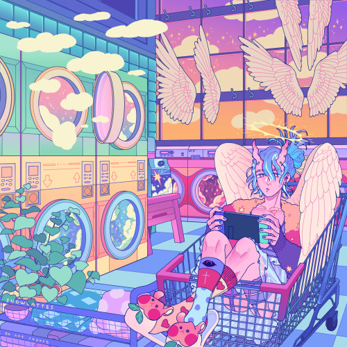

afterworld laundry’s shifts 00:00
.
🌸🌻🍁❄️
carrd | twitter | instagram | inprnt | store | portfolio website


late borthday post for me!! got a pretty banger "slut" party last weekend with friends and fams hehe im glad to have this as first finished art on this year, and intended as good early exercise to start each year! i wish i can keep doing it on the coming times (SLamat ULang Tahun ~ means Happy Birthday if it's not obvious enough ??? idk where to put it not to ruin the joke but hey, im not witty enough it's ok )


lovesender's journey 💌📭
Happy Valentine's day to the romantics hehe and also the so late letter set preview as well😭🤲💗 I was planning to finish personal V-day illust originally but also crave to make a letter set for valentine collections, the letter set ended up late for production since i make the design more intricate that what i originally planned haha but since i also have wanted to do background illustration again, but overall im glad to manage finish the personal illustration one for today!
🌸🌻🍁❄️
carrd | twitter | instagram | inprnt | store | portfolio website


