Flaminggoatsstudio - All Angels Are Trans And God Is A Gay Porn Star


More Posts from Flaminggoatsstudio and Others


I have a quick question about colouring if you dont mind! 🥺 I notice that whenever I try to render something with lots of shades and colours etc (esp if there’s dramatical lighting) everything ends up looking just,, muddy? I was wondering if that’s something you had to deal with before and if you have any advice on how to fix it? Haha thank you!!!
This definitely happened to me in my earlier years, and it sometimes still happens now if I’m not paying attention.
If something’s turning out to be muddy, I would try more clearly defining your contrasts in the image. Especially with dramatic lighting, it should be relatively simple (though not easy) to portray contrast, as opposed to something like more softer lighting/not as contrasting. Definitely check out your values (just lower saturation of the whole image till it’s in greyscale to check) from time to time while painting if you feel your image is getting muddy. Usually that’s a result of things like overrendering, not enough contrast (and contrast can come from both hue and value, not just value). So keep in mind color theory along with value, since color can definitely be a factor in muddiness. For ex, contrast in terms of color theory can be a complementary color scheme, and contrast in value is light and dark, and the intensity and degree to which you apply those is up to you :)
I also recommend simplifying your lights and darks at first, so you know where those are placed and so you don’t accidentally let them get away from you while painting. And use references too!! See how other artists paint light and dark, for example. Another tip is to paint the planes of an object before softening them, and to see if the contrast is as you wanted it to be. Think low-res polygon going to a more rounded form. Good luck! Happy painting :)


Ellsworth Kelly, Austin, 2015. Now at Blanton Museum of Art, The University of Texas at Austin.
Hi! I just found your art and it’s so beautiful, I just have two questions- where do you find your pose references (do you take them yourself or look somewhere online)? And how do you paint lighting so well, especially on faces? Thank you and I hope you have a nice day ❤️
Hi there! I do both, I take pictures of stuff like my hands, poses, etc. and I also look online to find similar poses to get as many angles as I can.
For painting lighting, I look at photo references of lighting where it’s close to what I’m painting. Stuff like the turning shadow, rebound light, cast shadow; see if you can identify those in references or other objects. I’d also look at Bargue plates (ex down below), especially for faces. Lighting on faces is a bit more complex because there are so many planes at different angles, but hey, that’s what makes it interesting too. It definitely helps to look at facial structure drawings and sculptures. Knowing where the planes of the face are is important when you’re painting light on faces.


I love Bargue :)


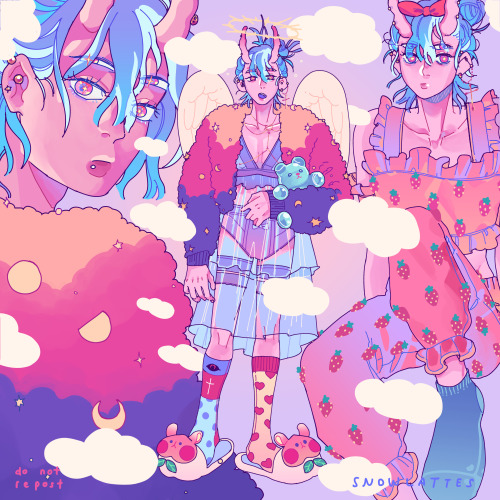
late borthday post for me!! got a pretty banger "slut" party last weekend with friends and fams hehe im glad to have this as first finished art on this year, and intended as good early exercise to start each year! i wish i can keep doing it on the coming times (SLamat ULang Tahun ~ means Happy Birthday if it's not obvious enough ??? idk where to put it not to ruin the joke but hey, im not witty enough it's ok )


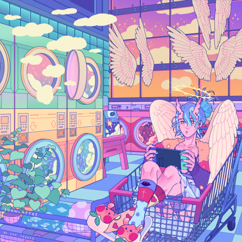

afterworld laundry’s shifts 00:00
.
🌸🌻🍁❄️
carrd | twitter | instagram | inprnt | store | portfolio website


Online store is open!
Store
A few new originals have been added, as well as restocks of regular items. (And a small batch of calendars)


Inlaid earthenware tiles, England, 13th-16th centuries
Victoria and Albert Museum
-
 small-amethyst-deceiver liked this · 1 week ago
 -
 kiokari liked this · 1 week ago
 -
 hyper0bject reblogged this · 1 week ago
 -
hyper0bject liked this · 1 week ago
-
 bad-jew-jew reblogged this · 1 week ago
 -
 doctorfunk liked this · 1 week ago
 -
 jlaguff reblogged this · 1 week ago
 -
 inlovewetrust-555 liked this · 3 weeks ago
 -
 flaminggoatsstudio reblogged this · 1 month ago
 -
flaminggoatsstudio liked this · 1 month ago
-
 absintherust liked this · 3 months ago
 -
 quitschekaetzchendebugging reblogged this · 4 months ago
 -
 tristantzara liked this · 5 months ago
 -
 eminhiding liked this · 8 months ago
 -
 orangefantana reblogged this · 9 months ago
 -
 loverattled liked this · 9 months ago
 -
 funderberkersims liked this · 9 months ago
 -
 transgirl-from196 liked this · 11 months ago
 -
 noncontingentflesh liked this · 11 months ago
 -
 spoon-boi reblogged this · 11 months ago
 -
spoon-boi liked this · 11 months ago
-
 thevoidsea reblogged this · 11 months ago
 -
 thewoodlandspite liked this · 11 months ago
 -
 junkworldusa liked this · 11 months ago
 -
 ghostofasecretary liked this · 11 months ago
 -
 mossydecadence liked this · 11 months ago
 -
 flameswallower reblogged this · 11 months ago
 -
flameswallower liked this · 11 months ago
-
 sapphorb reblogged this · 11 months ago
 -
 enuffula reblogged this · 11 months ago
 -
 toxoplasmosisgrandma liked this · 1 year ago
 -
 a-nywherebut-here reblogged this · 1 year ago
 -
 monocotiledonea reblogged this · 1 year ago
 -
 aire1111 liked this · 1 year ago
 -
 kiiwiighost liked this · 1 year ago
 -
 arkatrine reblogged this · 1 year ago
 -
 the-mirandaimension-unlimited liked this · 1 year ago
 -
 exuviator reblogged this · 1 year ago
 -
 stewartwaynefanning liked this · 1 year ago
 -
 angryopossum liked this · 1 year ago
 -
 swordgays liked this · 1 year ago
 -
 silly-scroimblo-skrunkl liked this · 1 year ago
 -
 harrowitzer reblogged this · 1 year ago
 -
 stillspiderseason liked this · 1 year ago
 -
harrowitzer liked this · 1 year ago
-
 bluezazz reblogged this · 1 year ago
 -
bluezazz liked this · 1 year ago

amorphous blob (he/they) 19Sydney based queer artist, writer, and photographer
132 posts