Vincent Van Gogh The Postman (crop) 1889

Vincent van Gogh The Postman (crop) 1889
More Posts from Curlycupgumweed and Others

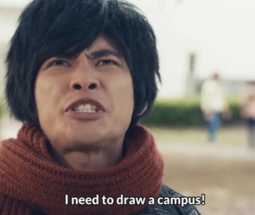
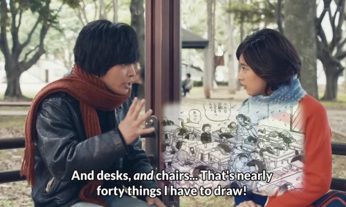
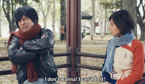
Here Em, have your sweaty OC talking to my slightly less sweaty OC.
Some people have waaaay too much time on their hands.... not that I mind in this case


Me minding my own business, drawing Fakir as a tree
My Brain: Make it an oak tree
Me looking at all the leaves I have to draw
Me: Absolutely not.


The Map
The execution
The rebellion
I keep drawing this night dad so here, another random illustrations but a story might be coming. :) The young girl with the stars is The map, the red little boy is The blood moon.
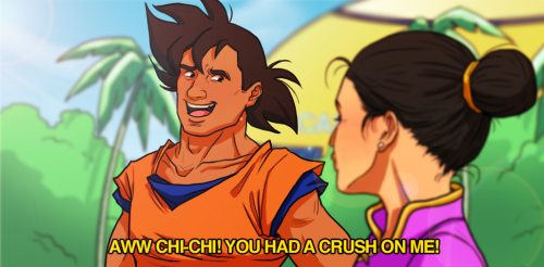
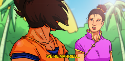
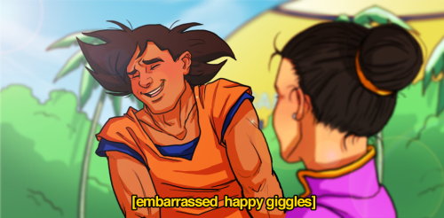
another Parks and rec/DBZ crosover just for valentine’s day!
also goku seems like the kind of husband who would awkwardly giggle like a teenager every time it’s mentioned his wife loves him even 30 years into their marriage
For Ask-this-black-rock-shooter
Art critique thing-a-ma-bobber.
(X) <-- Original Art (old link is dead :( have removed because it looks like the original artist has been hacked?) (X)<--- Wait! I found the new blog!
First of all I want to let you know that I am very impressed with your scenes! It’s often difficult to do a full body, but backgrounds too? Plus with the perspective and variety of scenes that I’m seeing here? You’re sure not taking the easy way out!
1. Speaking of perspective, in this first picture I don’t think that the angle of the girl matches the tub.
Not to say that mismatching perspective is a bad thing (in fact it can be quite rad) it just doesn’t seem intentional here.
If you lower her head more to the left, it’ll match better.

As for the picture itself, It’s really a cute concept. The idea of hanging in a tub with a boatload of duckies sounds very appealing right now. Bubbles seem like they would be an appropriate addition, but those can be a pain to draw, and they aren’t really needed.
2. Yay! Princess Tutu! I’ll start off by saying my favorite part of this is her face, it’s so serene and pleasant. (you do good work with the faces)
The leg has some strange anatomy. It’s a bit too far to the right. What I usually do when I’m drawing characters with something obscuring their legs (ie, dresses, other characters, ect) is to lightly draw the whole body, and then add whatever it is after.

Also, references are super useful. They’ve really helped me with various ballet poses.
3. Nice wideshot! I’m rather bad about practicing characters from various distances, so to see so much variety is very admirable. Her body language doesn’t seem to be that of one who has lost her papers. If you put the arms arms more to the side, then it’s easier to see how she’s come to lost them. (Also, I don’t know if you were going for a shocked expression, but i included some stuff for that too)

4. I can’t quite tell if this is supposed to be like a snowglobe, or a fortunetellers ball. (though I’m assuming snowglobe)

Also, her legs appear to be missing. (Sorry! I know that body parts tend to be undrawn whilst one is still working on the picture. It just seemed like you might be having some trouble as to where to place her lower half)

5. Hmmmmmm, I might suggest lighting up the lines on the neck because the tendons usually aren’t as pronounced unless a person is flexing them.
Other than that, I don’t really have much more to say on this one other than I’m eager to see where you go with this! She’s very mysterious, and alluring. Oh! Though, if you decide to color her I would suggest more muted colors rather than an intense pallet. (though who knows? Maybe you could pull off an amazing neon flower girl!)
6. Dis one is my favorite. It’s so whimsical, and sweet! I could totally see this in a storybook somewhere, or put in a little frame. I have no input on this one, but if you decide to work with it more, I would love to see!
7. This picture is very dramatic, from the pose to the coloring; however, I don’t think that the material used for the red does the drawing justice. (Was it crayon that was used? Maybe marker?) Water color would be preferable, but I know how that can wrinkle the paper…hmmm…. Maybe just a color pencil? Aside from coloring with a lighter touch (advice applicable for crayon, not so much for marker) I’m not sure how else to go about it. One more note. The skirt is rather flat when compared with the other fabrics in the drawing. It doesn’t need anything too extreme. Just a little upward motion would help to add a bit more harmony!

Anywhoo! I think that’s all I have to say ;) I hope that it’s helpful. I’m feeling inspired now! Keep on drawing my friend ^.^


Places to be, things to do. #pascalcampion
-
 isntitwonderland reblogged this · 2 years ago
 -
 signs-of-sleep reblogged this · 2 years ago
 -
signs-of-sleep liked this · 2 years ago
-
 hulimatii liked this · 4 years ago
 -
 dandelionnights liked this · 5 years ago
 -
 calvin-is liked this · 5 years ago
 -
 vampirepulp liked this · 5 years ago
 -
 mozart-1053 reblogged this · 5 years ago
 -
mozart-1053 liked this · 5 years ago
-
 bironism liked this · 5 years ago
 -
 mbftm reblogged this · 5 years ago
 -
 oleandera reblogged this · 5 years ago
 -
 siriusimurg liked this · 6 years ago
 -
 moonspinner reblogged this · 6 years ago
 -
 queenofasgard-stolethetardis liked this · 6 years ago
 -
 mememum reblogged this · 6 years ago
 -
 jovialearthquakesheep reblogged this · 6 years ago
 -
 nuricurry liked this · 6 years ago
 -
 the-feral-king liked this · 6 years ago
 -
 sqbr liked this · 6 years ago
 -
 nequiciose reblogged this · 6 years ago
 -
nequiciose liked this · 6 years ago
-
 child-of-hurin reblogged this · 6 years ago
 -
 starspray reblogged this · 6 years ago
 -
 cumwhizard reblogged this · 6 years ago
 -
 madtomedgar liked this · 6 years ago
 -
 gnarlysnarly reblogged this · 6 years ago
 -
gnarlysnarly liked this · 6 years ago
-
 misformarina reblogged this · 6 years ago
 -
 vardasvapors liked this · 6 years ago
 -
child-of-hurin liked this · 6 years ago
-
 nelyafinwe reblogged this · 6 years ago
 -
 mintkoh reblogged this · 6 years ago
 -
 theknightartorias reblogged this · 6 years ago
 -
cumwhizard liked this · 7 years ago
-
 dokibaesil reblogged this · 7 years ago
 -
theknightartorias liked this · 7 years ago
-
dokibaesil liked this · 7 years ago
-
 coloursandcurls liked this · 7 years ago
 -
nelyafinwe liked this · 7 years ago
-
 ghostadas reblogged this · 7 years ago
 -
 poronguita-insipida-blog reblogged this · 7 years ago
 -
poronguita-insipida-blog liked this · 7 years ago
-
 slab94 liked this · 7 years ago
 -
 pnf404 liked this · 7 years ago