Played Around With Post-it Notes And Gel Pens Again


played around with post-it notes and gel pens again
missed it :”D
More Posts from Chelsychacon and Others


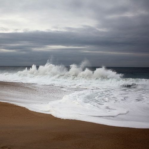
- The cold of the waves
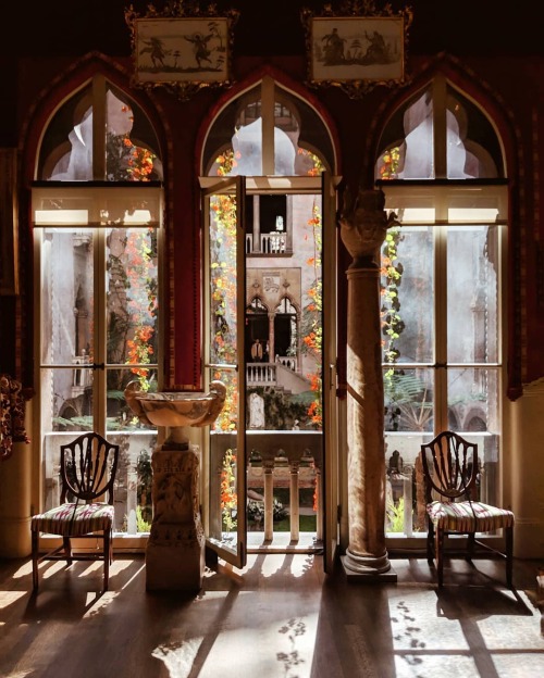
Isabella Stewart Gardner Museum, Boston, Massachusetts, by Melissa Lee


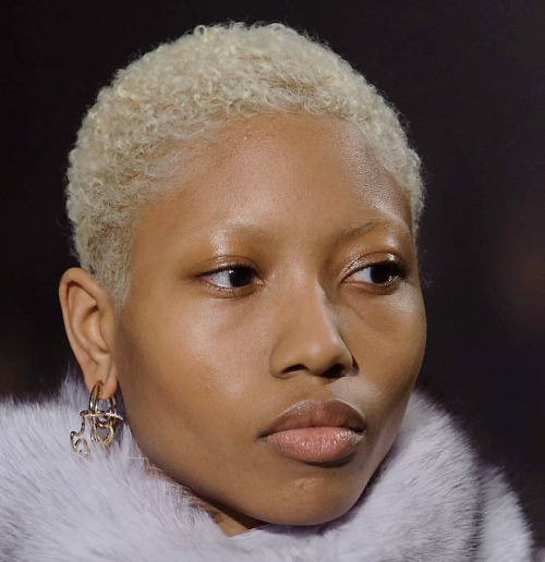
RED BLACK


So pissed off at HBO Max and Warner Brothers Discovery right now

Star-crossed
If you would like it as a print you can purchase it at my store <3
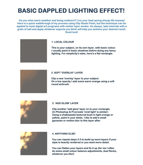

I created a quick walkthrough on my process! You can do the same with any digital art program and brushes you like. As always, learning comes with critical thinking and if you feel this does not apply to you, then no worries! There’s no correct way to do things as long as you achieve the results you want.
The technique can be customized with different brush types and colours, and can be as simple or heavily rendered as you so desire. I hope it helps a little! I like to do lighting like this in my own work for a sense of atmosphere.
Please ignore the fact I spelled complementary wrong, it’s been a long week ok lol

[image description: it's a drawing of Leia Organa as a Jedi. She's wearing all white, with a hood and a purple lightsaber. She has Silka beads hanging from the fabric that covers her head, instead of a padawan braid. End of i.d]
Enjoyed this one a little too much?

THE LAYERS CHEAT SHEET PART TWO (PART ONE HERE) Once again, I’m no expert- there are things about these layers I probably haven’t covered, so please try them out for yourself! Layers 1-7 help your contrast. They are usually a pair of the former two groups I went over in my last post. 1. OVERLAY: Helps your contrast by boosting your lights and darks, while the more mid tone pixels aren’t affected as much. It does this based on the layers beneath it. “Screens” the lights, “multiplies” the darks. 2. SOFT LIGHT: Similar to overlay, but a “softer” effect. You can think of soft light as more transparent. 3. HARD LIGHT: You can look at hard light as an intense version of overlay, with much brighter colors and a much less transparent look. 4. VIVID LIGHT: This is the heavy metal version of overlay- think of it similar to color dodge and color burn. Very intense colors, good for finding interesting lighting and color combos. 5. LINEAR LIGHT: Crazy amounts of contrast and color is added here, even more than vivid light. so heavy metal 6. PIN LIGHT: This one is interesting because besides it also being an intense contrast layer, it can add random noise to the active layer. Apparently this is a combo of the lighten blend mode on the light pixels and darken on the dark pixels, but the noise effect is what makes it really interesting imo. 7. HARD MIX: You will turn this mode on and be like “no” but it is actually adjusting its fill will reveal another overlay-ish type layer. It throws the colors on the active layer towards a more primary color such as blue, or magenta. _____ 8. DIFFERENCE: This will invert your colors, taking into account the layers below. If colors are very close, they will be black. 9. EXCLUSION: This also inverts your colors, taking into account the layers below. If colors are very close, they are grey. Exclusion and difference are layers that would be good for graphic pieces, I haven’t really gotten used to incorporating them in my painting workflow. 10. SUBTRACT: Similar to the above layers, but more intense. You will notice that the darker you make your active layer with Difference, exclusion, and subtract, the lighter and more transparent looking the result will be. 11. DIVIDE: Divide, however, usually results in crazy highlights that are pretty opaque unless the layer is fairly light, and then it will begin to go transparent. ___ 12. HUE: Makes the lower layer take on the hue of the active layer. 13. SATURATION: The lower layers take on the saturation of the active layer. 14. COLOR: The lower layers take on the color of the active layer. 15. LUMINOSITY: The lower layers take on the luminosity, or brightness, of the active layer. Once again, I’m no expert, but I hope this helps. Thanks guys! http://drawmaevedraw.tumblr.com/
-
 erikadaniela91 liked this · 2 years ago
 -
 idol-occultum-antoinette reblogged this · 3 years ago
 -
 bitratekiller reblogged this · 3 years ago
 -
 wolf-said-what-now reblogged this · 3 years ago
 -
 jyggadad reblogged this · 3 years ago
 -
jyggadad liked this · 3 years ago
-
 the-eldritch-angel reblogged this · 3 years ago
 -
 astraphage liked this · 4 years ago
 -
idol-occultum-antoinette reblogged this · 4 years ago
-
 moonythegaybee liked this · 4 years ago
 -
 leonthompsonart liked this · 4 years ago
 -
 nauseabogota liked this · 4 years ago
 -
 cotton-candy-ace reblogged this · 4 years ago
 -
 irate-rat reblogged this · 4 years ago
 -
irate-rat liked this · 4 years ago
-
 oh-fuck-a-bastard reblogged this · 4 years ago
 -
 sukesharay liked this · 4 years ago
 -
 naultville reblogged this · 4 years ago
 -
naultville liked this · 4 years ago
-
 unknown-kai liked this · 4 years ago
 -
 ghostibus liked this · 4 years ago
 -
 nikicherry1234 liked this · 4 years ago
 -
 st-tidalwave reblogged this · 4 years ago
 -
st-tidalwave liked this · 4 years ago
-
 cantrelatetotrees liked this · 4 years ago
 -
 scamguy liked this · 4 years ago
 -
 ojsartjournal liked this · 4 years ago
 -
 oldfatwarlock reblogged this · 4 years ago
 -
oldfatwarlock liked this · 4 years ago
-
 vampiremansionpoolboy-moved liked this · 4 years ago
 -
 ilikechocolatemcgee liked this · 4 years ago
 -
 corrosoin liked this · 4 years ago
 -
 fire-rose-artbloggy reblogged this · 4 years ago
 -
 fire-rose liked this · 4 years ago
 -
 hi-i-am-crescent reblogged this · 4 years ago
 -
hi-i-am-crescent liked this · 4 years ago
-
 troubledsage reblogged this · 4 years ago
 -
troubledsage liked this · 4 years ago
-
 lightningbugs2379 liked this · 4 years ago
 -
 scherryscones liked this · 4 years ago
 -
 shades-of-tedium reblogged this · 4 years ago
 -
shades-of-tedium liked this · 4 years ago
-
 asteracaeus liked this · 4 years ago
 -
 purplexiasphinx reblogged this · 4 years ago
 -
purplexiasphinx liked this · 4 years ago
-
 svenderthings liked this · 4 years ago

| Visual Developer, Character Designer & Illustrator | Feel free to contact me chelsychacon@gmail.com
224 posts