Cleaning Up My Files And Forgot That I Had All These Wing Studies From Circa. 2015 So Thought, Y’know
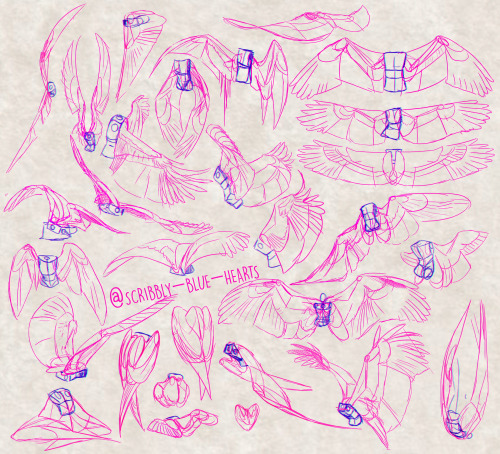

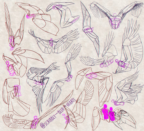


Cleaning up my files and forgot that I had all these wing studies from circa. 2015 so thought, y’know what, I don’t need to hold onto these, so have this as a little gift from me to whomst ever needs some quick wings for their OC’s, AU’s, and Art.
More Posts from Arttuti and Others
Webcomic tips
In the conclusion for now, some things I’d really recommend doing if you’re seriously considering making a webcomic (or really a comic in general). Some of these don’t really apply to strips or gag-a-day type of comics, but I’m not talking about those here.
1. Write down ideas\sketch stuff, LEGIBLY. “I’m gonna remember it later” NEVER works. And if you scribble it somewhere on a piece of paper, you’d better scan it or retype in one doc later, because tiny notes always get lost among other doodles in my skethbooks.

(i know it’s hard to keep everything clean and organized, but this mess is just not productive)
If your project is a collaboration, save your conversations. If you’re working alone, make a blog for your ramblings. You have no clue what tears of relief I cry when I open that blog and rememeber I don’t have to painstakingly look through my heaps of sketchbooks and folders for a tiny idea I’m not even sure I wrote down a few months ago.
2. Inspiration folders, or even better, inspo blog with tags also help with collecting and remembering ideas. Color schemes, landscapes, style inspirations, atmospheric stuff, maybe some photo references, all those neat things.

3. Basic tier: character design sheets. Top tier: common poses, expressions. God tier: outfits they wear throughout the comic. Holy cow tier: turnaround sheets for all those outfits.

(I’d die trying to find good pages for references without these)
4. If you haven’t finished detailing the plot, don’t even think about moving on to drawing the comic. You’re gonna regret it when you come up with a really cool plot element that can’t be incorporated anymore because you’ve already drawn all the parts you could’ve tweaked.
5. Don’t just define the plot, make a script. Writing down the lines and the brief description of the actions serves me fine:

(notice that I approximately divided the pages & the text that’d go to each panel on a page)
6. Hard mode: make thumbnails for all the pages, if possible. At least whenever a new chapter starts.
7. If your story involves some convoluted chronology shenanigans, you’d better write down the events of your timeline in the chronological order.
8. Backgrounds. You can’t avoid them, bro. Like half of the comics are backgrounds, especially if your story involves a lot of adventuring and looking around. I know it hurts, but you’ll have to become friends with them. Read some tutorials, practice on photos, go out and sketch some streets, use 3d programs (like Google Sketch) to understand the perspective, use sites like houseplans to visualize your buildings better, I don’t know. Just be prepared for their imminent evil.
9. If you’re drawing digitally, pick a brush size for the lines and stick with it. You don’t want your lines and detail levels to look all wonky and inconsistent in different panels. And I don’t mean the cool stylistic varying lines, I mean this:

Also, things on the background should have thinner and/or lighter lines to avoid distraction. Usually less details too, unless you’re making a busy background with a simple foreground to help it pop out. Or wanna draw the attention to an object on the bg.

10. Readable fonts. Even if you chose to ignore people with poor sight or dyslexia, the majority of your readers aren’t gonna be excited about struggling to decypher this:

Also, as much as I love my black speech bubbles, colorful text on black still kinda hurts the eyes. I wouldn’t recommend doing that for all the characters. Black speech bubbles are usually used for creepy, inhuman voices. And yes, having a colorful outline in this case helps.
11. Probably newsflash, but did you know that panels have their place, order and functions? They do! My favourite thing ever is how I used panels when I was like 12:

(comics ain’t rocket science, but this one is)
The composition of the panels and word balloons always serve for a better reading experience. They guide your eyes over the page, so that you never feel lost or confused. The images in the comic equal frames in a movie, so it’s pretty damn important in what order you look at things and how quickly you can understand what’s going on!

(Eric Shanower & Scottie Young’s Wizard of Oz)
12. One update a week is fine for testing waters. Don’t overestimate yourself, especially if you have a pretty busy life outside it. A stable comic that updates slowly, but regularly is better than an unpredictable erratic one. You can always pick up the pace later, if you feel confident enough.
13. Try to always have a buffer - a couple of pages in reserve. If you’re making the pages much faster than you’re updating, this shouldn’t be a problem. But if those paces are equally the same, it’s goddamn HARD. But on the other hand, if something happens and you skip an update, those come in handy.
If you’re looking at this list and thinking “wow that’s a LOT of work”, you’re totally right. And it’s okay to be intimidated at first! But that’s why it’s important to start with something small. Once you get the formula down, these things will be natural to you.
How I Animate

The Technique:
I draw the frames and then I use the liquify tool to push the lines into the next frame and redraw them where I need to. This allows me to keep the lines consistent, but gives me the control of frame by frame animation bc I am still making each frame manually! I also use 3d models as reference to help me with the angles! Super important to use reference while you animate (and with art in general), if youre no good handling 3d models then act it out and record yourself!

The Theory:
i think most people are at least loosely familiar with the 12 principles of animation (if youre not, heres a 2.5 minute video showcasing them!), but may not necessarily know how to employ them. the main 3 i tend to focus on when I animate is rhythm, telegraphing, and inertia so ill cover those there 👍
1. Timing & Rhythm
Timing is how you space out your frames both in how long an individual frame is held for, and also when you drawn an inbetween of two frames you can favour one frame slightly more than the other instead of drawing the exact average of the cels, giving the favoured cel more timing weight.

Left line has the cels evenly spaced out on the timeline, right holds the first cel for longer and the second cel slightly favours the last frame. It creates a more interesting rhythm to the animation! Rhythm is how I think of animation timing. Theres a beat like a song to every animation I make, and creating an interesting beat is what makes an animation fun to watch (for me, anyway):

2. Anticipation / Telegraphing

Before I animate a big change in movement, I like to telegraph that its coming. Usually this is doing a little counter movement in the opposite direction, but thats not the only way to telegraph a motion, e.g. eye movement can telegraph a head turn!

3. Follow-through / Overshoot / Inertia


Unless the movement is mechanical, it wont come to a hard stop and will have some level of bounce or easing out to it. How much "bounce" you add will have a big impact on how the animation feels, but a very subtle bounce will add a natural feeling to the end of a motion.

Secondary animations will use a lot of this, note that the head and the hand have a small amount of continuous motion (primary animation), and then the hair has a lot of bounce and inertia (secondary animation which reacts to the primary animation). Note the different amounts applied to the braid vs the sideburn vs the bangs
anyway! I hope this was insightful ❤️ if you like my art you can commission me by the by :)
![Title card reading: [Storyboarding Basics. Brought to you by NU Animation Club, March 23 2023]. There is a chibi drawing of Feeb drawing on a CINTIQ](https://64.media.tumblr.com/1bb4994121212e48c92ee88de5cbe45d/8f6b9c73271b12ac-28/s500x750/efeaa63ce1f755c3643a35f0973a68f1f1057236.png)


a couple snippets from a presentation i gave at school this past week on storyboarding!!
‼️DISCLAIMER: I am still a student and have only worked on student and indie projects! This is just stuff that I personally find helpful as an amateur, so feel free to take it with a grain of salt!
Happy boarding, friends! ✍️💕
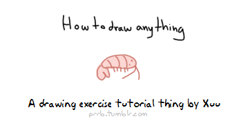
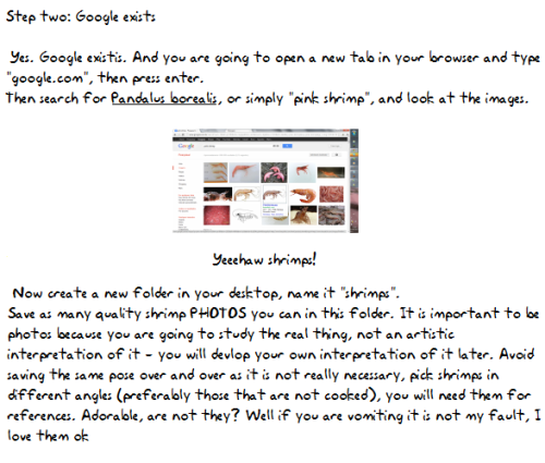

How I pratice drawing things, now in a tutorial form. The shrimp photo I used is here Please support me on patreon so I can make more tutorials! :)


Do you find drawing environments overwhelming? I did too, for a really long time. I started out drawing characters, and making the switch to painting environments was really hard at first! In my latest patreon tutorial, I break down the process into the most basic and essential steps, so that you don’t get lost in the details and know exactly what to focus on. Find it here for just $5: patreon.com/loish


Hey just thought I'd let you know you have some of the best artwork I've ever seen! Congrats! Especially Chirrut, he's amazing in your style! I was also wondering if you had any advice on how to draw heads and eyes? They're one of my two biggest struggles and I'd love it if I could get your advice. Anything helps. Thank you and I hope you have a fantastic day!
*_* Thanks a bunch askdh and thanks for taking the time to write me! I had a lot of fun working on Chirrut ;;;
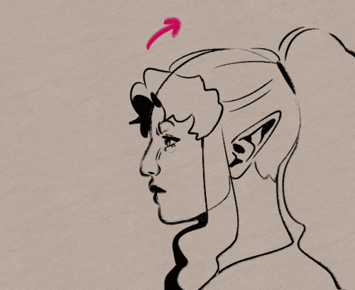
Hmmm I usually think it’s not useful to explain how I make eyes or noses, since the way to draw them changes depending on the pose… My advice would be practicing with ¾ heads. That view always force you to work volumetric shapes and also give a lot more of information. Also, I think it’s much more easy since you have more landmarks to help you.
I would also say consulting anatomy to identify the landmarks on the face (zygomatic and nasal bone , superciliary arch, mandible…) and practice on photos. Using references for drawing is not bad and drawing over photos when you need information of a face is a lot of fun. Is not necessary to draw all the bones, but knowing where the volumes and principal shapes are can help you learn. I.E:

I love that photo because it’s SO SO easy to see the volumetry of the face; just the line of the jaw gives you a lot of informacion about it. And it makes it easy to identify the elements and principal shapes of the head:

(I broke his nose, I’m sorry, but I made this quickly (??)) the point is, take your time to study the lines and understand the anatomy.Also:

that triangle is very helpful too and could help you placing the principal elements. The lines that make him look like he’s crying (?) are the relation between the eyes and the mouth and are very helpful when placing it.
Again, this is only a way to learn and understand how to build a face. That is always the key, even if you use a cartoon style. Rules can be broken, but I think it’s important to understand them first. It could help you make your style more solid.
And well, once you’ve studied it from photos, trying it on your own (even if you have references, that’s ok) and practice, practice u3u
Hope this helps and hope it’s not too technical ;;;
-
 moths-reblog reblogged this · 3 weeks ago
 -
 im-just-heere liked this · 3 weeks ago
 -
 bydofox liked this · 1 month ago
 -
 ink3d-feathers liked this · 1 month ago
 -
 xombriakepler liked this · 1 month ago
 -
 andromeda-gay liked this · 1 month ago
 -
 lambsoul liked this · 1 month ago
 -
 nova-o-heart reblogged this · 1 month ago
 -
 dndrat liked this · 1 month ago
 -
 fourentiredogs liked this · 1 month ago
 -
 otissa-huy liked this · 1 month ago
 -
 bells-missing-sanity liked this · 1 month ago
 -
 tamas-and-the-clowns-sol-left liked this · 1 month ago
 -
 j-nor liked this · 1 month ago
 -
 andtoioop liked this · 1 month ago
 -
 satwo reblogged this · 1 month ago
 -
 laughysaffy-skies reblogged this · 1 month ago
 -
laughysaffy-skies liked this · 1 month ago
-
 skiddknee liked this · 1 month ago
 -
 lil-fuzzy-hoodie liked this · 1 month ago
 -
 gamerxchan liked this · 1 month ago
 -
 moronicprincess reblogged this · 1 month ago
 -
 lootboxing liked this · 1 month ago
 -
 pileofshitnerd liked this · 2 months ago
 -
 morbaer liked this · 2 months ago
 -
 a10wea reblogged this · 2 months ago
 -
 duelfeather-art liked this · 2 months ago
 -
a10wea liked this · 2 months ago
-
 jhunhuujj liked this · 2 months ago
 -
 peryshki liked this · 2 months ago
 -
 acidicleafbat liked this · 2 months ago
 -
 criwbcake liked this · 2 months ago
 -
 blue-reimu reblogged this · 2 months ago
 -
 xxcringecake69xx liked this · 2 months ago
 -
 dangerousangerissue liked this · 2 months ago
 -
 stormnightshade liked this · 3 months ago
 -
 wingedrat reblogged this · 3 months ago
 -
 frogfishwastaken liked this · 3 months ago
 -
 strawberrypie53 liked this · 3 months ago
 -
 ketchupshots liked this · 3 months ago
 -
 just-a-small-little-guy reblogged this · 3 months ago
 -
just-a-small-little-guy liked this · 3 months ago
-
 lapislaputa reblogged this · 3 months ago
 -
 darthbloodorange reblogged this · 3 months ago
 -
 ratdisc liked this · 3 months ago
 -
 psrj liked this · 3 months ago
 -
 mewoc reblogged this · 3 months ago
 -
sittadehl reblogged this · 3 months ago
-
 kiwi-of-war liked this · 3 months ago
