Hips Tutorial by Bokuman


Hips Tutorial by bokuman
Support the artist on Patreon!
More Posts from Arttuti and Others
can you give a run down on skintones?
PART ONE: COLOR SELECTION.
In painting skin tones, a lot of the time I see people choose colors that are over-saturated or unbalanced. There isn’t really an exact art to this that I can explain—you just need to get a feel for what saturation balance you need for that particular skintone. Here are some examples of what I usually pick.

As you can see, I used different base colors (orange, reddish, yellow) for the skin shades in all three examples. The reason for this is because all skin tones have a different base color besides just Light, Medium, and dark. Some people divide them into categories of “warm” and “cool.” Pantone has some really good examples and references for this.

PART TWO: COLOR VARIATION.
Another big part about drawing and painting skin tones that a lot of people forget is how skin thickness affects color variation. The presence of bone, blood, and muscle underneath the skin affects its colors. This is especially noticeable on the face.

The colors here are a little exaggerated to show my point, but with a little adjusting and blending…

Voila! Subtle, but more realistic.
PART THREE: DETAILS.
Our skin is the largest organ on our body, and as our body’s first line of defense against the outside world, it’ll be covered with tiny details and imperfections. Things like sunburns, tans, freckles, scars, and facial hair all add character to your subject matter. Here are some examples!
TANS: Everyone tans differently, depending on your ethnicity and skin tone. Fair skinned folks tend to burn more than tan, which means you’ll need a more startling, eye-catching red.If you have a skin type that tends to tan more, the color will be more brown than red. For black skin tones, the tan is less red. (And while we’re on the subject: black people DO tan, so it’s important for you to put on sunscreen and be careful in the sun, too.)

Those are the areas that the sun tends to hit the most—and things like goggles, hats, and masks can change the shape of that area.
FRECKLES AND MOLES: Freckles are also products of the sun. Some people have freckles that stay year-round, while others have freckles that fade in the winter and return in the summer. Moles are skin cells that grow in a cluster instead of being spread throughout the skin. When exposed to the sun, they tend to darken. (Another note on skin health: if you have any oddly-shaped/colored moles, moles that have changed color, size, or shape, or anything of the sort, please check with your doctor!)
Freckles like to cluster around each other, sort of like stars, and they vary greatly in size. You can have a few freckles in one place, or a lot of freckles in multiple places. Most commonly freckled areas are your face, shoulders and neck, back, and forearms.

FACIAL HAIR: Facial hair also affects the colors of the face. For simplicity’s sake we’ll be using black hair, as it is the most noticeable. Facial hair usually grows in these areas, and can make the skin look blueish/grayish because of the darker hairs beneath the skin. If your hair is red, this also very noticeable.

END NOTE.
There you go! That’s about all I can think of at the moment for skin tones. As always, references and practice are your best friend (and so is this neat little trick that pheberoni has.) Good luck with your arting!
Your art is so good !!! How do you color the skin its soo smooth
Thank you very much Anon ( ̄ε ̄@)hehehe!!Well I have some shots of one of my recent drawings so I’ll try to explain it a little bit hhahahah


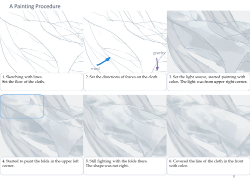
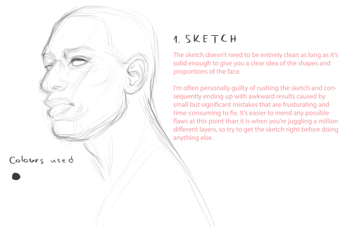
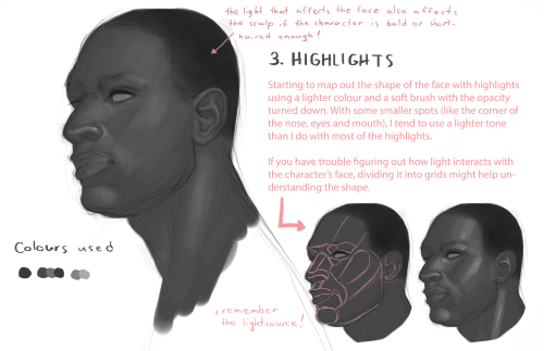
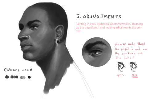
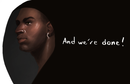
Basically what I do is: 1. Put on base color2. Add some light shadows (They don’t even have to look very smooth, like the images above) 3. Then I start adding some darker shades of color and different skin tones to give it the correct shape, at this point I start adding some brighter tones, so yeah, they usually look very messy at this point. My brushstrokes also look like crosses or some sort on this step I think (I do it like that ‘cuz I think it’s easier to merge the colors later, at least for me hehehe) 4. Aaaand at the end, to merge the colors and make them look smoother I use a soft brush with low opacity to add some light shadows and brighter tones on bigger areas, I also try to use almost the same tones I used on the step three so it can merge nicely.So yeah, I think that’s about it (〜 ̄△ ̄)〜I hope I helped you out with that <3
Sorry if someone has already asked this but can you show us a colouring tutorial please?

ya take a babi

color da babi

make a fuckin uhhh multiply/shade layer then u take ur fuckin sai marker brush
pick a shading color or something

cel shade that motherfucker
but be messy with it, literally just go fucking ham, dont be too precise and don’t make it look so clean
ysee that residue there? yea man, it looks really messy but it also kinda looks like a painting right

make a screen/luminosity layer on top of the multiply layer
then ya pick a lighting color

then u do the same thing as earlier

bam you got,,, a child
this is the simple n easy way i do it, i got more complicated ways but hewe u go
OH YEAH HERE’S MY PEN SETTINGS
-
 crookednerddream liked this · 3 months ago
 -
 lestats-groupie liked this · 4 months ago
 -
 qqumka liked this · 4 months ago
 -
 creampuff18 liked this · 5 months ago
 -
 lmasterlong liked this · 5 months ago
 -
 loveasachoice liked this · 5 months ago
 -
 xxcuboidxx liked this · 6 months ago
 -
 tamobomb001 liked this · 6 months ago
 -
 yellowmoth liked this · 6 months ago
 -
 helloliriels liked this · 7 months ago
 -
 saith707 liked this · 8 months ago
 -
 haji-lin liked this · 1 year ago
 -
 artreferencesarchive reblogged this · 1 year ago
 -
 minihayalet320 liked this · 1 year ago
 -
 artrefsntutos reblogged this · 1 year ago
 -
 poppyglide liked this · 1 year ago
 -
 mar-chive reblogged this · 1 year ago
 -
 fracturedsombra liked this · 2 years ago
 -
 nopetorm64 liked this · 2 years ago
 -
 xqdormir liked this · 2 years ago
 -
 gwodricsworld liked this · 2 years ago
 -
 sylmitsu2 liked this · 2 years ago
 -
 floatinglilo reblogged this · 2 years ago
 -
 hydrangeahelper liked this · 2 years ago
 -
 sunnyqup reblogged this · 2 years ago
 -
 tinysoulz liked this · 2 years ago
 -
 tamethespaghetti liked this · 2 years ago
 -
 6jelene9 liked this · 3 years ago
 -
 mess-in-public liked this · 3 years ago
 -
 undertalenobody liked this · 3 years ago
 -
 lilthz-references reblogged this · 3 years ago
 -
 lxvesiickprince liked this · 3 years ago
 -
 tealeo reblogged this · 3 years ago
 -
 artdumppile reblogged this · 3 years ago
 -
 the-fancy-cookie liked this · 3 years ago
 -
 limikkin liked this · 3 years ago
 -
 tutoriarts reblogged this · 3 years ago
 -
 artdumppile reblogged this · 3 years ago
 -
 sylphy liked this · 4 years ago
 -
 05050301 liked this · 4 years ago
 -
 arundolyn liked this · 4 years ago
 -
 crimsonviking95 liked this · 4 years ago
 -
 jayonette reblogged this · 4 years ago


