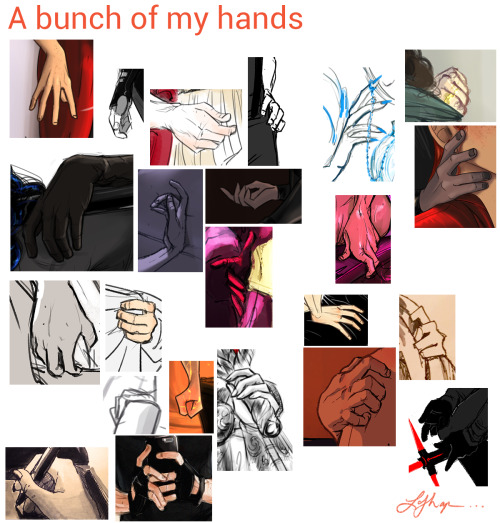
5 Min Tutorial For Trcelyne, Hope It Helps!


5 min tutorial for trcelyne, hope it helps!
More Posts from Arttuti and Others


THANK YOU! ANON!
I stopped the coloring of the shirt here cause I guess you get the basic idea. If you wanna see more of the coloring and the brush I use you can look HERE! Also you can see how not just folds but shading can define a form HERE!
I hope this helps! I’m so bad with words and explaining things (/)//(/)


Webcomic tips
In the conclusion for now, some things I’d really recommend doing if you’re seriously considering making a webcomic (or really a comic in general). Some of these don’t really apply to strips or gag-a-day type of comics, but I’m not talking about those here.
1. Write down ideas\sketch stuff, LEGIBLY. “I’m gonna remember it later” NEVER works. And if you scribble it somewhere on a piece of paper, you’d better scan it or retype in one doc later, because tiny notes always get lost among other doodles in my skethbooks.

(i know it’s hard to keep everything clean and organized, but this mess is just not productive)
If your project is a collaboration, save your conversations. If you’re working alone, make a blog for your ramblings. You have no clue what tears of relief I cry when I open that blog and rememeber I don’t have to painstakingly look through my heaps of sketchbooks and folders for a tiny idea I’m not even sure I wrote down a few months ago.
2. Inspiration folders, or even better, inspo blog with tags also help with collecting and remembering ideas. Color schemes, landscapes, style inspirations, atmospheric stuff, maybe some photo references, all those neat things.

3. Basic tier: character design sheets. Top tier: common poses, expressions. God tier: outfits they wear throughout the comic. Holy cow tier: turnaround sheets for all those outfits.

(I’d die trying to find good pages for references without these)
4. If you haven’t finished detailing the plot, don’t even think about moving on to drawing the comic. You’re gonna regret it when you come up with a really cool plot element that can’t be incorporated anymore because you’ve already drawn all the parts you could’ve tweaked.
5. Don’t just define the plot, make a script. Writing down the lines and the brief description of the actions serves me fine:

(notice that I approximately divided the pages & the text that’d go to each panel on a page)
6. Hard mode: make thumbnails for all the pages, if possible. At least whenever a new chapter starts.
7. If your story involves some convoluted chronology shenanigans, you’d better write down the events of your timeline in the chronological order.
8. Backgrounds. You can’t avoid them, bro. Like half of the comics are backgrounds, especially if your story involves a lot of adventuring and looking around. I know it hurts, but you’ll have to become friends with them. Read some tutorials, practice on photos, go out and sketch some streets, use 3d programs (like Google Sketch) to understand the perspective, use sites like houseplans to visualize your buildings better, I don’t know. Just be prepared for their imminent evil.
9. If you’re drawing digitally, pick a brush size for the lines and stick with it. You don’t want your lines and detail levels to look all wonky and inconsistent in different panels. And I don’t mean the cool stylistic varying lines, I mean this:

Also, things on the background should have thinner and/or lighter lines to avoid distraction. Usually less details too, unless you’re making a busy background with a simple foreground to help it pop out. Or wanna draw the attention to an object on the bg.

10. Readable fonts. Even if you chose to ignore people with poor sight or dyslexia, the majority of your readers aren’t gonna be excited about struggling to decypher this:

Also, as much as I love my black speech bubbles, colorful text on black still kinda hurts the eyes. I wouldn’t recommend doing that for all the characters. Black speech bubbles are usually used for creepy, inhuman voices. And yes, having a colorful outline in this case helps.
11. Probably newsflash, but did you know that panels have their place, order and functions? They do! My favourite thing ever is how I used panels when I was like 12:

(comics ain’t rocket science, but this one is)
The composition of the panels and word balloons always serve for a better reading experience. They guide your eyes over the page, so that you never feel lost or confused. The images in the comic equal frames in a movie, so it’s pretty damn important in what order you look at things and how quickly you can understand what’s going on!

(Eric Shanower & Scottie Young’s Wizard of Oz)
12. One update a week is fine for testing waters. Don’t overestimate yourself, especially if you have a pretty busy life outside it. A stable comic that updates slowly, but regularly is better than an unpredictable erratic one. You can always pick up the pace later, if you feel confident enough.
13. Try to always have a buffer - a couple of pages in reserve. If you’re making the pages much faster than you’re updating, this shouldn’t be a problem. But if those paces are equally the same, it’s goddamn HARD. But on the other hand, if something happens and you skip an update, those come in handy.
If you’re looking at this list and thinking “wow that’s a LOT of work”, you’re totally right. And it’s okay to be intimidated at first! But that’s why it’s important to start with something small. Once you get the formula down, these things will be natural to you.
Stumbled across your art recently, and I totally admire your work! As a complete noob to the digital art scene, I'd just like to ask whether you have any tips on colour picking (like for skin tones, under varied/dramatic lighting and such!). I have a ton of other things I want to ask, but I'll limit myself to one question and then try to google the rest, haha/ Thanks for sharing your art with us! ^^
ahh thank you so much! ♥ welcome to the digial art scene friend, i hope you enjoy your stay and ctrl + z
now onto your question! (if you don’t know what layer and layer modes are and how they generally work you should probably google that before you continue reading)
we all perceive colour differently (thx science) and i trust my intuition a lot when it comes to colour picking because of that, and also because i feel like you can make pretty much every colour combination work within the right context. context is key! but still, remember that all of this is about how i perceive colour, so you might not agree with everything i say.

here’s a quick rundown of terms you’ll see around a lot in reference to colours and shading: the hue, which is the ‘colour’ itself, the saturation aka the intensity, and the brightness [or value] which describes how dark or bright we perceive a colour to be.
rule of thumb: when you shade don’t just add black (or white) to your base colours, that will make your drawings boring and lifeless. use different hues and saturation!
now first things first: which skin colour does the character have?

you’ll mostly be navigating in the red to yellow spectrum for the skin tone. so when i pick the base colours i usually start with the skin and adjust the rest of the colours accordingly. if you’re not sure where to begin it might help if you first determine the values (brightness) of the base colours in grayscale.
and here are a few colour variations—i stuck to the approximate values but played around with a lot of different hues and levels of saturation.
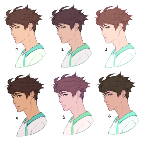
now compare 3 and 5: you’ll notice that 3 is very bright and leans towards orange hues, whereas 5 has a pinkish tint.

on the left i gave 5 the hair colour of 3 and in my opinion the pink hue of the skin doesn’t go well with the orange undertone of the hair. you’ll have to experiment a lot to find out which combinations work for you.
ctrl + u is your biggest friend (or image >> adjustments >> hue/saturation in photoshop, the shortcut works in sai and clip studio paint too). play with the sliders and see what happens. i do that a lot myself, because it’s easier to coordinate the colours like that afterwards instead of trying to manually pick perfectly matching ones right away.
for further adjustments i like to use an extra semi-transparent layer on top of everything with just a single colour to add atmospheric light. this unifies the colours and makes them more harmonious, if that’s what you’re looking for. this is about as far as i’d go if i didn’t want to shade the drawing.

if i do want to shade, especially with high contrasts and dramatic light, i darken the base by just adding an additional black layer, here set to 40% opacity. of course you could add a colour layer like the ones i mentioned previously too.


to create an impression of dramatic light you need a high contrast between light and dark areas (1). if i want additional visual intrest i often add secondary light which falls onto the main shadow areas. here i picked a faint greenish blue to balance out the yellow (2). and since light is at least partially reflected when it hits a surface you should add a faint glow that goes across the shadow/light border. i uses a mid-brown with a very soft brush on a layer set to overlay here (3).
for this shading style i like to use the layer mode colour dodge with lowered opacity + fill settings. for some layer modes opacity and fill do the exact same thing (e.g. for multiply or screen). however for colour dodge there’s a big difference:

a lowered opacity merely alters the transparency of the entire layer. that looks pretty awful sometimes, because the bright orange affects the dark of the hair much more intensely than the already brighter skin. but when you lower the fill percentage you primarily lower the amount of light that falls onto darker colours. so the layer’s opacity setting treats every colour equally whereas the fill setting takes their values into consideration. it might be hard to understand if you don’t try it out yourself, so just play around to get a feel for how it works!
and to summarise, here’s a process gif:

colour is an extremely big topic and i’ve only barely scratched the surface but i hope that still helped you out a little! the fastest way to learn is always to try things yourself, so grab a sketch and experiment. 👍

I'm so excited to announce Loish's Digital Art School! I've been working on this for a long time and I'm so glad I can finally share it with you all. This is for those of you who are looking for brushes, tutorials, and other super helpful learning content!
Loish's Digital Art School is a collection of resources for digital artists that includes video tutorials, brushes, palettes, challenges, and more. Most importantly, it’s free! I know how important it is to have access to helpful information, especially if you’re self-taught. To get access, just head on over to Loish.School ❤️
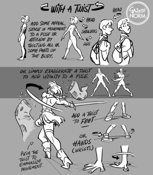
Tuesday Tips - With a Twist! Add some vitality to a pose by twisting parts of the body. A little or a lot. Give it a shot. #Norm #100tuesdaytips #WithATwist #grizandnorm #arttips #arttutorial
-
 papasyapperia liked this · 3 weeks ago
 -
 swordfolio liked this · 3 weeks ago
 -
 kagayakukagavaku liked this · 3 weeks ago
 -
 potatoshoe liked this · 3 weeks ago
 -
 dendrogynous reblogged this · 3 weeks ago
 -
dendrogynous liked this · 3 weeks ago
-
 graphx reblogged this · 3 weeks ago
 -
 stabbyhobbit reblogged this · 3 weeks ago
 -
 verathena14 liked this · 3 weeks ago
 -
verathena14 reblogged this · 3 weeks ago
-
 petrabraveheart liked this · 3 weeks ago
 -
 marinecorvid liked this · 3 weeks ago
 -
 drawing-dinos82 reblogged this · 3 weeks ago
 -
 aria-hannah reblogged this · 3 weeks ago
 -
aria-hannah liked this · 3 weeks ago
-
 violethowler reblogged this · 3 weeks ago
 -
 elbowsmelbow liked this · 3 weeks ago
 -
 lokidokeyartichoki reblogged this · 3 weeks ago
 -
 starsandatoms liked this · 3 weeks ago
 -
 gravesend666 liked this · 3 weeks ago
 -
 oxbellows liked this · 3 weeks ago
 -
 chaoticbooklesbian reblogged this · 3 weeks ago
 -
 breecoleur reblogged this · 3 weeks ago
 -
 firebreathingkoifish reblogged this · 3 weeks ago
 -
 micahdodoodles liked this · 3 weeks ago
 -
 42firedrift reblogged this · 3 weeks ago
 -
42firedrift liked this · 3 weeks ago
-
 the-fandom-hopping-mage reblogged this · 3 weeks ago
 -
 starstuffatsea liked this · 3 weeks ago
 -
 estrellukyperiwinkle reblogged this · 3 weeks ago
 -
 ihavenofac3 liked this · 3 weeks ago
 -
 fairfield-sun liked this · 3 weeks ago
 -
 bajuuuu reblogged this · 3 weeks ago
 -
bajuuuu liked this · 3 weeks ago
-
 thenerdestsquirrel liked this · 3 weeks ago
 -
 reeama-the-mage reblogged this · 3 weeks ago
 -
 great-exhibition-of-1851 liked this · 3 weeks ago
 -
 forthefearofme reblogged this · 3 weeks ago
 -
 rana-sentimental reblogged this · 3 weeks ago
 -
firebreathingkoifish liked this · 3 weeks ago
-
rana-sentimental liked this · 3 weeks ago
-
 ask-geralt reblogged this · 3 weeks ago
 -
ask-geralt liked this · 3 weeks ago
-
 tragedy-machine reblogged this · 3 weeks ago
 -
tragedy-machine liked this · 3 weeks ago
-
 miyakitt reblogged this · 3 weeks ago
 -
 gemystarlightdreamer liked this · 3 weeks ago
 -
 klauuyt liked this · 4 weeks ago
