Writing References: Character Development
Writing References: Character Development
50 Questions ⚜ "Well-Rounded Character" Worksheet
Basics: How to Write a Character ⚜ A Story-Worthy Hero
Basics: Character-Building ⚜ Character Creation
Key Characters ⚜ Literary Characters ⚜ Morally Grey Characters
Personality Traits
5 Personality Traits (OCEAN) ⚜ 16 Personality Traits (16PF)
600+ Personality Traits
East vs. West Personalities ⚜ Trait Theories
Tips/Editing
Character Issues
Character Tropes for Inspiration
Tips from Rick Riordan
Writing Notes
Allegorical Characters
Binge ED
Childhood Bilingualism ⚜ Children's Dialogue ⚜ On Children
Culture ⚜ Culture: Two Views ⚜ Culture Shock
Emotional Intelligence ⚜ Genius (Giftedness)
Emotions ⚜ Anger ⚜ Fear ⚜ Happiness ⚜ Sadness
Facial Expressions
Fantasy Creatures
Happy/Excited Body Language ⚜ Laughter & Humor
Hate ⚜ Love
Health ⚜ Frameworks of Health
Identifying Character Descriptions
Jargon ⚜ Logical Fallacies ⚜ Memory
Mutism ⚜ Shyness
Parenting Styles
Psychological Reactions to Unfair Behavior
Rhetoric ⚜ The Rhetorical Triangle
Swearing & Taboo Expressions
Thinking ⚜ Thinking Styles ⚜ Thought Distortions
Uncommon Words: Body ⚜ Emotions
Voice & Accent
Writing References: Plot ⚜ World-building
More Posts from Ardouradvice and Others
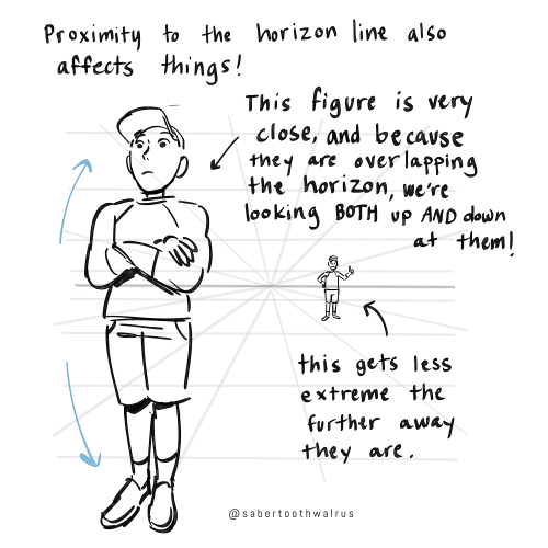
Someone has probably already asked you this but do you have any tips on studying/understanding perspective? I keep trying to find resources to learn but none of them really stick or are actually useful
so I'm hoping that your issue isn't just figuring out the difference between 1-point, 2-point, and 3-point perspective and how it works, because there are tons and tons of resources available for that, and I'm guessing what people tend to get tripped up on is what you're supposed to be doing with your grid.
I'm definitely far from being an expert on understanding perspective, but I'll share some of the things that helped ME finally Get It.


Things like eye level and different camera angles can be a GREAT tool to use when doing a comic or storyboard between multiple characters of different heights!! I actually drew an example of this exact thing for a friend about a month ago (I used adventure time characters bc they're easy to draw and have a good height variety):
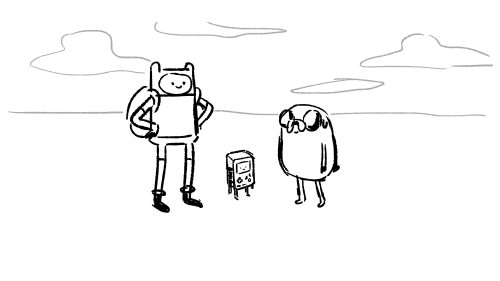
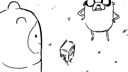


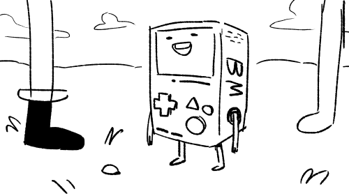
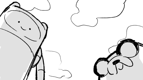
You can use camera angles like this to add variety to your shots, and even use it to help convey something emotional (using a down-shot on a character to show that they FEEL small, use an up-shot on a character to make them look more intimidating, etc etc)
hope this helps!

STOP DOING THIS IN INJURY FICS!!
Bleeding:
Blood is warm. if blood is cold, you’re really fucking feverish or the person is dead. it’s only sticky after it coagulates.
It smells! like iron, obv, but very metallic. heavy blood loss has a really potent smell, someone will notice.
Unless in a state of shock or fight-flight mode, a character will know they’re bleeding. stop with the ‘i didn’t even feel it’ yeah you did. drowsiness, confusion, pale complexion, nausea, clumsiness, and memory loss are symptoms to include.
blood flow ebbs. sometimes it’s really gushin’, other times it’s a trickle. could be the same wound at different points.
it’s slow. use this to your advantage! more sad writer times hehehe.
Stab wounds:
I have been mildly impaled with rebar on an occasion, so let me explain from experience. being stabbed is bizarre af. your body is soft. you can squish it, feel it jiggle when you move. whatever just stabbed you? not jiggly. it feels stiff and numb after the pain fades. often, stab wounds lead to nerve damage. hands, arms, feet, neck, all have more motor nerve clusters than the torso. fingers may go numb or useless if a tendon is nicked.
also, bleeding takes FOREVER to stop, as mentioned above.
if the wound has an exit wound, like a bullet clean through or a spear through the whole limb, DONT REMOVE THE OBJECT. character will die. leave it, bandage around it. could be a good opportunity for some touchy touchy :)
whump writers - good opportunity for caretaker angst and fluff w/ trying to manhandle whumpee into a good position to access both sites
Concussion:
despite the amnesia and confusion, people ain’t that articulate. even if they’re mumbling about how much they love (person) - if that’s ur trope - or a secret, it’s gonna make no sense. garbled nonsense, no full sentences, just a coupla words here and there.
if the concussion is mild, they’re gonna feel fine. until….bam! out like a light. kinda funny to witness, but also a good time for some caretaking fluff.
Fever:
you die at 110F. no 'oh no his fever is 120F!! ahhh!“ no his fever is 0F because he’s fucking dead. you lose consciousness around 103, sometimes less if it’s a child. brain damage occurs at over 104.
ACTUAL SYMPTOMS:
sluggishness
seizures (severe)
inability to speak clearly
feeling chilly/shivering
nausea
pain
delirium
symptoms increase as fever rises. slow build that secret sickness! feverish people can be irritable, maybe a bit of sass followed by some hurt/comfort. never hurt anybody.
ALSO about fevers - they absolutely can cause hallucinations. Sometimes these alter memory and future memory processing. they're scary shit guys.
fevers are a big deal! bad shit can happen! milk that till its dry (chill out) and get some good hurt/comfort whumpee shit.
keep writing u sadistic nerds xox love you
ALSO I FORGOT LEMME ADD ON:
YOU DIE AT 85F
sorry I forgot. at that point for a sustained period of time you're too cold to survive.
pt 2
also please stop traumadumping in the notes/tags, that's not the point of this post. it's really upsetting to see on my feed, so i'm muting the notifs for this post. if you have a question about this post, dm me, but i don't want a constant influx of traumatic stories. xox


just saw another fic that completely misunderstood elementary schoolers. going to make a post as soon as my shift is done
Quick editing tip: Passing time
Hey all, here’s a quick tip about showing the passage of short amounts of time in a scene. I see a lot of beats like this:
She hesitated
He paused
A few seconds later
There was a long silence
He waited for her to answer
She didn’t respond
Instead of telling us there’s a brief moment of silence or pause in your scene, try showing us by creating the feeling that time has passed through action, description, or inner monologue. Here are a few examples.
Before:
“Are you coming or not?”
He waited for her to answer, but she didn’t respond.
“Clare? Did you hear me?”
“Huh?”
After:
“Are you coming or not?”
Clare scrolled through her phone, her face illuminating with a eerie blue glow.
“Clare? Did you hear me?”
“Huh?”
Before:
Jared lingered at the suspect’s front gate. If this guy didn’t answer Jared’s questions, he was screwed.
“Hey you!” a voice shouted. “Get off my property!”
Jared hesitated. Finally, he turned to face the man. “I’m afraid I can’t do that.”
After:
Jared lingered at the suspect’s front gate. If this guy didn’t answer Jared’s questions, he was screwed.
“Hey you!” a voice shouted. “Get off my property!”
Jared patted his holster. He had a gun, but he certainly didn’t want to use it. Taking a deep breath, he turned to face the man. “I’m afraid I can’t do that.”
Not only does creating a pause instead of describing a pause allow your reader to feel the moment more vividly, it gives you a chance to explain what exactly that pause is about. People hesitate, pause, don’t respond, etc. for all kinds of reasons. Give us as much insight as you can into your weird quiet moment.
Of course, you don’t need to do this every single time. Sometimes it’s fine to say “he paused” or “the room was quiet for a moment”—it could be the best choice for that scene. But look back through your draft and see if you’ve used those “telling” descriptions more often than you needed to. If so, try to create the feeling of a pause—perhaps one that gives the reader a bit more information—using these techniques.
Hope this helps!
Hi pigs "whale yuri Wednesday" with wings!!! I think the colors in your art are very cute nd i was wondering if you have a method with picking them? I struggle a lot with color picking when i dont have smth to work off of!
Also not an ask but you should post more about your original art/reblog it!! ocs too!! :]
well!! i don't have a specific method most of the time I'm eyeballing all of that!! but i can give some general tips on how i personally pick colours...
also: thank you 🫶🫶 ... i do not make art very often so most of the time i feel like there is nothing to post about!! but i will try to reblog my own art more often!! i have been working a lot on one oc of mine so perhaps you will see more of it :]
- i tend to first put all the colours side by side to get a sense of how they'll all look together!!
- usually i start with a very light or very dark colour that i like, and build off of that.


- after i choose a color to work off of, i tend to pick another colour that's similar to the first colour. (black and white can go well with basically every colour if you're stuck!)
i personally try to keep the colours distinct enough that you can tell it's another colour. this isn't totally necessary, it's mostly because i use a lineless style and my shapes won't be distinguishable if i don't make it clear which colour is which. for example with fhese two images - it's easier to tell between the colours on the right than the colours on the left.


specific processes here:
in the top left corner here, i chose the black, then the dark blue/dark purple, then the purple, then the light purple. they're all in the same area of the colour wheel but each one gradually progresses in brightness and moves into another area of the colour wheel.

same with the top right corner - i started with the white and chose a shade of orange that was easy to see against it. then a similar shade of yellow to pair with the orange, and then i wanted a highlight colour to stand out. since the general pattern of this colour set is bright/warm colours, we can choose another bright or warm colour that's different in brightness or shade - in this case i chose a bright green, but a bright red would have also gone nicely with this.
the bottom left and right is mostly the same as above, but finding a colour palette like the bottom right can be trickier. i started with a combination of white, cyan, and purple but thought that it looked a bit boring. so i picked a colour that wasn't blue or purple but a bright(er) red so that it stood out. could have also used bright orange/yellow/pink instead, but i think the red gives it an interesting contrast. i like to think that it's all about contrast
i tend to make colour palettes at random just for fun, so i think that practice or just putting colours together to see what looks good can also help!! some more examples below of just. colour palettes or colours that work well together

and yeah! to be honest i don't really know what i am doing but i like messing around with groups of colours. do what you want, lay down some colours that you like and most importantly have fun 👍👍👍

Whipped this up real quick to show my palette basics. Here’s my coloring tutorial post: https://kandyarts.tumblr.com/post/628614256321036288/yalright-punks-i-made-a-fun-lil-coloring-tutorial


-
 sydneysandshoes liked this · 1 month ago
 -
 sunflowerharrington reblogged this · 1 month ago
 -
sunflowerharrington liked this · 1 month ago
-
 numberoneturtlefan liked this · 1 month ago
 -
 taevescence liked this · 1 month ago
 -
 captainfiri liked this · 1 month ago
 -
 znvr liked this · 1 month ago
 -
 fluorspar-doodles liked this · 1 month ago
 -
 thelostboyofuniverse51 liked this · 1 month ago
 -
valentinevamp liked this · 1 month ago
-
 jyaartist liked this · 1 month ago
 -
 burglethyturts reblogged this · 1 month ago
 -
burglethyturts liked this · 1 month ago
-
 worldofamelancholicstar liked this · 1 month ago
 -
 thelibrarian05 liked this · 1 month ago
 -
 wrappeddinplastic liked this · 1 month ago
 -
 starfalltanuki liked this · 1 month ago
 -
 clarabagss liked this · 1 month ago
 -
 lunaerza liked this · 1 month ago
 -
 synnc1ty liked this · 1 month ago
 -
 bellairestrella liked this · 1 month ago
 -
 0o-r-anon-o0 liked this · 1 month ago
 -
 jamesunderwater reblogged this · 1 month ago
 -
jamesunderwater liked this · 1 month ago
-
 flakefallkim reblogged this · 1 month ago
 -
 rabidrat1 liked this · 1 month ago
 -
 dracomalfoyswhre liked this · 1 month ago
 -
 floraltrousers liked this · 1 month ago
 -
 l1mllnal liked this · 1 month ago
 -
 sindysugar reblogged this · 1 month ago
 -
 missjomarch liked this · 1 month ago
 -
 everythingisgreat liked this · 1 month ago
 -
 exp1r3d-m1lk liked this · 1 month ago
 -
 mansion-of-haunts liked this · 1 month ago
 -
 rustinpiss liked this · 1 month ago
 -
 angelofcentauri liked this · 1 month ago
 -
 alvqrx liked this · 1 month ago
 -
 ellies-analog liked this · 1 month ago
 -
 1eat-art liked this · 1 month ago
 -
 ifinglovessmut liked this · 1 month ago
 -
 justforreblogingwritingprompts reblogged this · 1 month ago
 -
 ilovewhimperingaudios liked this · 1 month ago
 -
 w-prompts reblogged this · 1 month ago
 -
 unknown-strawb3rries liked this · 1 month ago
 -
 windxwpanes reblogged this · 1 month ago
 -
 iceviolet11 liked this · 1 month ago
 -
 kosmim liked this · 1 month ago
 -
 pescii8 liked this · 1 month ago
 -
 travislbloom liked this · 1 month ago

sideblog for @letardoursprout so i have somewhere to collect all the tutorials/advice that i likeicon by lovelyshiz. header by hexh-pixel
66 posts