SO! You've Seen These Little Things I Do Sometimes And You Want To Know The Process!
SO! You've seen these little things I do sometimes and you want to know the process!


It's genuinely super simple, so here goes! Apologies by the way if anything is unclear or glossed over. A lot of this is personal taste and such so I hope this can be a nice boost to create something!

RESOURCES AND THINGS TO KNOW!
To preface this little guide already assumes you have basic knowledge of color distribution, lineless art, or breaking up art into proper layers for later processing! I am also assuming that your art program has access to scatter brushes and tiling textures. Personally I use Clip Studio Paint, but this can work on other apps. Anyways, here are some good sites for this:
EZGIF - Free, easy gif maker for assembling any kind of gif*! It also has stuff like converting those damn WEBP's back into png.
*PLEASE KNOW THAT YOU CANNOT MAKE GIFS THAT ARE PARTIALLY TRANSPARENT. YOU MUST USE A SOLID COLOR UNDER ANY PART THAT IS OVER BARE CANVAS
Transparent Textures - Free to use source for HQ transparent textures that tile! Amazing for finding a paper texture for these if you commit to the paper doll look. Best results for textures that are in white or black!
So! You have a finished, prepared piece that you want to glitterfy. Well I'm not covering that right now so you can scroll down to That part if you came just for the glitter. This next section is for...
PREPARING THE PAPER DOLL
To start, your piece should already be separated into respective layers in any order you'd like! We're about to use a ton of clipping masks so Make sure you know your program before starting! So, as my example we have my oc Roy, resized to around... 1500x1500 or the nearest equivalent Smaller is better because it brings out the texture! He looks a little ah...Flat, though right now?

I'm using this guy for a couple different reasons! Those being:
Roy has translucent bodyparts! Just so you will know what to do with characters who are translucent! I'll get to this in a moment so sit tight
He has a clear, defined, and distinct palette that is easy to pick a color to slap the glitter on! This is important because I personally find balance to be the most appealing part of the finished art.
He also just has a lot of doohickeys on his design.
This is where you need your transparent texture! You can use any kind of texture and I encourage experimentation and such, but I personally use a simple paper texture. What we are going to do is go through and clip our imported and tiled texture to each applicable layer! (Make sure to just Copy and Paste the layer you do NOT need to repeatedly go through this menu...)

And... When you are done, you should have something like this:

"But why don't I just clip the texture to the entire piece through a folder? Why go through the hassle of clipping to each individual layer?"
Well that's because of the next step, where we will be adding the shadows. If we don't clip each individual layer, your shadows will look like this example on the left which sort of just ruins the 3D effect and kinda just looks icky, as opposed to this, which is nicer and smoother.


Now I'm no lighting wiz! In fact I'm rather mediocre at best but some general tips for adding the shadows:
Try to keep your shadows going all in one direction mostly! It gives the effect of one light source and generally just looks better than if you shaded around ALL edges everywhere.
Try to only shade where there are parts overlapping that need the dimension! Overdoing it can make the piece look odd. It's especially helpful to separate any details like different shades of hair, layers of hair, etc so that you can put as much volume as you want.
Once the shadows are all added in you should have something that looks like this:

Which looks good! Now I'd sometimes stop here if I can't pinpoint how I'd like the glitter to sit or if I think the piece just doesn't need it, but we're moving on to the big important steps!
ADDING GLITTER
This part is entirely up to your taste! But I'll describe how I do my glitter stuff. Firstly I start out by identifying which color I want to pop out. For Roy here I chose the red parts! For your character it may be different. Experimentation is key!
This is also, however where you need that scatter brush I mentioned earlier. Personally I just use the default CSP spray brush, but again go wild!

Make a folder above your piece, set its blending mode to glow dodge (or add, or add glow depending on what options you have), and create three layers inside of this folder. Setting the folder to clip is optional right now but will be needed later.

Then, fill each glitter layer with your choice of particle in whatever color looks good! Yes, you can do gradients and other stuff on the particles too! World's your oyster.

^ Unclipped example of a glitter layer.
Glitter tips for the early 2000's webcore enthusiast:
Use different strokes and patterns for the glitter distribution! This helps it animate better by moving around. For example this time I went diagonally for the first, horizontally for the second, and then in loose circles for the third. Particle density and stuff is also completely up to you.
Use a color that would pop against the intended area! For Roy I used an orange-ish yellow since it compliments both blue and red.
So now we have the layers! This is where clipping is our best friend once again! You're just going to go in and clip the glitter to whatever layers you want it on. Entire folder, not just one of the layers!

Once that's all done, go through and toggle the respective glitter layer for the frame, saving individual copies when done. You should end up with 3 identical images with different glitter distribution.
"BUT WAIT! JONES, THE TRANSLUCENCY!!" I hear you call! Yes, this is where we handle that! If your character is NOT translucent, you can scroll past this section.
Open up your frames all in one canvas, stacked on top of eachother (no jittering or slight displacement! ON TOP of eachother!)

Our layout should look something like this...Note how the translucent parts are rather hard to see, well if you took your frames and put them in EZgif, they'd be gone entirely! That's because you physically cannot have a partially translucent gif due to technology limitations. So an easy little cleanup thing I did was:
1. SELECT THE CANVAS AROUND THE CHARACTER WITH THE MAGIC WAND TOOL. Do not have any expansion settings on or it probably won't look right in the end.

Make sure you do not miss any gaps! I personally missed the gap between the arm, leg, and lanyard and I had to redo this next step...
2. SELECT -> INVERT SELECTION


3. FILL SELECTION WITH THE DESIRED COLOR. IT MUST BE OPAQUE. I personally picked this cloudy gray color.

You can now save individual frames of your character with the fill so that they don't go bald when you move on to the next step! Again, you should have 3 frames.
FINISHING UP
This is nice and easy. Upload your three frames into EZGIF and wait for it to process. It'll look like this if you're in the right place.

Once things have loaded, make sure to change the settings to the following:
FRAME DELAY: 0 (this is how fast the frames move.)
DON'T STACK FRAMES: ENABLED
You can play around with this but I generally leave everything else alone because you don't need it. Just hit the make a gif button and you're all done!

Aaaand that's it! If you've read this far...Firstly thank you for dealing with my rambliness and horrible explanation skills. Secondly, I hope that this can come in handy for anyone interested! Would love to see if anyone puts this to use. n_n
More Posts from Ardouradvice and Others
i love your art so much!! would you be alright sharing some info about your process for art? i'm in love with all of it especially your more recent painterly stuff :D if i could eat your art to gain its power i would
Thank you so much!!! :DDD and ofc! I'll try and articulate whatever I do (I truly just See What Looks Good tbh) below the cut :]
I'll use my most recent work as an example :]

So I start off with the sketch of course, for this I'll usually have the general idea of what I'm doing planned out in my mind, but if I can't figure out the pose/layout or whatever I'll usually scour pinterest for references/inspiration

Then COLOUR SHIT. Ok, I couldn't get a version of this without shading bcus I sadly merged the layers already </3 but basically once I have the base colour(s) down I'll mess with the layer's colour settings until it works with the lighting I'm doing and then I'll start shading. I'd say there's a more refined process but tbh I kinda just pick a section (skin, hair, clothes, etc...) and go ham.


After that, rendering! (And small details [the first pic]) tbh I have no idea what rendering is/how to do it? But my definition is 20 layers of airbrushing at low opacity until it looks good 👍 (for this piece that was alot of dark blues, reds and purples. In general I try to use the dreaded Colour Theory to make things look nice and cohesive [complimentary colours and the like]) this section is very much trial and error, I'll also mess with the settings and colours for everything I've done so far ALOT, as well as go back and fix little things I did forever ago

Then the background/any final details! (Usually if I'm doing a more complicated background I'll work on that at the same pace as every thing else [sketch, colour, render] but for pieces like this where it's simple, I'll do that whenever)
But yeah! Hopefully that's helpful (?) In some way. My process is all over the place and I usually break my own order of doing things and start like rendering half way through colouring half the time?? Anyway thank you!!! It feels very awesome to know people like my art and wanna see how I do stuff :DDD
writing tips - fevers
guys so the injury post absolutely fucking exploded (500 notes in 24 hours is a lot for me) and the fever part really threw yall for a loop.
I didn't go into it but I can! just to clear up questions.
Fevers are funky asf
like, there are so many factors that indicate when a fever is like a big deal and when it's not. part of it has to do with the age of the patient, how long the fever lasts, any causes or prexisting conditions....
Like this:
If person is feverish due to an infection, their symptoms are gonna be slightly different than someone who is fighting the flu. this is because the antibodies are attacking different parts of the nervous system with different kinds of chemicals blah de blah blah blah.
The younger the patient, the more susceptible they are. if the character is a child, a fever of 102 F is way worse than a 30 year old man experiencing that. It'll take a larger toll on the baby's body.
Some people have naturally higher body temps. There is a standard deviation away from the target temp that is still ok. Some people simply exist at 99.2 F, even though for some that's febrile.
idk man it's weird people are weird don't @ me about it.
obviously it's bio science which means not everything has exactly a clear answer. there are so mnay variables at play that it's easier just to blanket statement the whole thing.
because this isn't a blog for medical advice.
please don't use this blog for medical advice.
100% of death.
thanks guys love the effort
xox
I love your art so much!! It's inspiring me to get back into pixel art (I gave up quickly). A huge problem I had was I didn't know what size was best to set my canvas for specific projects. I always ended up overestimating and making it too big and then it looked less like pixel art and more like grainy digital art. Do you have a rough guide you stick to for landscapes/bedrooms/cities VS. things like animals and characters?
aw thank you i'm happy to hear that! i hope u stick with it ♥
with landscapes/bedrooms/cities i use 275x155. this provides a fair amount of detail while still keeping it pixely, plus it resizes to wallpaper size. for vertical i just reverse it at 155x275.
i've also recently started to use 215x215 (same amount of pixels as above) so that i can resize my art to easily fit both wallpapers, and mobile videos... since tiktok and instagram reels are everything nowadays 😒
for characters and animals, generally i will base the size of the canvas around how i stylize eyes.


so i'll draw the eyes first, then just draw everything else around that.


i also have a smaller resolution style with 2px dot eyes that i use for adding characters to landscapes, since my landscape resolution is too small for my regular style unless the character is close to the screen.
hope this helps!
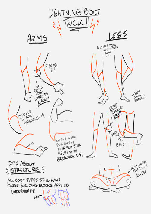
this showed up in my FB memories, the lightning bolt trick! I don't sketch out the lightning bolt much nowadays but it's still super helpful when I need to lay out tricky arms and leg poses. And I still apply the logic of it, especially with how I draw arms :' ) Biggest thing it helps with is shape breakdown and visualization, we gotta use whatever works to break down shapes into simpler concepts for our brains 👏💓
Quick editing tip: Passing time
Hey all, here’s a quick tip about showing the passage of short amounts of time in a scene. I see a lot of beats like this:
She hesitated
He paused
A few seconds later
There was a long silence
He waited for her to answer
She didn’t respond
Instead of telling us there’s a brief moment of silence or pause in your scene, try showing us by creating the feeling that time has passed through action, description, or inner monologue. Here are a few examples.
Before:
“Are you coming or not?”
He waited for her to answer, but she didn’t respond.
“Clare? Did you hear me?”
“Huh?”
After:
“Are you coming or not?”
Clare scrolled through her phone, her face illuminating with a eerie blue glow.
“Clare? Did you hear me?”
“Huh?”
Before:
Jared lingered at the suspect’s front gate. If this guy didn’t answer Jared’s questions, he was screwed.
“Hey you!” a voice shouted. “Get off my property!”
Jared hesitated. Finally, he turned to face the man. “I’m afraid I can’t do that.”
After:
Jared lingered at the suspect’s front gate. If this guy didn’t answer Jared’s questions, he was screwed.
“Hey you!” a voice shouted. “Get off my property!”
Jared patted his holster. He had a gun, but he certainly didn’t want to use it. Taking a deep breath, he turned to face the man. “I’m afraid I can’t do that.”
Not only does creating a pause instead of describing a pause allow your reader to feel the moment more vividly, it gives you a chance to explain what exactly that pause is about. People hesitate, pause, don’t respond, etc. for all kinds of reasons. Give us as much insight as you can into your weird quiet moment.
Of course, you don’t need to do this every single time. Sometimes it’s fine to say “he paused” or “the room was quiet for a moment”—it could be the best choice for that scene. But look back through your draft and see if you’ve used those “telling” descriptions more often than you needed to. If so, try to create the feeling of a pause—perhaps one that gives the reader a bit more information—using these techniques.
Hope this helps!


was watching one of yr speed-paints and im so confused on how yr chopstick pen blends colours?????? i’ve been using the brush for a whileeeee and it does not blend the same beautiful way do you use any custom settings?
that's because it doesn't blend!!
my favourite activity is picking a random spot on the colour wheel that's close to the colour i'm trying to render and just praying it looks good for either lighting or shading. i also take advantage of the brush's slight transparency to create the blended look (i have the brush set to around 70% opacity) AND i also colourpick in the area where two colours overlap and go back over it with the brush so it looks smoother
a visual will probably help explain ,,
little doodle of darrell as a treat C: i also make the brush itself way bigger when it's time to render and take advantage of having opacity by pressure turned on! that way it's easier to cover more space at once and the low opacity helps blend better
i hope this makes sense i realize i have a very odd way of doing these things and i've never really taken a step back to actually analyze my process before


brush settings for your purposes (whatever those may be) C:
I want to start drawing landscape. Do you have any tips?
Took me a while to answer this (sorry anon)! Drawing landscapes for me are mostly just a matter of doing a few 'art studies' and a bit of imitating life. Here's a brief rundown of my process. I find that I learn best when I see a picture or a reference that really tickles my fancy, like these ones! First image for it's colors, and the second for it's composition.


And then I pull up the dreaded white canvas on start on a rough idea or just start dribbling out the basics: composition, a bit of color, general shapes, etc. If you have a hard time doing general landscapes, don't worry! Imagine breaking it down like this: You layer on some general colors and shapes; don't be afraid to make mistakes, you can always go back to it! Be loose and organic with it at first, we're not striving for detail yet, and just let that brush move freely. And once you got the shapes down, you can go back and forth in the canvas to start detailing. I find that it's best if you really look into how some things are "made". Like for example, how that patch of grass in your reference is made: 'is it layered? does it have some shiny bits in it that I wanna highlight? are the blades of grass sharp enough to individually detail or more clumped up together to just put in a sorta grassy blob?'. Also, don't be afraid to experiment a bit. Try putting some highlights around the edges to make it pop out more, or try putting small changes in the color you're working with; something that's close but still different, so that it compliments each other! Then it's just a matter of going forward with it; see what you like and what you wanna keep and imitate, see what you want to change or maybe just leave out on. Keep on detailing and going until you're happy with it!

This is a really brief rundown and explanation of a process that can be entire unique to each and everyone of us, and takes a bit of time and practice to pull off. But I believe in you! We all start from somewhere, sometime down the line; and that can start right now if you want it to! Goodluck to any artists out there who wanna try out landscapes. It's a fun and comforting process of organic and loose art that breathes in a lot of life in some people, especially me. Twitter | Prints | Ko-Fi | Patreon


-
 theunpossible liked this · 2 months ago
 -
 4lprazol4mx liked this · 2 months ago
 -
 spongetea liked this · 3 months ago
 -
 arachnokisses liked this · 3 months ago
 -
 wangpussy reblogged this · 3 months ago
 -
 wukxon liked this · 3 months ago
 -
 flowersrevenge reblogged this · 3 months ago
 -
 bleedingquills liked this · 4 months ago
 -
 honeythlifsform liked this · 4 months ago
 -
 sweetparasiteee liked this · 5 months ago
 -
 hanasfavsong reblogged this · 5 months ago
 -
hanasfavsong liked this · 5 months ago
-
 devouraes liked this · 5 months ago
 -
 crebazalr liked this · 6 months ago
 -
 aliaa-j liked this · 6 months ago
 -
 vanillamidnight-us liked this · 6 months ago
 -
 ardouradvice reblogged this · 7 months ago
 -
 flamagenitus reblogged this · 7 months ago
 -
 artking-4 reblogged this · 7 months ago
 -
 eobardthawneallen reblogged this · 7 months ago
 -
 jammed2toast liked this · 7 months ago
 -
 reference-side reblogged this · 7 months ago
 -
 sinnamon-wade liked this · 7 months ago
 -
 kokutozessou reblogged this · 7 months ago
 -
kokutozessou liked this · 7 months ago
-
 silasona reblogged this · 7 months ago
 -
silasona liked this · 7 months ago
-
 melovehats reblogged this · 7 months ago
 -
 izumi-yami liked this · 7 months ago
 -
 breezemoonriver reblogged this · 7 months ago
 -
breezemoonriver liked this · 7 months ago
-
 bitter-like-coffee liked this · 7 months ago
 -
 yesireblogstuff reblogged this · 7 months ago
 -
 miiiwu-refs reblogged this · 7 months ago
 -
 miiiwu liked this · 7 months ago
 -
 justpickupthatpen reblogged this · 7 months ago
 -
 builduperrors liked this · 8 months ago
 -
 deaddying liked this · 8 months ago
 -
 haruhideaki liked this · 8 months ago
 -
 wermking liked this · 9 months ago
 -
 maltshark liked this · 9 months ago
 -
 sunaiiwa liked this · 10 months ago
 -
 kismekotka liked this · 10 months ago
 -
 seiganmkii reblogged this · 10 months ago
 -
 sashasashiromiya liked this · 10 months ago
 -
 ssskaay liked this · 11 months ago
 -
 cemeteryenby liked this · 11 months ago

sideblog for @letardoursprout so i have somewhere to collect all the tutorials/advice that i likeicon by lovelyshiz. header by hexh-pixel
66 posts